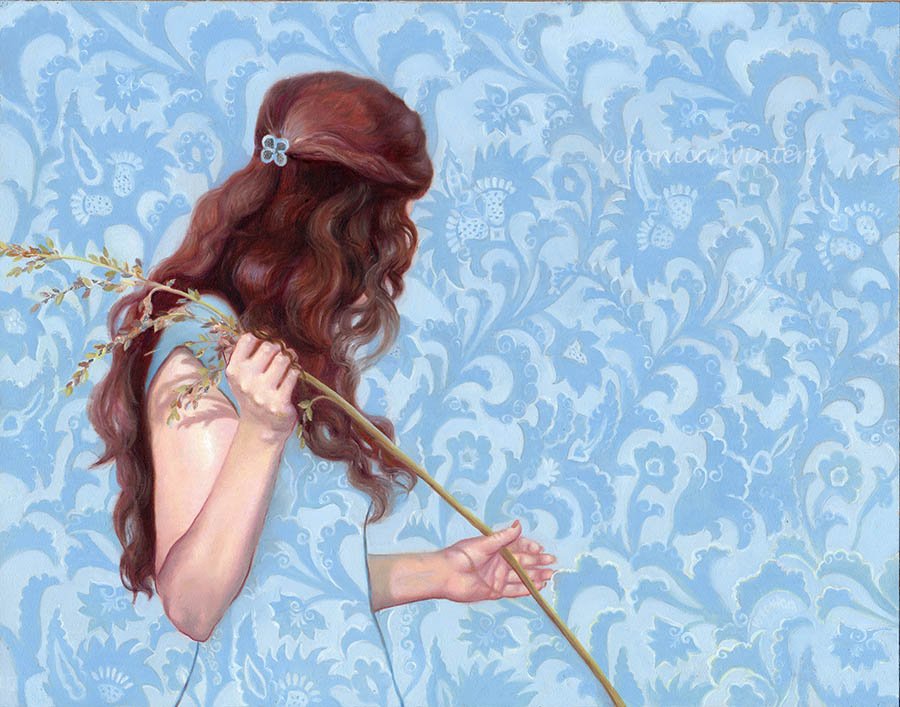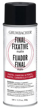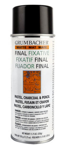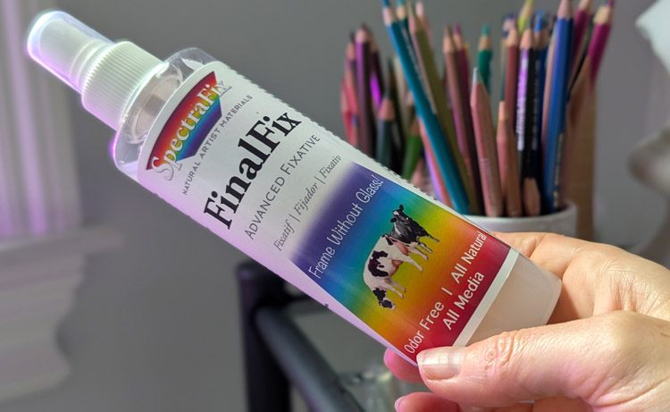
SpectraFix FinalFix Fixative Product Review
Hello, artists! Today, we’re diving into SpectraFix Final Fixative – a game-changer for protecting your mixed media art or art on paper without the nasty fumes. This article is not sponsored. I appreciate your support if you buy a book from me (links are at the end of this review).
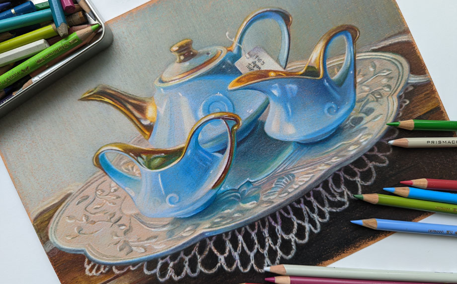
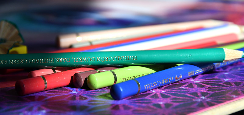
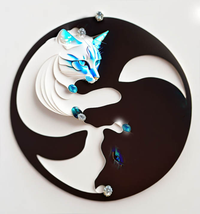
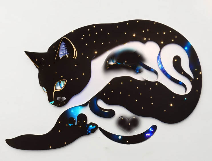
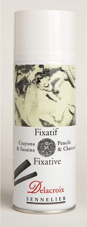
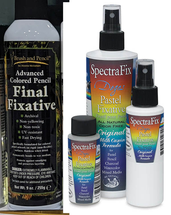
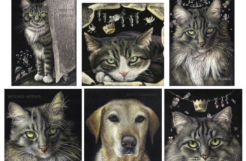
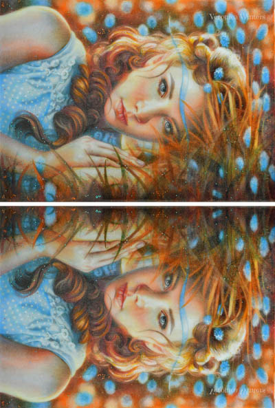
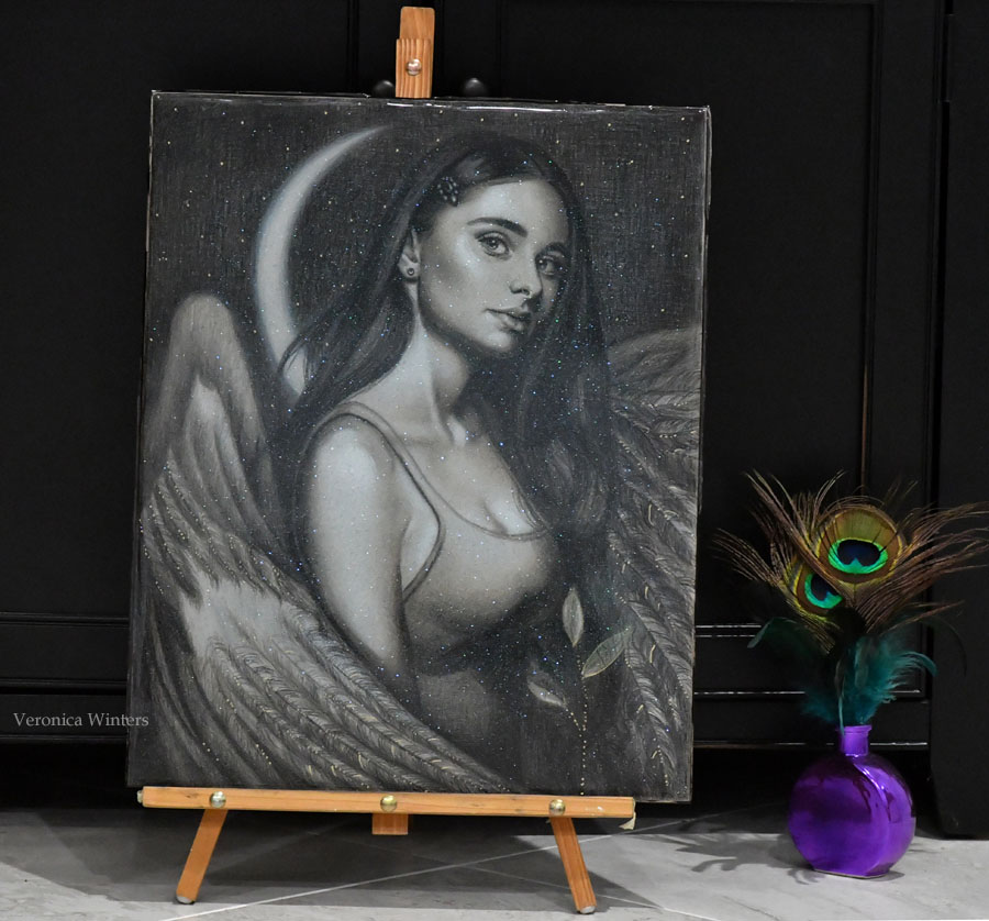
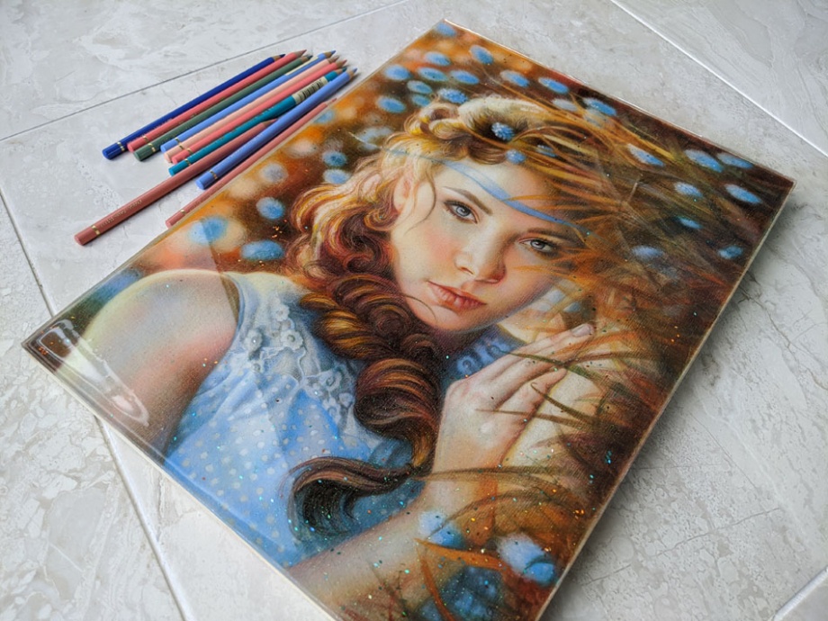
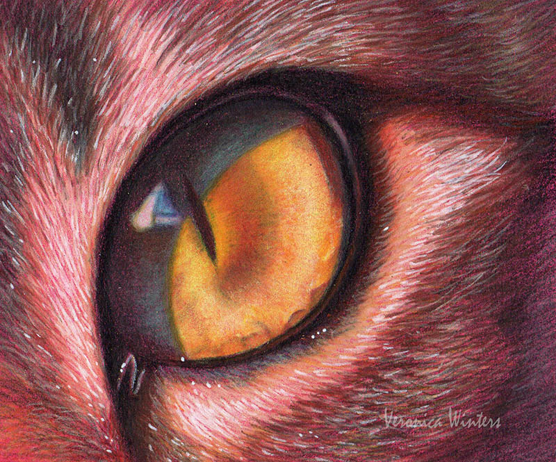
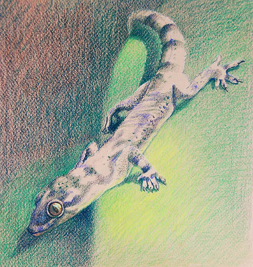
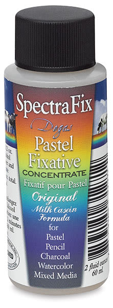
SpectraFix is a brand of non-toxic, odor-free artist fixatives for protecting artwork like pastel, charcoal, colored pencils, pencils, and watercolor, based on an antique recipe from Edgar Degas. It is made from a casein-based formula, protecting colors without dulling or darkening them. While the brand offers different formulas, some allow for the artwork to be framed without glass.
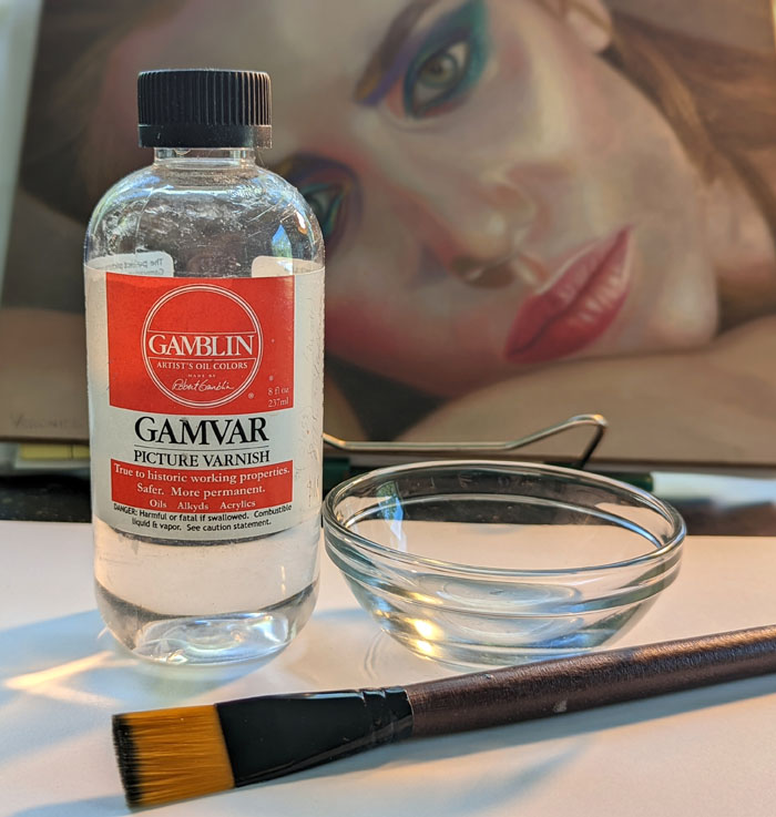
First of all, if you’d like to learn about the crucial difference between varnishes and fixatives, and how to fix your drawings, go here.
3 reasons to varnish your art:
- The environmental changes can produce environmental smudge on the surface of the unvarnished drawings and mixed media art that would be difficult, if not impossible, to remove later on. (One example is the growth of mold on the surface).
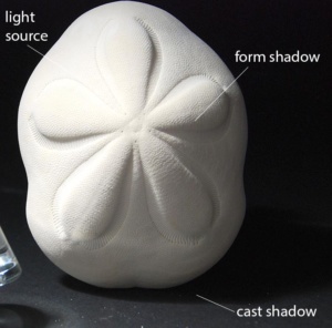
- Fixatives protect your art from UV light, dust, moisture, and environmental changes.
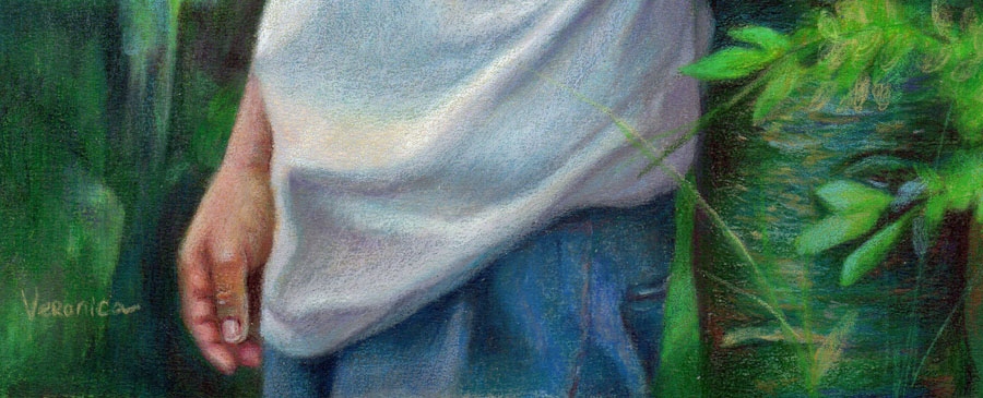
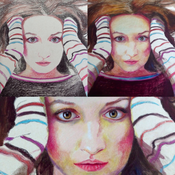
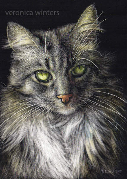
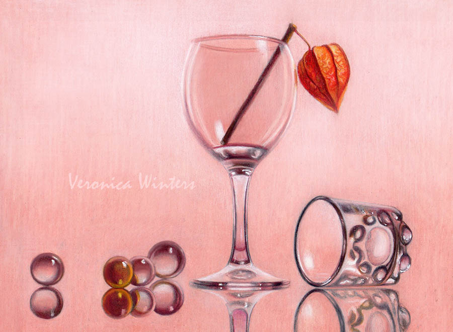
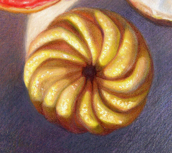
- High-quality fixatives even out the surface, making the colors evenly bright and saturated. Personally, I love to see how my drawings transform after varnishing.
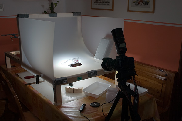
Always test the product on a scrap piece of paper or old artwork first to ensure you get the desired result!
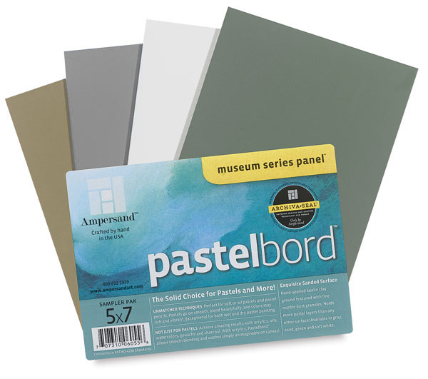
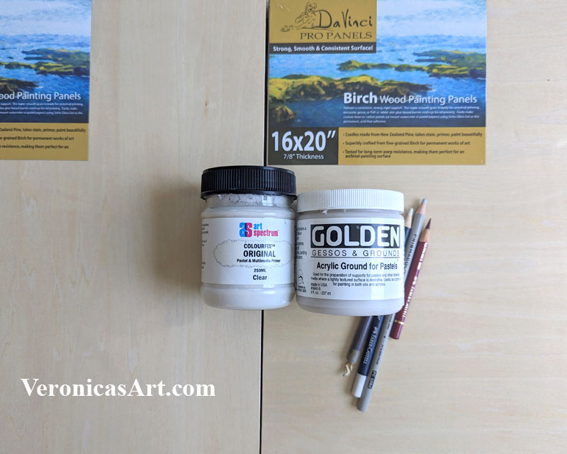
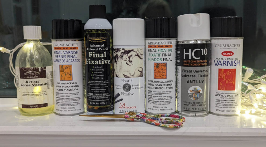
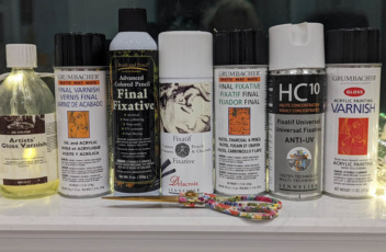
Features of SpectraFix FinalFix
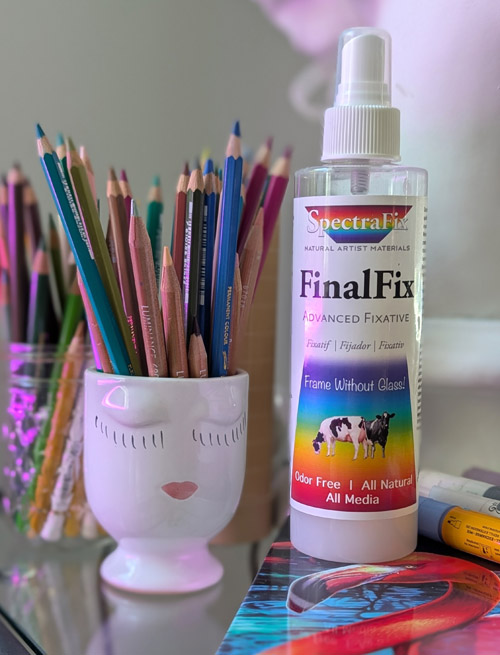
Available in pump or aerosol bottles, like 8oz or 10oz sizes. I don’t recommend buying the pump bottle for the reasons mentioned below.
Advantages:
- Archival quality. Non-yellowing.
- Totally non-toxic with no odors, so you can spray it in your art studio safely. It doesn’t give you headaches, and you don’t need to create special conditions to spray it outdoors.
- It preserves vibrant colors, allows for workable layering without stickiness, and adds scuff resistance.
- It takes a couple of days to cure completely, but when a combination of casein and beeswax cures, it forms a protective coat that allows for cleaning with a damp cloth. This feature alone is worth the cost of the FinalFix as it allows artists to display some pastel drawings, colored pencil art, and charcoal artwork without glass. You can still display it under plexiglass or glass, but the drawing won’t smudge on the glass.
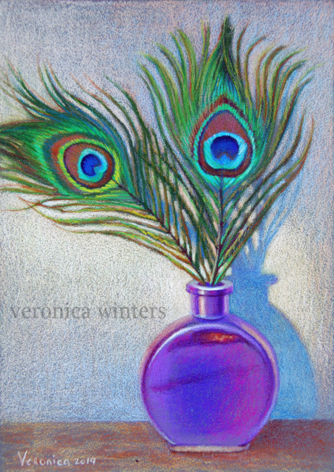
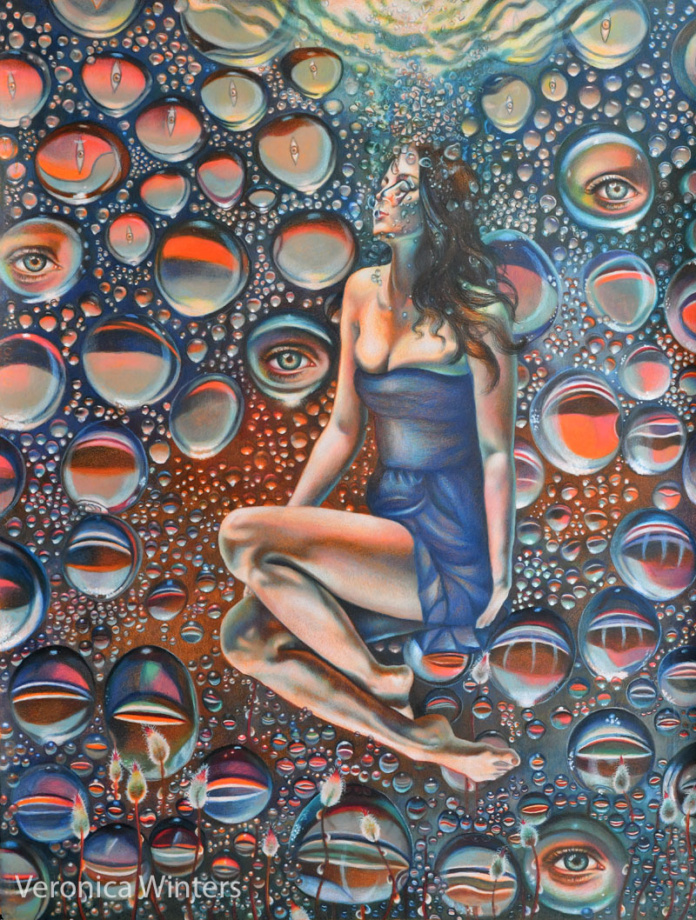
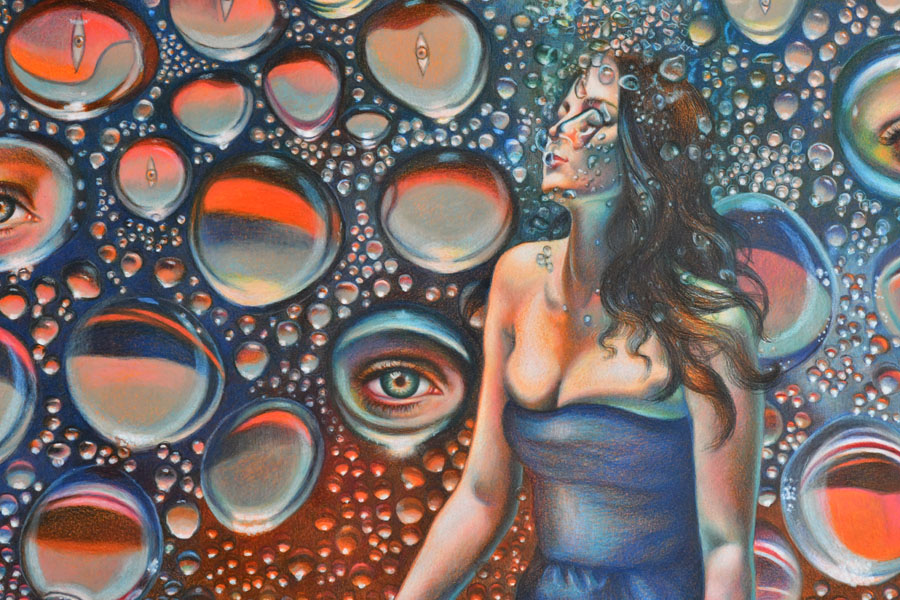
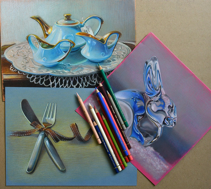
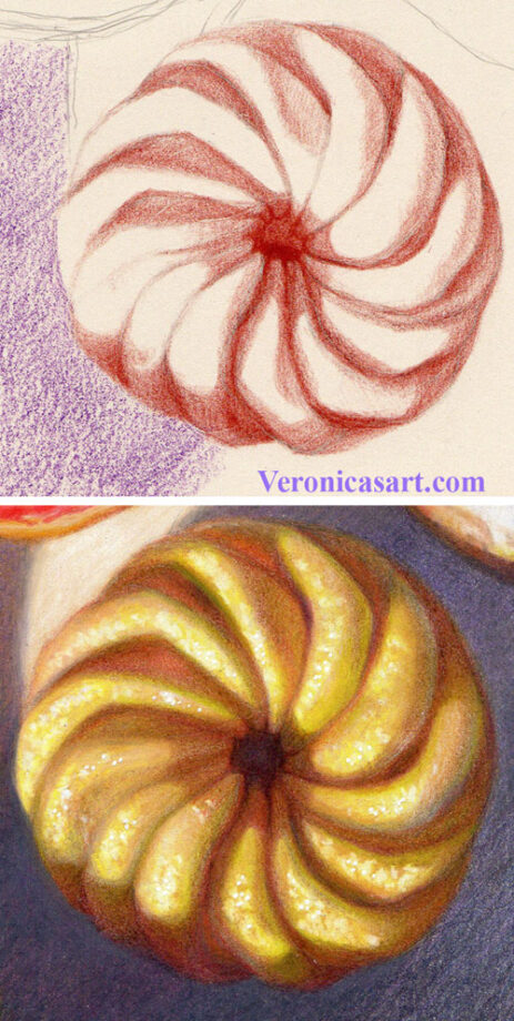
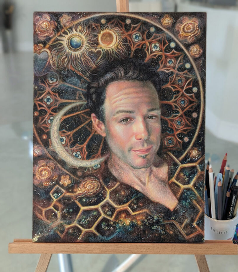
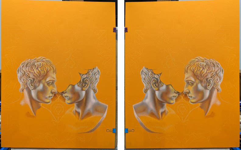
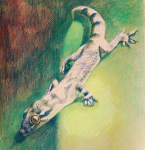
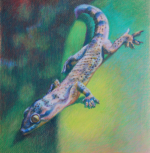
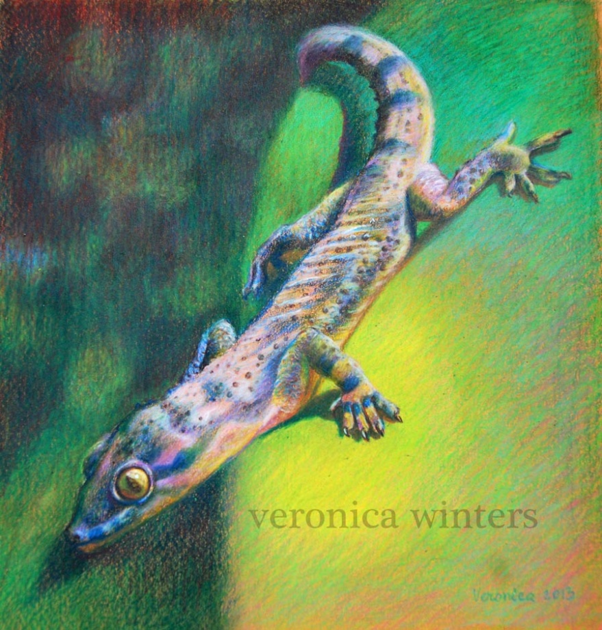
- It provides a protective layer that allows for further layering on top of the fixative. I used it in between layers of colored pencils to reduce smudging and unnecessary shifts in color. In other words, a light coat gives me the ability to layer more colors over my drawing to build rich color and contrast.
- When sprayed in layers, the drawn surface becomes well-protected and feels hardened to the touch.
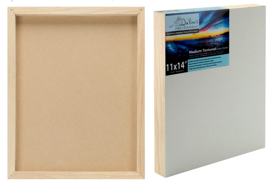
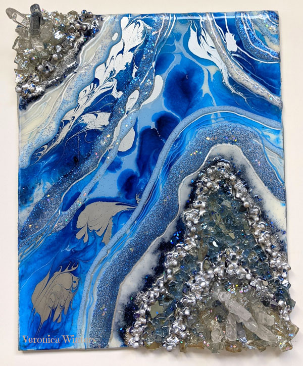
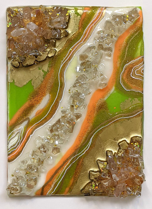
- Eco-friendly and versatile for mixed media projects. Final Fix is suitable for use with various media, including pastel, charcoal, watercolor, and gouache. It can also be used on various surfaces like wood, canvas, and glass, although I haven’t tried that yet.
Drawbacks:
- My major surprise with this fixative is the spray nozzle (pump sprayer nozzle) and how it leaves puddles of fixative on the surface while spraying it. It’s quite scary to see it on my art sprayed on while it’s still wet. However, when it dries, it dries absolutely clear, and the surface feels different, protected from smudging and moisture. Such uneven spray delivers uneven coverage, and the nozzle can clog as well. To avoid this, buy FinalFix in aerosol spray bottles for a finer mist and more controlled application. I haven’t tried the aerosol spray yet, but I will in the future because, besides this issue, the spray is excellent and what I need to have in my art studio.
- NOT for use on thin paper! Thin paper warps under this fixative.
- Although I haven’t experienced it in my work, this fixative potentially can cause a slight color shift or darkening on some pieces. It looks much darker while it’s still wet, but it dries evenly and is glass clear.
- The slicker surface reduces tooth for heavy pastel layering; therefore, it’s not compatible with oil pastels. For oil pastels, try the Degas Fixative instead.
- It’s not really a drawback but a warning. Don’t use it as a final varnish on acrylic or oil paintings without an extra varnish layer, as it might delaminate over time when applied directly over your painting. It’s not designed for paintings’ protection.
Price
Current price range: Expect to pay $16 to $43, depending on size and retailer, like $15 for an 8-oz pump or $27 for a 10-oz aerosol. It’s quite expensive in comparison to other professional fixatives and gets used up fairly quickly too.
It’s interesting to note that it’s the only manufacturer that offers empty refillable flairosol spray bottles for about $15 each. Again, not cheap, but you can buy the refills of any economical bulk-sized fixatives, including SpectraFix Degas Fixative, FinalFix, and Natural Glass Spray, and re-use the bottle. Before recommending it, however, I plan on testing this Flairsol spray bottle in the future to see if it gives me a much finer spray mist necessary for even fixative coverage and application.
Conclusion:
Most fixatives give me headaches, but this one is safe for studio use. Overall, suppose you’re after a safe, natural fixative. In that case, SpectraFix FinalFix is worth the price for most dry media artists if drawings and mixed media paintings are done on heavyweight paper (130 gsm), mixed media paper, heavy art boards, or even wood. Grab yours and protect those masterpieces! Subscribe for more reviews. What’s your go-to fixative? Let me know!
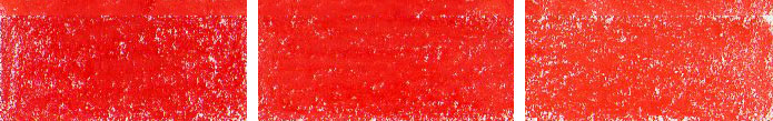
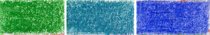
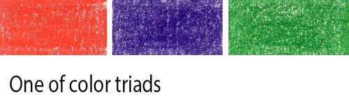
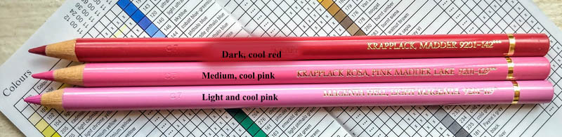
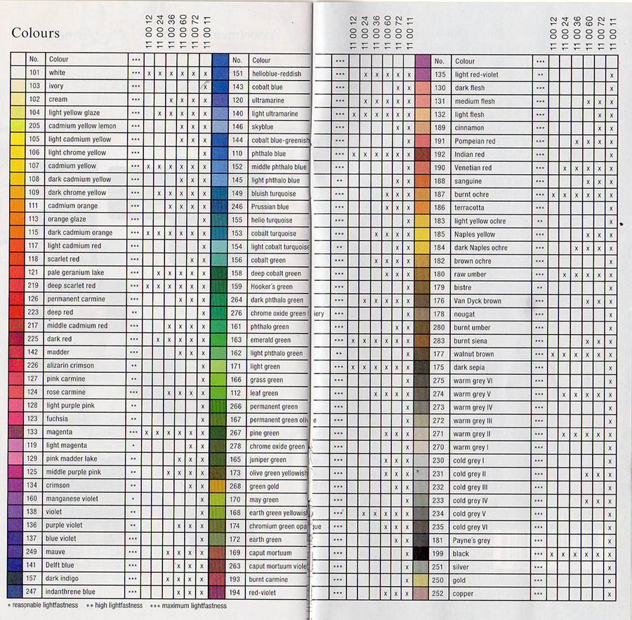
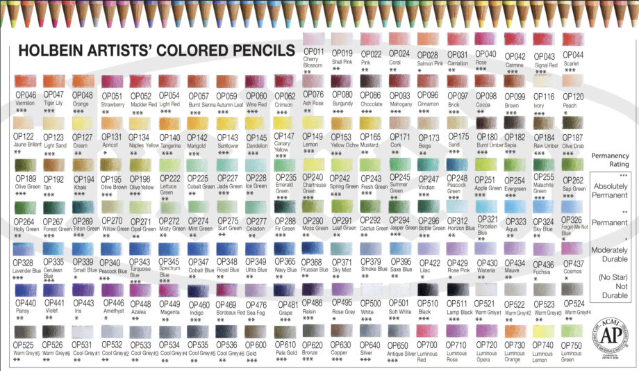
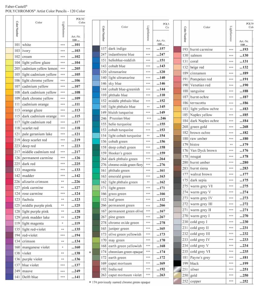
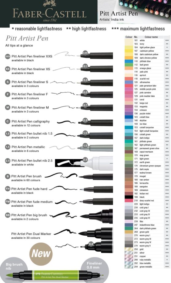
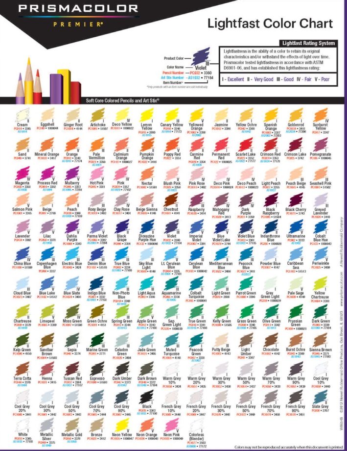
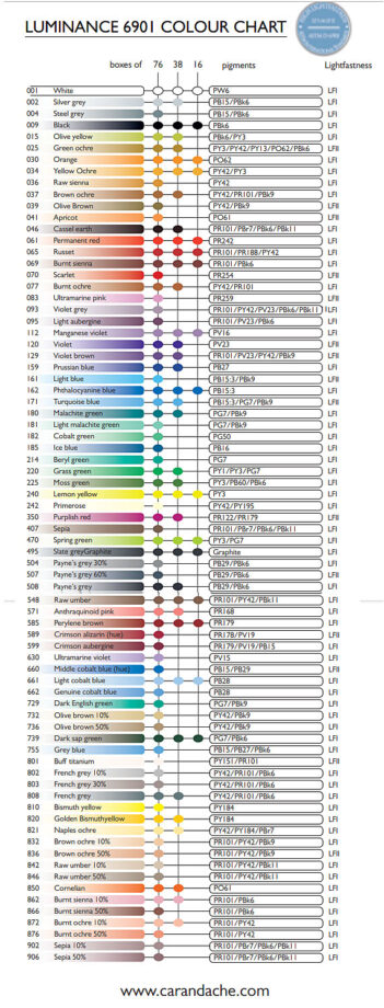
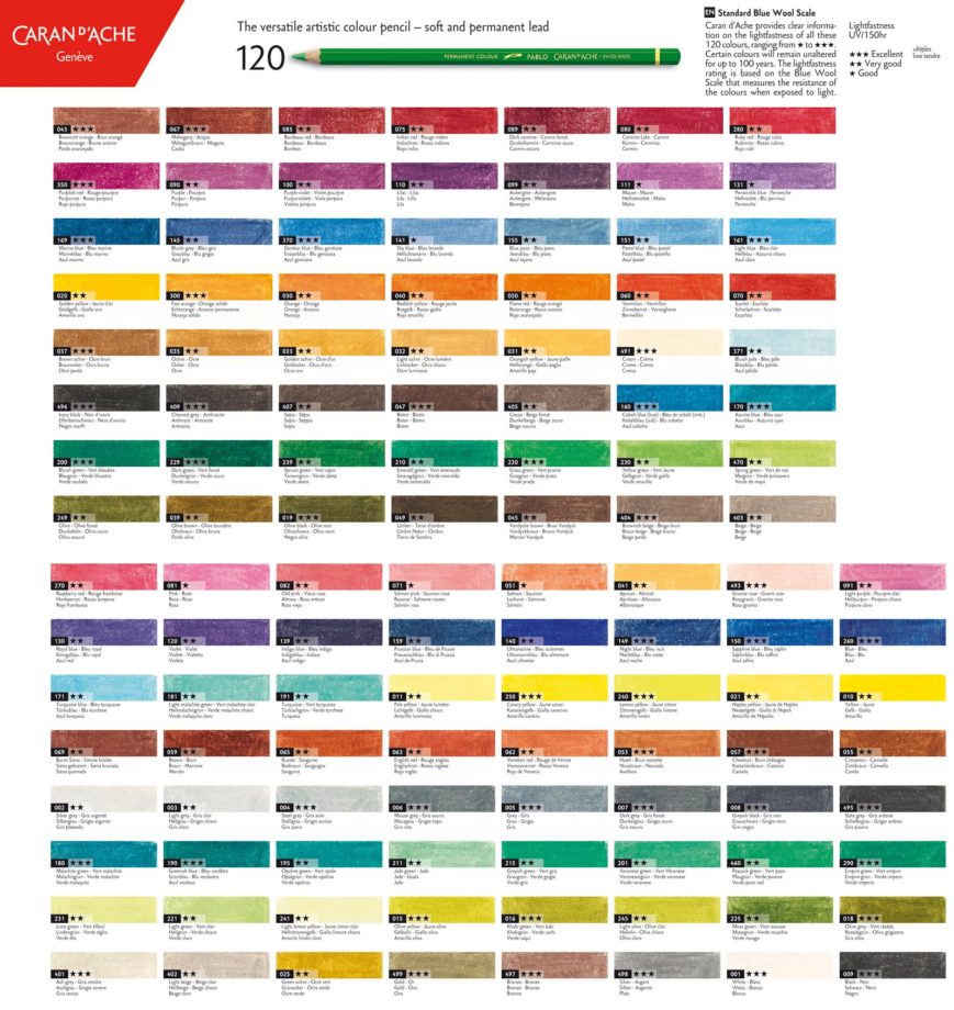
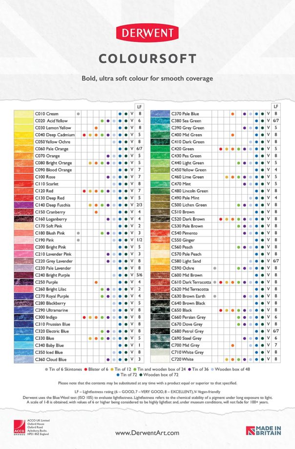
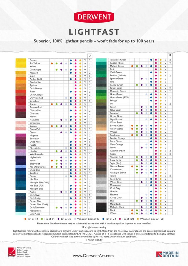
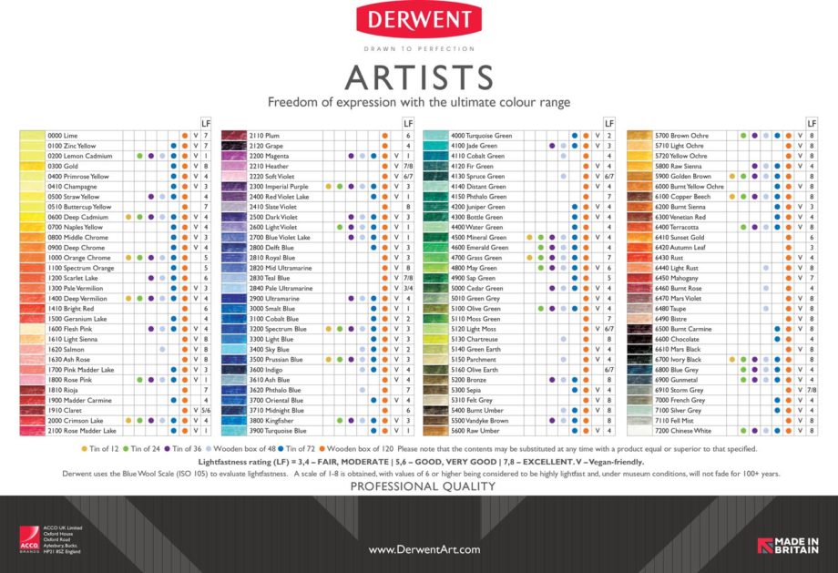
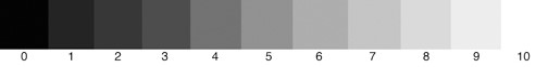
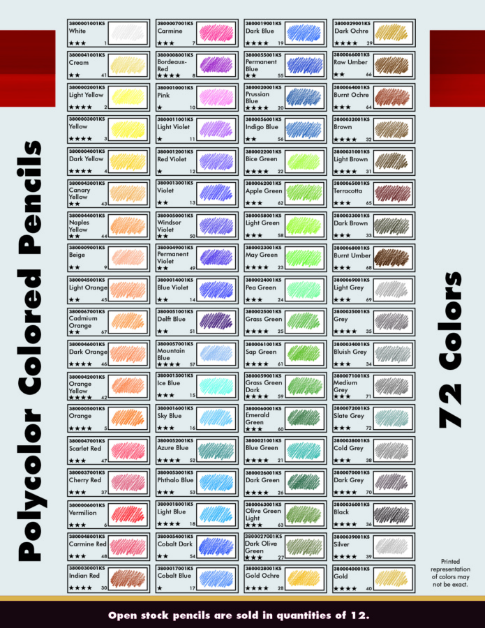
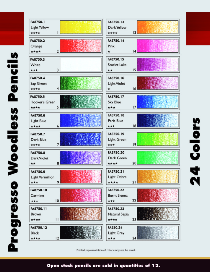
Lightfastness Charts of all major professional colored pencil brands.

References & resources:
If you’re unsure how to use your particular varnish or fixative, go to the manufacturer’s website. Companies have their own blogs and videos showing artists how to use their products correctly.
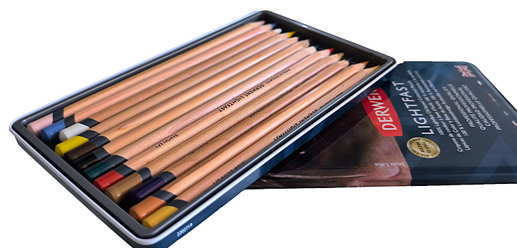
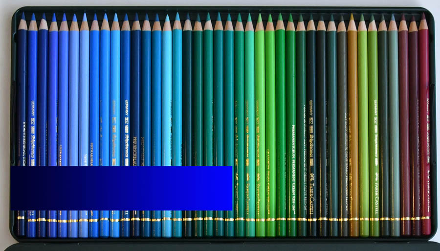
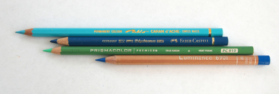
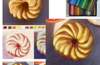
I also reviewed the best colored pencils, like Luminance, Pablos, Prismacolors, Derwent Lightfast and more on my Youtube Channel