Tag: colored pencil drawing

How to improve art skills by taking great pictures for colored pencil drawing and painting

How to take great pictures for colored pencil drawing and painting

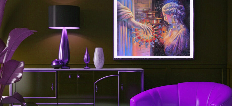
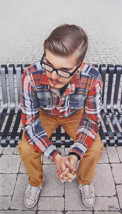
If artists paint in figurative realism style, most rely on photography these days. Model fees, time constraints, lighting and studio conditions – all add up in a puzzle we have to organize and manage, if we paint from life. While painting from life is a must for realist artists to get the skill going, perfecting photography is also a necessary skill. Because colored pencil drawing is such a slow medium to work in, almost all artists rely on their references to create art as opposed to drawing from life. Sometimes it takes weeks to complete one colored pencil drawing, and we have to rely on our photo reference to capture story, composition, design, color, and details. That’s why great photography becomes key to artistic success. Let’s master it!

How to take great pictures suitable for colored pencil drawing and painting

It took me years to understand how to see the light turning the form and how to pick pictures, capturing that light. I used to play with pictures from fashion magazines that looked incredibly beautiful, yet they were missing something I couldn’t quite figure out what. Some were OK for black-and-white drawing but none of them were good for oil painting. Why?

All magazine pictures are Photoshoped heavily, getting rid of important information necessary for artists to capture the form realistically. First, the Photoshop filters and presets get rid of warm/cool balance in skin tones, objects and even backgrounds that we normally see in nature. Second, copyright is a big deal, and we can’t use such images for our art to create the originals. Thirdly, a lot of times the “connection” between the subject and artist is missing. We have no emotional attachment to the photo that’s not ours that results in unfinished or poorly executed art.

Photo equipment:

My greatest investment into my studio equipment is my camera Nikon D500 with the interchangeable lenses. The quality of lenses is even more important than the the body itself. The higher the quality, the better the outcome. Over the years I bought several lenses for different tasks.

  • Nikon 105 mm- micro lens for extreme close up photography
  • Nikon Nikkor 85 mm – for portrait photography (that gives no distortion)
  • Sigma 12-24 mm – for interior photography (that has a wide angle with no distortion)
  • Nikon Nikkor 18-200 mm zoom lens – for general photography ( while it’s my heavy duty use lens, it gives the most distortion and requires extra work in Photoshop to even out the perspective, etc. Zoom lens have the most distortion especially noticeable in cityscape photography).

I also have an inexpensive Westcott reflector kit with multiple colored surfaces (silver, gold, white) that I use for portrait photography at times. I use the reflector to bounce the natural light back onto my model or object that removes harsh shadows or adds more light into the shadows.

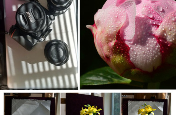
You can also consider buying a backdrop equipment that I don’t need personally because I shoot models in natural environment, and when I do still life photography I make my own light box set up that you’ll see in the article below.

Besides having excellent equipment you also need to have a good eye to take great pictures, which you develop by studying the art of others and practicing your photography skills.

Pixabay image

Advantages of Mastering Photography:

  • It develops your originality and vision.
  • It forces you to extrapolate and focus on what’s important in busy environments.
  • It teaches you to see how light shapes the form
  • The artist is the sole designer and creator of artwork beginning from the very first step of photography.
  • It’s a forgiving medium, giving you many chances to practice at all times. You become attuned to cropping and balancing techniques that artists traditionally use in their paintings.

Disadvantages of Using Photography:

  • It often flattens out the form to such a degree that you have a hard time re-creating the volume. That’s why it is best to start taking pictures with one directional light source that gives you definite lights and shadows.
  • Camera makes its choice. Even the best cameras don’t capture what you see as an artist, which involves emotion. By working from a picture, artists analyze the subject rather than respond to it freely.
  • There is a lot of distortion in the images depending on the lens and camera you use that is obvious in cityscape photography or in pictures of geometric objects. The same distortion is present in pictures of people or fruit, or whatever subject you have, but our eye doesn’t catch those distortions as quickly as we notice those in linear and geometric forms. Those “unseen” distortions will travel to a student’s drawing when the artist transfers the outlines rather than learns to sketch freehand from his reference.
  • You may have problems with exposure. Use the HDR (high dynamic range) function on your phone to level out the exposure. HDR combines two or three pictures into one automatically, giving you a single balanced shot. HDR function is very handy when the sky looks too bright or the background is so light that it makes your subject appear too dark. • You can take good pictures with your phone, although the quality won’t be the same as shooting with a DSLR (digital single lens reflex) camera. If you shoot with your phone, zoom in on your object as closely as you can. That will blur the background, giving your subject a boost in color and texture.
colored pencil manual veronica winters
You’ll find sample photos and more information on mastering the photography in The Colored Pencil Manual as well my Colored Pencil Video Course

Subjects

leopard, how to improve art skills
This image is taken from Pixabay, a free resource for artists to use!

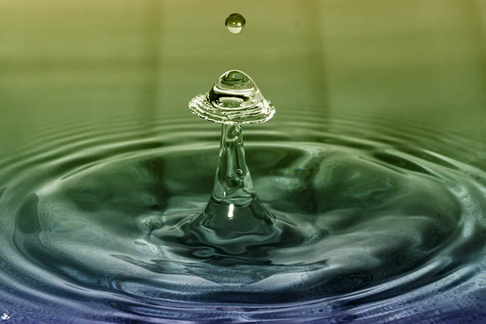
First of all, decide what you favorite subjects are, and isolate them from busy environments. Here are some ideas for your photography. Close-ups of textured subjects—these can be the most fun, unpredictable subjects for your photography and art.

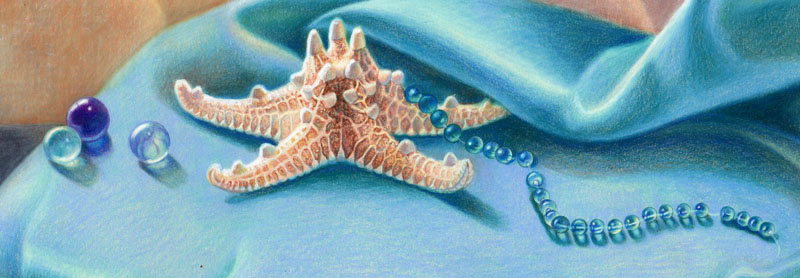
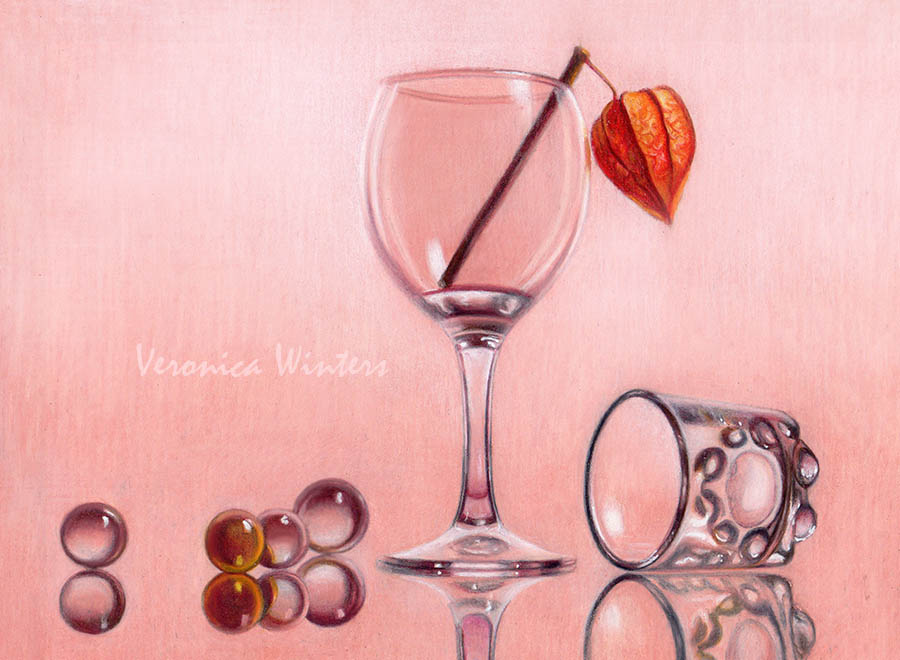
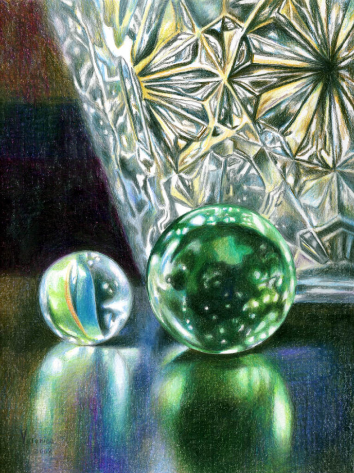
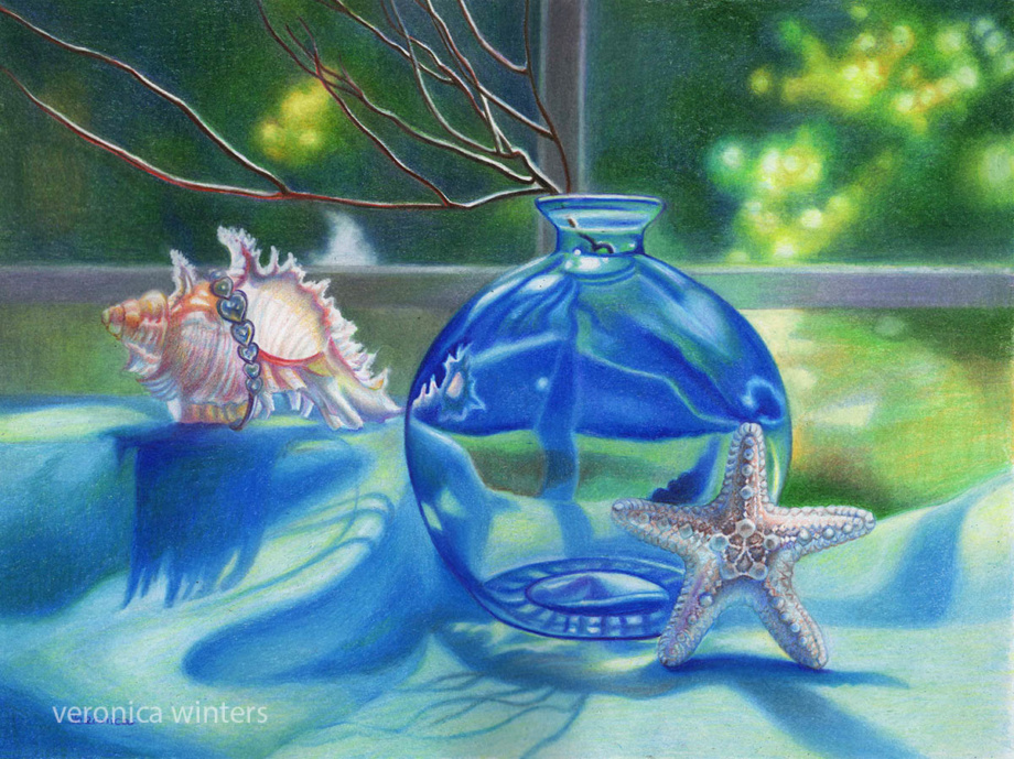
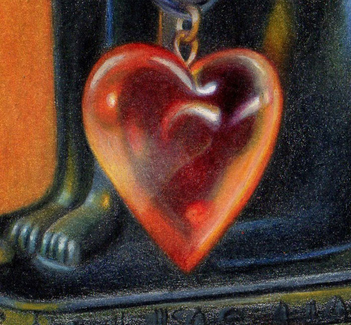
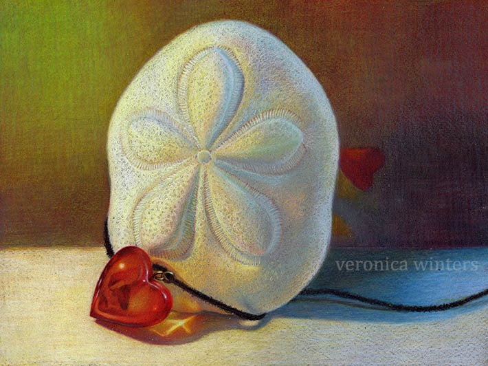
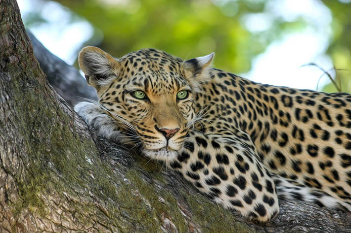
They can be reflective surfaces and reflections, fabric patterns and lace, rusted door locks, wood grain, colorful feathers, candy, sliced fruit, marbles, flowers, kitchen utensils or tools, and even mechanical parts of clocks. Other popular subjects are glass; portraiture; animals, birds, and pets; food; florals; seashells and sea life; trees and landscapes.

Properties of light

Your goal of shooting in the “right lighting conditions” is to beautify your subject and to bring the best out in it. Ask yourself what attracts you to this object. It could be a specific texture, transparency, color, or an abstract pattern of light and shade that you see. You need to figure out what you love about your subject and how you can highlight its most attractive qualities in a specific light. If your subject looks boring in a picture, chances are that the lighting conditions were boring at the time it was shot.

Light temperature:

starfish, how to take good pictures
In this picture the evening light is warm (yellow) and the shadows are cool (blue).

The light can be either warm or cool. In the beginning it may be difficult to spot the difference, but if you ask yourself if it is yellowish or bluish, it makes more sense. Fluorescent lights tend to be cooler, while the tungsten lights are warmer. In nature, you see a beautiful golden light twenty minutes before the sunset. The light temperature affects how you see the colors and how they unify everything in the image. You also use the light temperature to understand the color on your subject: if the light is cool, it gives cool lights and warm shadows. If the light is warm, it gives you warm lights and cooler shadows.

Quality of light:

This picture has a soft, diffused light throughout. While the picture looks like fun to draw, it would be much harder for a beginning artist to create volume and to turn the form using this kind of lighting. (Pixabay image)

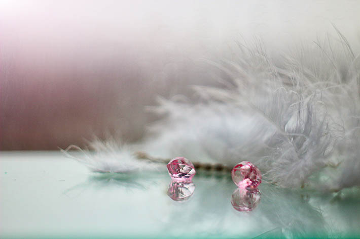
Natural light is the most beautiful light we have as artists. While the soft, diffused light may give the artist beautiful, soft skin tones in portrait photography or a dream-like mist in a landscape, this light is difficult to master for a beginner who is shooting pictures of glass, fruit, or flowers. The glass loses its sparkle and reflections, the fruit doesn’t have the volume or shadows, and flowers appear quite bleak. That’s because the diffused light gives you very soft, almost unnoticeable shadows and highlights, which, in turn, are difficult to reproduce in art for a student. Whatever the light temperature is, the goal is to avoid getting monotonous images that often happen in diffused light situations when you have an overcast sky.


Light direction and shadows:

how to improve art skills
This teapot has one directional light set up on the right at night. Such light gives strong highlights and shadows that are easier to re-create in a drawing.

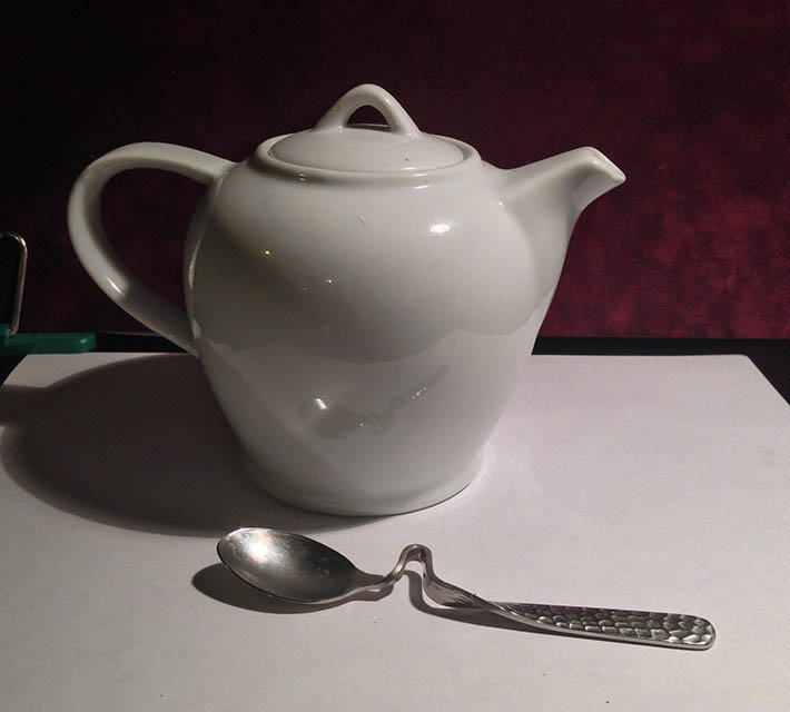
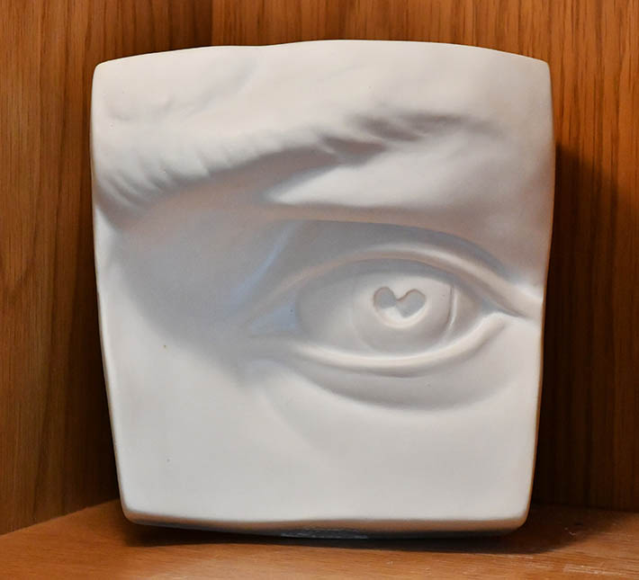
The most effective way to study the light on a form is to have a singular, strong directional light source set up at 45 degrees, which is often called Rembrandt lighting. This light direction creates beautiful highlights and shadows that will add dimension to your objects.

If you go to an atelier school of classical painting, you’ll see students draw from plaster casts and still lifes set under a single directional light that doesn’t change direction for the entire drawing process. Such setups are vital to an artist’s understanding of how to turn the form. So when you take pictures inside, find and focus on one primary light source, like a table lamp, and consider its strength. Look at your subject and find definite highlights and shadows on and under it because it will give you this 3-dimensional quality you want to re-create in your drawing.

Set up a strong directional light drawing people. In this example the David’s Eye sculpture looks very three-dimensional because of the directional light that makes the forms pop.

In my video course I teach how to take your colored pencil drawing to the next level including set up and photography. Watch a video preview here:

Depth of field:

Shallow depth of field allows you to capture your object in a sharp focus, blurring the rest of the image. A soft background supports the focal point rather than competing with it. When you have a high depth of field set at f16 on your camera, everything is in focus, and oftentimes the image will look too busy and indistinguishable from other elements in the background where everything competes with each other. Always think what you’d like to focus on, then make it your priority by zooming in or fixing the depth of field.

Zoom in, keep it simple & use negative space as a design element:

crystal pitcher colored pencil drawing
This is a crystal pitcher colored pencil drawing. The background (negative space) becomes part of the design in the artwork.

Background affects the edges and creates abstract shapes. As a beginner, stick to plain backgrounds to isolate your subject and to show contrast. After a while you can start playing with the color and complexity of your negative space as well.

Use backgrounds and boxes for staged photography:

light box still life set up
Light box still life set up

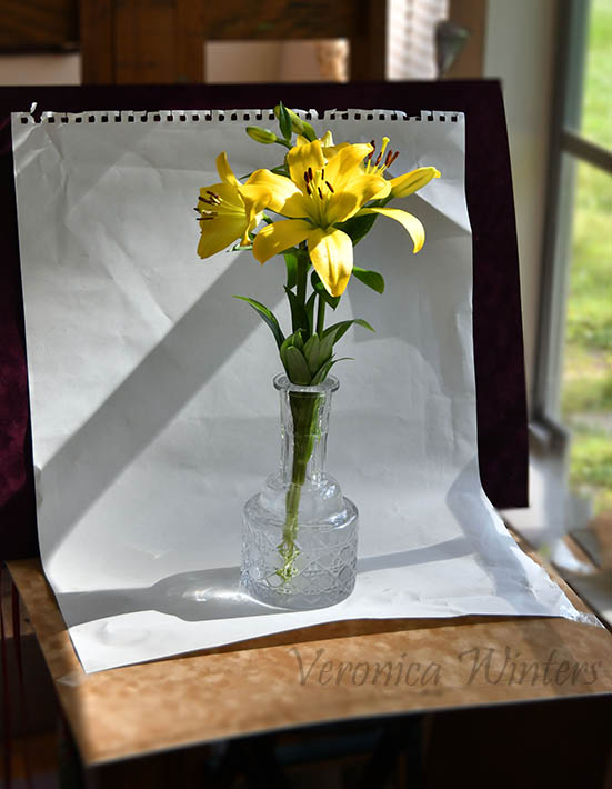
If you don’t want to buy a light box, you can make a very simple setup next to your window. Use colorful but plain matboards, fabric, or paper as your choices. The result is a single image with a beautiful, natural directional light, a shadow, and a white or color background all around it.

Avoid flash photography:

Flash destroys the natural flow of light and its shadows. It flattens out the object and gives you strange, unnatural colors. Professional photographers know how to rotate their flash unit to get the right position of the flash, but most of us don’t!

Prioritize values over color:

When a student is learning to draw and paint, it is difficult to translate hues to tones. Convert your photos into greyscale to see values. Most students end up with middle-toned drawings because of weak contrast.

Well, I hope this article helps you to shoot beautiful pictures as references for your art!

video courses by veronica winters
Check out free previews of my video courses here: https://veronica-winters-art-school.teachable.com/

How to draw glass in colored pencil

how to draw glass

5 tips drawing glass in colored pencil

In this post I’d like to explain the basics of drawing glass and other glass-like, transparent or reflective objects in colored pencil. At the end of this article you’ll find additional resources such as my online video course and drawing demonstrations that will give you more colored pencil drawing ideas on how to draw glass.

Drawing crystal or glass or other reflective surfaces is not as difficult as you may think once you understand the basic principle behind it. Observation is key!

How to draw wine glass veronica winters
Drawing of wine glass, Veronica Winters

How to draw glass: tip #1 | Symmetry & ellipses

The accuracy of shapes is the first important element in colored pencil drawing of any surface like a wine glass or cup. When you draw the wine glass, the shape of the wine glass itself must be perfect or very accurate having symmetrical sides and correct ellipses.

In the beginning, it’s a very laborious process to get the accurate drawing of shapes but overtime you’ll become a better draftsman, and it will be much easier to keep the shapes accurate, even and symmetrical. Therefore, to draw realistically, you must strive for achieving the most accurate shape (outline) of your drawing.

The overall shape of the object mustn’t be crooked or uneven.

how to draw wine glass
This is an example of me using the folding technique on tracing paper. I basically sketch out a wine glass/cup/vase as I see it. Then draw the line right through the center. Fold. Trace my best side onto another side. Unfold. Then I transfer that symmetrical outline onto my drawing paper. I have extensive instructions of this drafting technique in my art book “The Colored Pencil Manual”.
Why don’t we just transfer the outlines right from a reference using a window light or a light table? Camera lens distort reality and produce crooked forms. If you use a zoom lens, sometimes you can almost see a fish-eye effect that is very noticeable on linear objects and architecture. Don’t be a slave to your camera.

How to draw glass: tip #2 | General pattern

glass object venice pavilion 2017
Unique glass object at the Venice pavilion, 2017 | Here the general pattern of crystal glass is quite difficult to ‘copy’ unless it’s drawn really big.

In colored pencil drawing of glass and crystal you should aim to break it down to general pattern first and then fuss over the details. See if the crystal glass has patters with ray cuts, squares, etc. You want to be perfect at repeating this pattern as it curves around the form. Only after that you look at the abstract shapes and colors found within this pattern.

how to draw glass
I created this drawing over a decade ago when I was learning how to draw glass in various shapes such as marbles, wine glass and crystal. The crystal vase has a rather simple, ‘repeatable’ pattern.

Your aim is to copy the largest shapes found within the design of glass object. It makes sense to either draw big, so it will be easy to put all the abstract designs you see in your colored pencil drawing of glass, or pick a crystal vase with a very simple pattern you can copy in art.

 how to draw glass
Still life with a vase, 9×12 inches, lightfast colored pencils on paper | This glass vase doesn’t have the pattern on its surface like crystal vases do. However, it has the ‘abstract shapes’ inside it because of its transparency. I always try to copy major shapes I see. I also curve the lines in accordance with the object’s shape.

Always try to find major abstract shapes within the vase or glass. Copy those shapes as precise as possible. Usually these are distortions, patterns or color movements either inside the glass or on its surface.

How to draw glass: tip #3 | Color behind the glass

how to draw glass
In this drawing the glass heart is semitransparent. It shows a lot of black – the color of its background. The black inside the heart is less color-intense because it mixes up with other hues of the glass.

Glass surface always reflects something behind and around it. So colors of the background must be very similar to the ones inside the wine glass/ glass vase/ glass object. Color intensity could very though.

how to draw texture
Here the same glass heart has a slightly different color because some background white shows through it.

How to draw glass: tip #4 | Soft colored pencil shading

Colored pencil drawing of glass requires soft shading. Lines must be short not to flatten out the shape. To create volume in the glass vase or wine glass, pay attention how abstract shapes found on the surface curve and wrap around the object.

Curve lines. Shade softly with short, overlapping strokes. Don’t make lines and shapes inside the vase or glass too straight because it flattens out the object. But if you have a bottle with straight sides, these lines must stay nice and straight.

how to draw glass
Turquoise tea set, 10×12 inches, lightfast colored pencils on paper | In this colored pencil drawing you can see how the objects’ edges stay crisp while shading inside the teapot is very soft. Colors flow one into another without having separate edges or unevenness.

Always try to improve your shading by placing tight, overlapping strokes. Don’t rely on fixing the unevenness of your shading with the blender. Rotate your paper to place the pencil strokes in the right direction. One of my favorite colored pencil brands is Caran D’ache Luminance because they’re very soft, durable, lightfast and blend exceptionally well simply by shading tightly or crosshatching with them. They’re very pricey but can make a great gift for every colored pencil artist.

How to draw glass: tip #5 | Blending

Glass has no texture. To imitate this glass-like surface colored pencil blending becomes key. Sometimes you don’t need extra blending if you shade with sharp pencils overlapping, crosshatching or moving in circles to create tight shading. Paper’s texture has a lot to do with it. Paper must be smooth with just a bit of paper tooth to adhere the colored pencil to. If your drawing paper has lots of texture, then blending is necessary.

how to draw glass
Glass chandelier, Veronica Winters | Many years ago I was fascinated by glass chandeliers when I was learning how to draw glass. I made several colored pencil drawings based on my photos I took at the palaces. I loved capturing all the reflections inside large glass and crystal shapes.

To imitate the smoothness of glass I shade everything with heavy pencil pressure. Usually I don’t use the blender. If you think your shading is not complete without additional blending, use Caran d’Ache full blender at the very end. Blend everything where you don’t want to see any texture. Glass vase has no texture but flowers sticking out of it might have some texture, for example.

Putting it all together

 how to draw wine glass
Still life with a wine glass, 9×12 inches, lightfast colored pencils on paper, private collection | This drawing is available as a downloadable step-by-step drawing demonstration “How to draw wine glass”

Step back and look at your colored pencil drawing of glass from a distance. Is the overall shape of the wine glass correct? Do you have enough variation in values ranging from light to dark? These are potential places to fix things. Is glass smooth with nice transitions? Do you have strong highlights?

Oftentimes the blending step is not the last one in drawing of glass. Additional layering may be necessary to tweak the values or to soften the edges. When the surface becomes too waxy and doesn’t accept any more pigment, spray it with a fixative for dry media (I recommend Grumbacher). Let it dry and try shading it once again.


colored pencil techniques video course by veronica winters
https://veronica-winters-art-school.teachable.com/p/veronica-winters-complete-colored-pencil-techniques-in-90-days
how to draw glass
Glass bunny, Veronica Winters | This drawing is available as a step-by-step demonstration in the Colored Pencil Magazine Workshop series (February 2021).
colored pencil manual veronica winters
I have two chapters dedicated to drawing glass and reflective surfaces. I explain how to make symmetrical shapes in wine glass and many other reflective objects. The colored pencil manual is sold on Amazon.

The Colored Pencil Manual art instruction book: https://amzn.to/3fRpoEb

How to Color like an Artist art coloring book: https://amzn.to/2LtH0Iq

Show me the attitude! Interview with Tanja Gant, colored pencil artist

Tanja Gant: show me the attitude! Interview with realist colored pencil artist

Colored pencil drawing by Tanja Gant

I’ve been following Tanja Gant’s art for many years. She is one of the top hyperrealist colored pencil artists working today. Every time I open social media I see yet another major award taken by the artist. I think Tanja collects them all like candy on Halloween. But in all seriousness, Tanja’s drawings mesmerize me with their unique point of view, perfection of forms and beauty I see in people she draws so perfectly.

In the first part of our conversation, the artist discusses the colored pencil techniques and art supplies. The second part of the interview is all about Tanja’s motivation, inspiration and story-telling. She also shares how she lived in and left Bosnia for the US. Enjoy!

Video podcast talkin points:

  • Colored pencils brands, paper, blending and burnishing: 1min-10min
  • Drawing transfer: 10:30
  • Models, set up, ideas and more: 15:58-24
  • Challenges: 24-27
  • Bosnia, education & advice: 27:45-42
  • Drawing in black-and-white: 42
  • Inspiration: 45
  • Motivation & advice: 55

Website: https://www.tanjagant.com/

This podcast is available in a video format on YouTube: https://youtu.be/oip99fEIljA

Don’t forget to subscribe to this podcast and share it with your friends! 🙂 Hooked on Art podcast on Spotify: https://open.spotify.com/show/601b3tkDmePVnsFPCRrDTm

Check out visionary art for sale