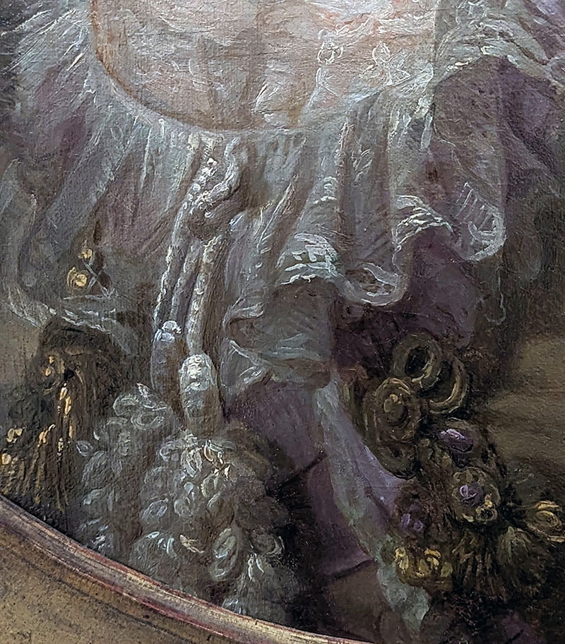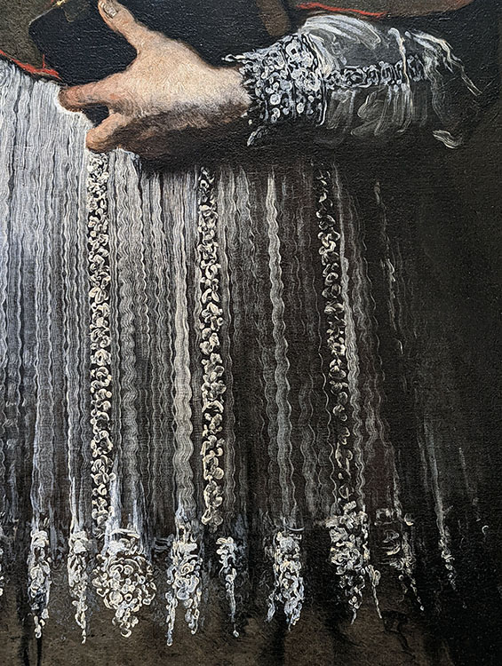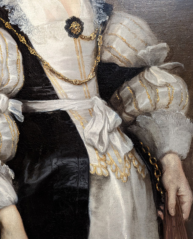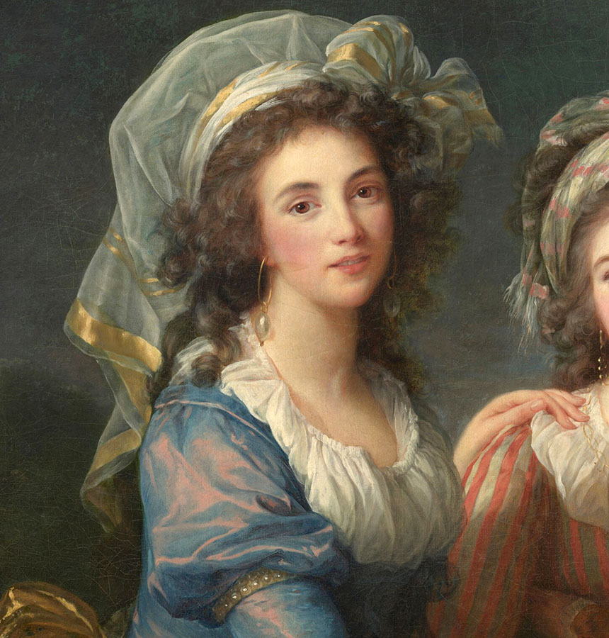
What is Sfumato?
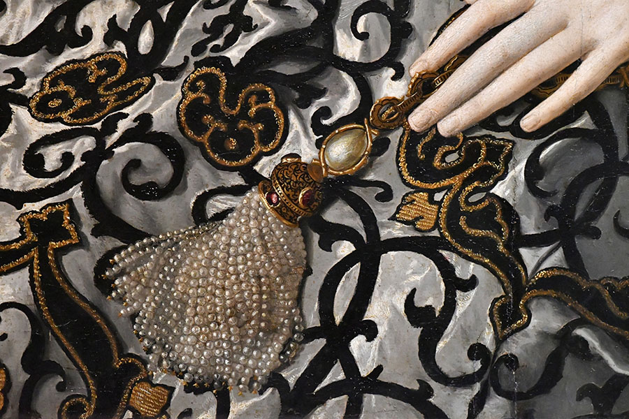
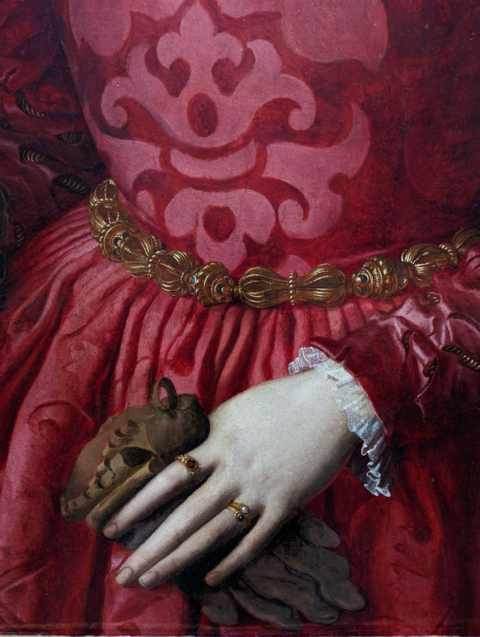
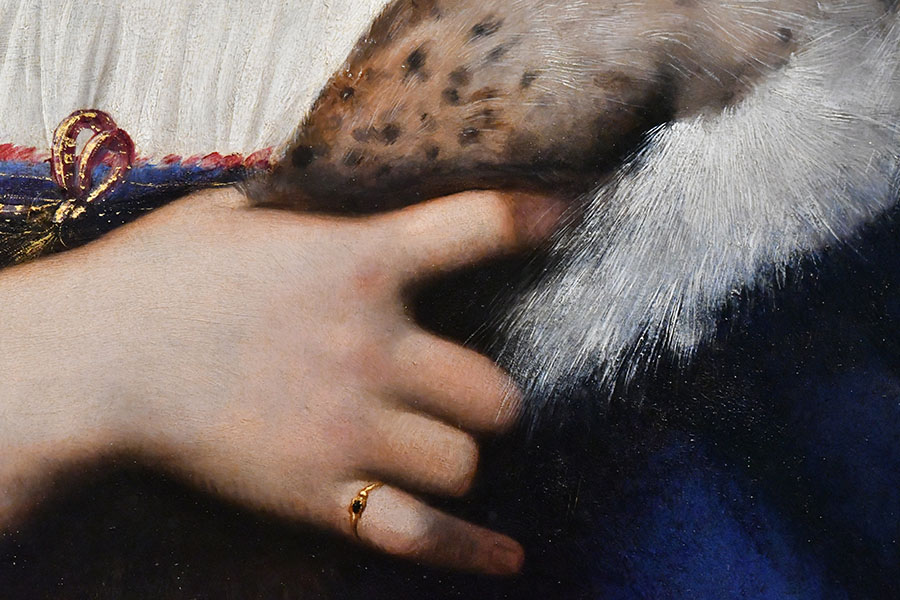
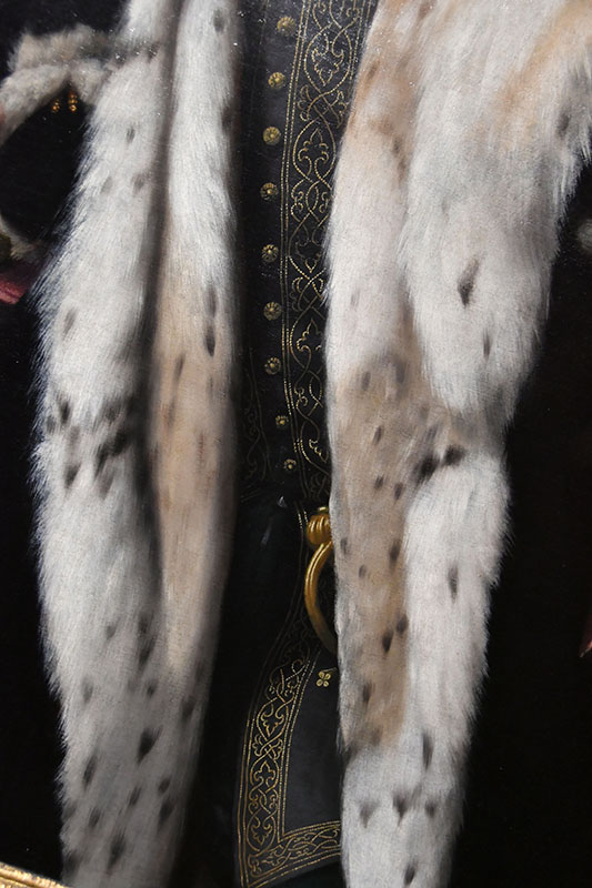
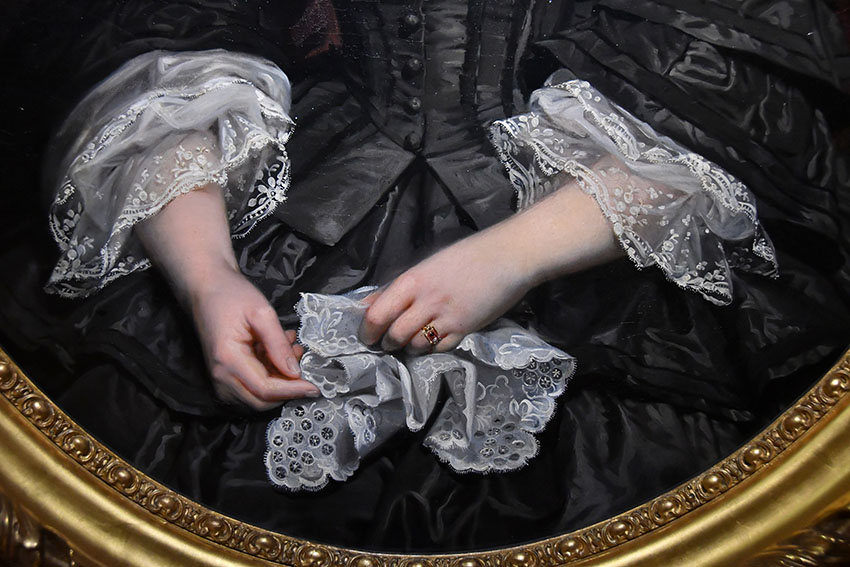
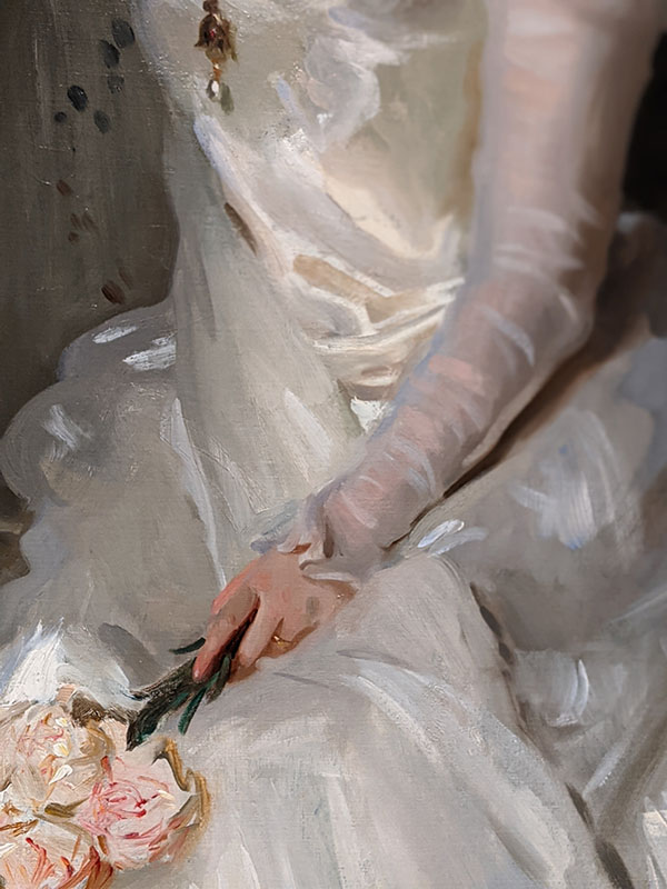
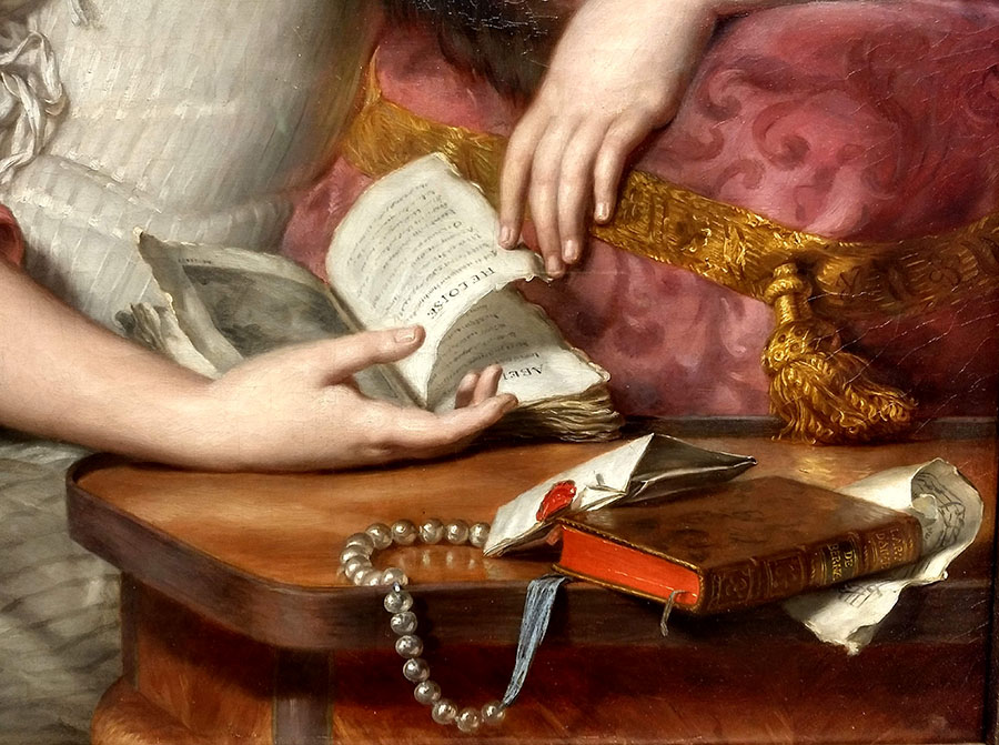
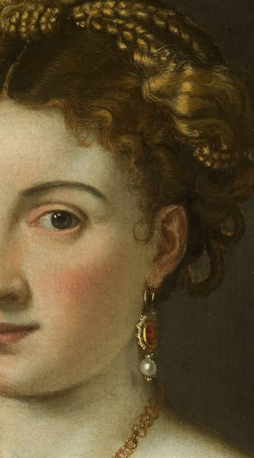
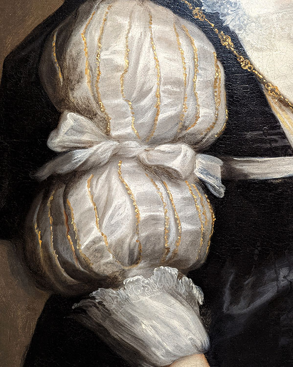
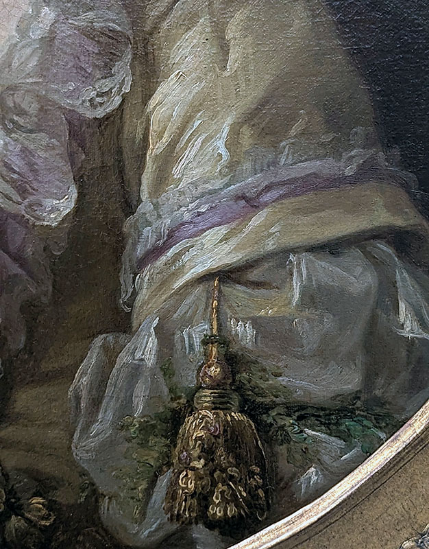
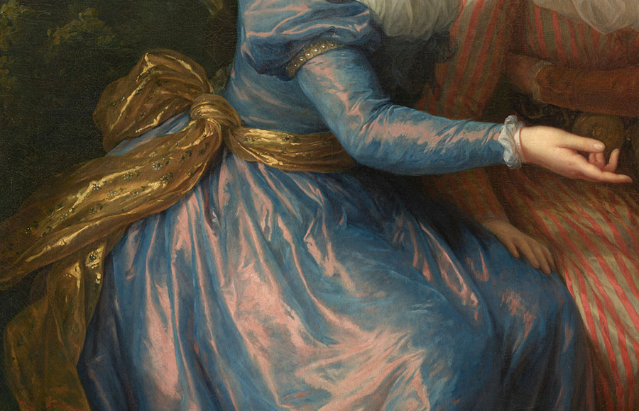
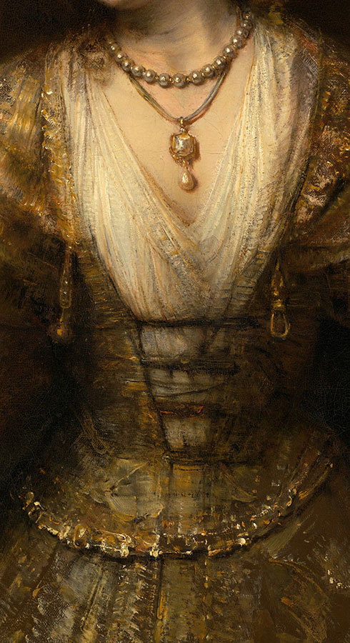
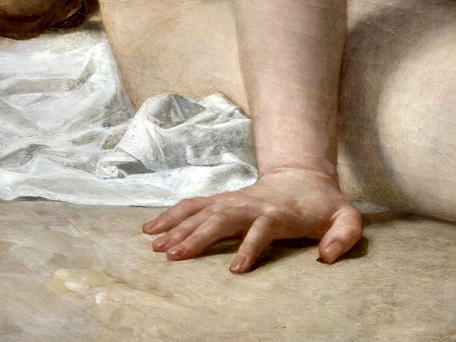
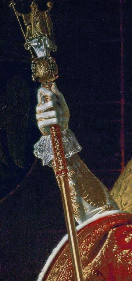
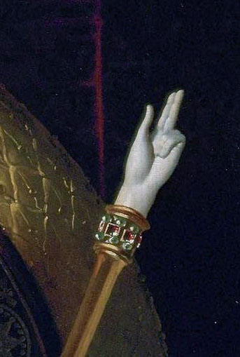
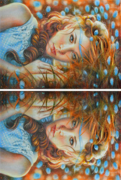
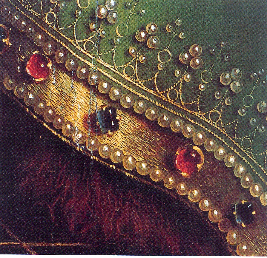
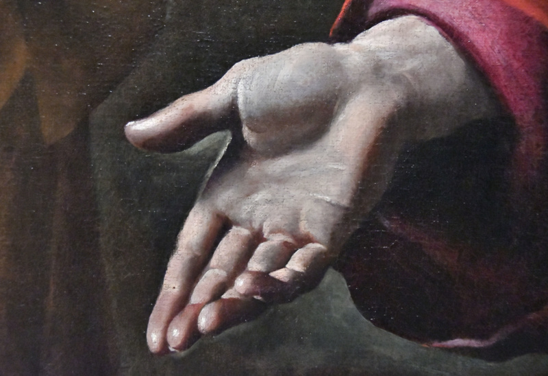
Sfumato is an oil painting technique that involves softening the transitions between colors, tones and outlines to create a subtle, soft or blurred effect, often described as “smoky” or “hazy”. The purpose is to eliminate the contour line describing the form and set it in natural atmosphere. Sfumato translates ‘shaded’ or ‘vanished’. Derived from the Italian word “sfumare,” meaning “to tone down” or “to evaporate like smoke,” it produces imperceptible gradations without harsh lines or tones, mimicking the way the human eye perceives out-of-focus areas or atmospheric haze. This method is achieved by applying multiple thin layers of glaze or a mix of light color with white, and blending with fingers, brushes, or rags, resulting in a dreamy, realistic quality, especially in rendering facial features, skin tones, and dreamy landscape backgrounds.
History of Sfumato
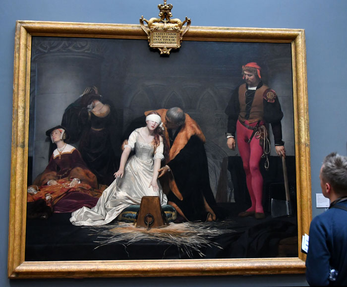
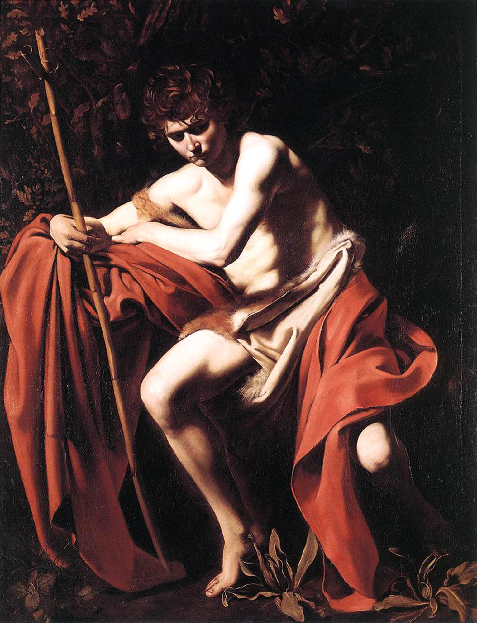
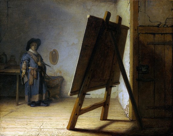
Sfumato emerged as one of realistic oil painting techniques during the Italian Renaissance in the 15th and 16th centuries, marking a shift from the earlier use of linework in art to more naturalistic, blended edges. The first, definite use of sfumato technique is attributed to Leonardo da Vinci who perfected and popularized the technique, drawing from his studies in optics, human vision, and the camera obscura. Da Vinci described it as blending colors “in the manner of smoke,” and it became a hallmark of High Renaissance art for creating illusionistic effects and atmospheric depth in landscapes. The technique influenced later periods, including Baroque art, where it enhanced realism.
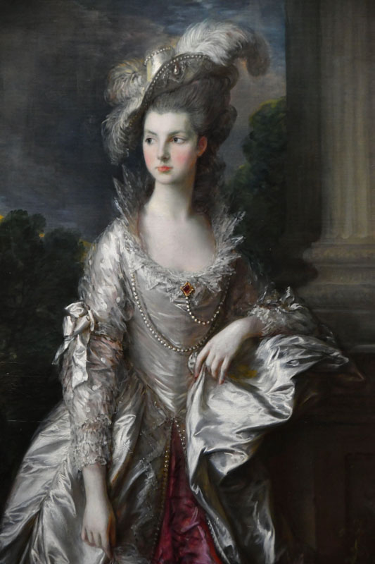
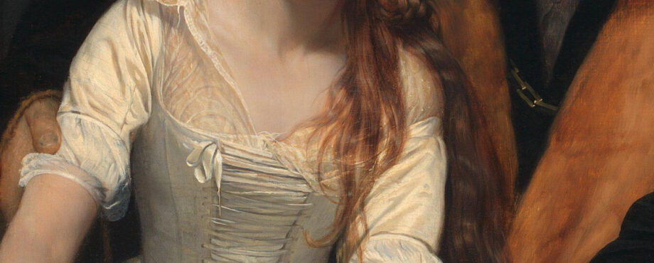
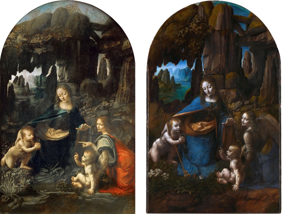
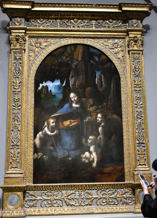
Leonardo da Vinci used sfumato extensively in paintings like the Mona Lisa (1503), where the soft blending around the face and landscape creates an enigmatic atmosphere, and Virgin of the Rocks (1483–1486), blending figures seamlessly with their surroundings.
A Venetian painter, Giorgione incorporated sfumato in brooding, atmospheric scenes, such as The Tempest (c. 1508), where figures and landscapes merge with hazy transitions
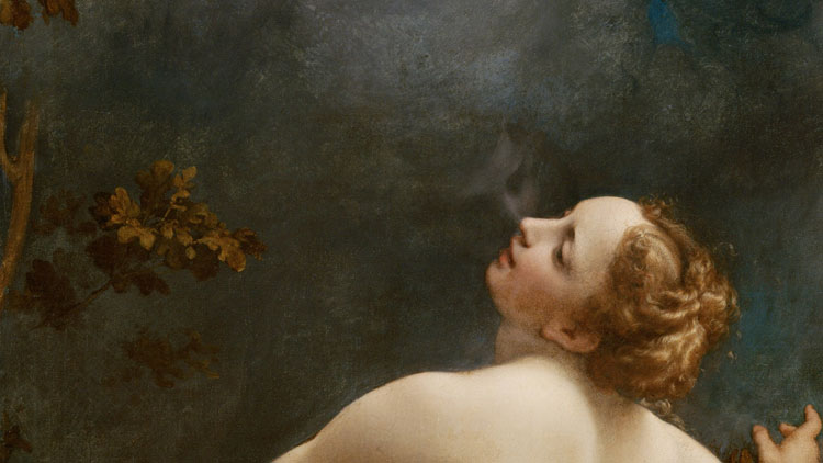
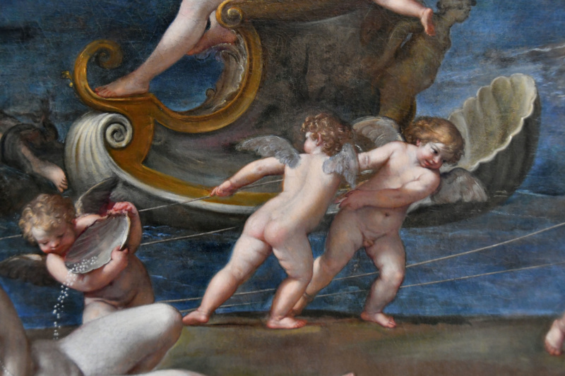
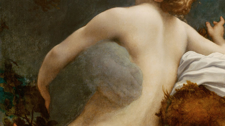
Correggio is famous for his dramatic use of sfumato in illusionistic frescoes and altarpieces, like The Assumption of the Virgin (1526–1530), where soft shading creates a sense of movement and depth. Jupiter and Io, oil on canvas by Correggio, c. 1530; in the Kunsthistorisches Museum, Vienna.

Art books from the artist: