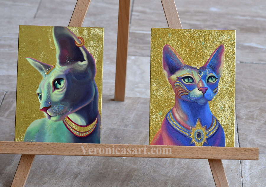
#1 Think of your idea & design
Idea, color, and design are three main variables of every painting I create. I sketch a lot and play with images in Photoshop to come up with my imagery. Nowadays I find that I’m more efficient when I use Photoshop to cut, paste and combine images to create a visual story that has visual balance, color and clarity.
As for images, I mostly use my references. As I travel, I collect my visual inspiration and organize them on folders on my computer. However sometimes I find a specific model/ picture on a copyright free sites- Pixabay, Unsplash. Freepick has beautiful images too. These are great free resources for artists! For example, I don’t do underwater photography and I can find the right reference there. So if you need pictures for reference or drawing, you may find lots of inspiration there.
#2 Study the anatomy daily
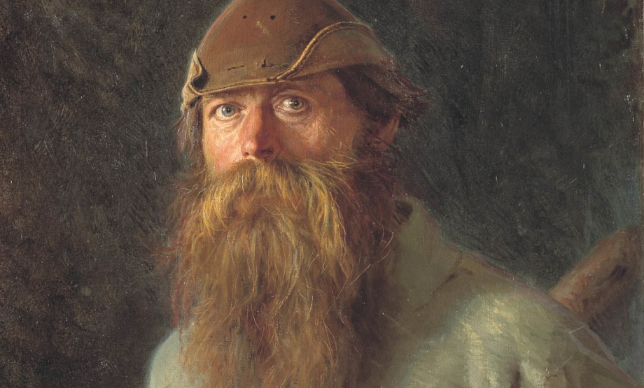
When I began my artistic journey two decades ago I thought I would never paint people. I sucked at it!!! I used to draw stick figures. Over the years I took more figure drawing classes than many of my peers in college. When I was in class, I saw how talented some students were and the only way for me to catch up was to double down on drawing the figure from life. I miss my studio time in New York. It was liberating and fun. A lot of learning happened there. I must say no art class can replace practice. Being alone in your studio painting for weeks, months, years is necessary to develop a unique voice.
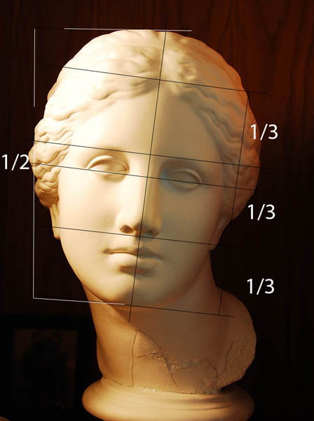
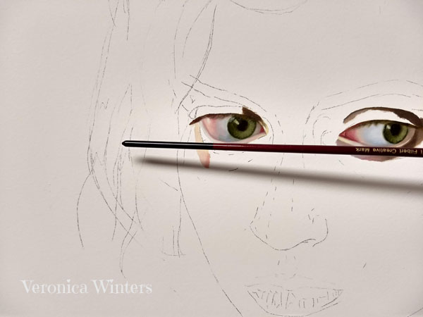
When you draw people, line up all the facial features, preserving proportions. This image shows you how to divide the face. It also shows how the eyes, nose, lips and eyebrows move because of the head’s tilt and rotation. You must keep checking the line up as you paint at all times. As the face turns, we see foreshortening of some features but the line up remains the same. One eye can’t end up on the forehead (move higher or lower) because of the rotation. I use my brush’s handle to check the line up when I paint.
#3 Understand how color mixing works
Color is like a thread that holds all elements together to reveal beauty in art. I used to be a very chaotic painter with somewhat intuitive understanding of color and its importance in art…
I think of my color scheme before I begin painting. It helps me create visual unity in the end. However, I also allow myself to deviate from the plan if I see it’s working in a new way. Sometimes I repaint the entire painting like that, and other times I just follow the reference photo 100 percent. My understanding of color and color harmony keeps evolving year after year. I discover fresh color combinations by extrapolating and simplifying the information I see in front of me.
Study art history to create beautiful contemporary art
I often study paintings created before and during the 19th-century to understand the use of color harmony by great artists. There are different approaches to color mixing in oil painting.
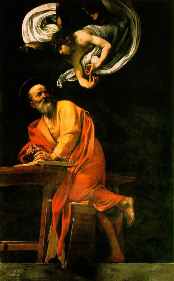
The old masters painted with black and browns for the most part, placing one strong color front and center to make a statement. Notice how red fabric revolves around the figure moving us around the painting in a spiral. In this painting by Caravaggio you can see that he creates strong contrast. White and red appear much stronger due to value and color contrast made with brown-black.
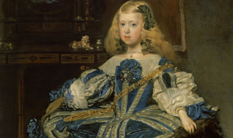
I don’t know how Velasquez or Caravaggio would have worked without the use of black. Their high-contrast paintings taught me to focus on placement of shadows, not the details. I also learned to have have 1-2 “leading” colors muting the rest of them with the use of greys and browns.
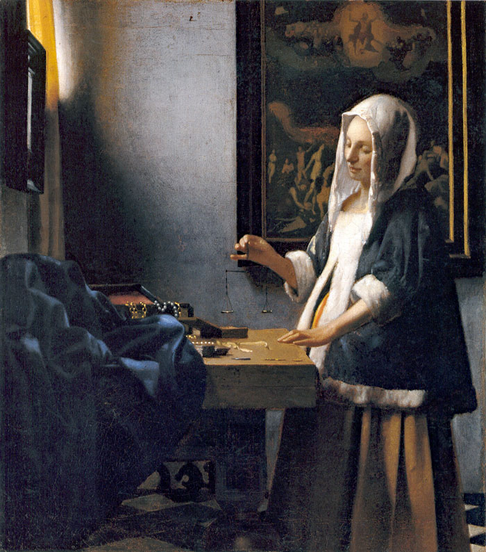
Both Vermeer and Ingres had subtle, controlled palettes that revealed beauty through color unity and softness. Vermeer painted cool light coming from a single window illuminating the figure. His figures are not illuminated by the candle light, rather they bath in natural light.
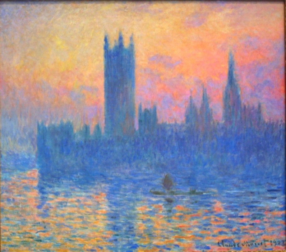
The Impressionists painted without the use of black. Their paintings taught me to see color in shadows. Blues and purples in the afternoon shadows… Greens in the face…
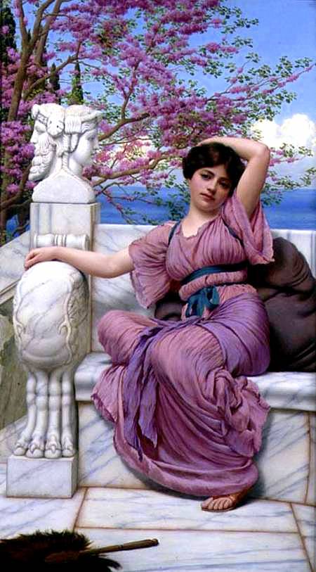
Painted by John William Godward, this painting is a great example of artistic excellence that shows us how the artist controls his color palette skillfully. Beautiful purples of the dress harmonize with the model’s scarf and flowers, blooming behind her. Her blue sash harmonizes perfectly with the color of the sea and the sky. White marble creates contrast and separates the figure from the background. Placed at a diagonal, a dark fan harmonizes with the woman’s large pillow set behind her.
The diagonals of her legs, torso and arms create a subtle movement inside the picture that lets us travel across the painting. Every element is in such balance and relationship to one another that we perceive it as an absolutely beautiful painting, admiring the realistic details we can all see. Such beautiful realistic paintings set a very high bar for any contemporary realist artist to live up to.
Color mixing in contemporary art painting
Color mixing is the hardest part to master in oil painting, in my opinion. Even when your drawing is pretty good, oil painting can still be a huge challenge because of a different approach to color mixing. That’s why even when you get the exact list of colors used in artist’s artwork, you can’t really re-create the same beautiful result you see on YouTube on in art museum.
Artists have various approaches to color mixing. Some paint in full color from the start, others work on detailed underpainting before moving to color. Some pre-mix colors, others prefer using tube colors. There is no wrong or right approach. The oil painting technique comes with experience and varies in accordance with artist’s personality.
Over the years I learned different ways of painting and I use them in a combination. I suggest learning from several artists that you admire by taking their workshops, classes or online courses. And then practice, practice, practice!
Oil painting in full color is much harder than drawing. Why? Because artists have to match color, color temperature and value in one stroke as opposed to achieving the same result via layering in colored pencils or watercolor. Therefore, we must have a system in place to make these decisions consistently as we paint.
Drawing in colored pencil leads to color vibrancy naturally because colored pencils don’t mix to gray. However, oil painting is a lot more complicated because the artist needs to give “light” to the paint. A few pure colors become beautiful by juxtaposing them with grays and neutrals, not by painting everything screaming bright with out-of-the-tube colors. This took me years to grasp!
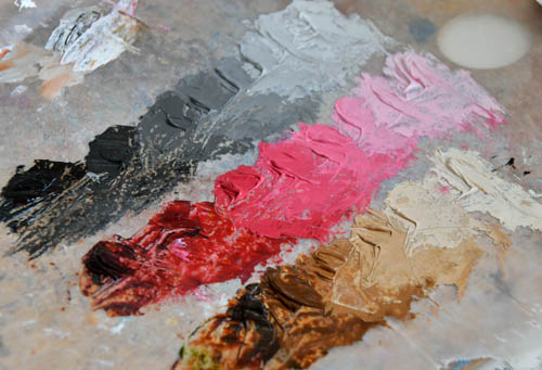
1. To organize myself, I often paint in full color over the underpainting. Underpainting is like a good set up to establish line drawing and contrast.
2. I premix batches of color for large areas to have consistency and color unity throughout my painting.
3. I premix color strings for skin tones as well. Colors vary depending on my project.
4. I use few colors to achieve colorful result. Less is more in oil painting. So, I know what color mixes I get by mixing them with each other daily. I used to keep color strings to remember my results. Now it’s intuitive based on my experience.
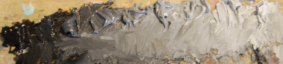
5. Use your palette knife, not the brush to mix the color strings. It’s the only way to mix large, clean batches of color.
6. To keep color mixtures fresh for more than one day, I wrap them up in wax paper. Airtight oil paint stays fresh for 3+ days on average.
Glazing is one of the old masters techniques when artists glaze transparent colors over the refined underpainting to build up hues in progression. One area can be glazed several times to increase depth and to enrich colors. Artists wipe off the extra paint to increase transparency and even application. Glazing darkens the surface, so artists must think of the end result in advance of using this technique. I show this oil painting technique in detail in my online class. Click on the link to see a preview.
7. I step back from my painting often to see major shapes and contrast as opposed to focusing on details.
8. I use a wide, soft brush to blend the strokes in the end of every painting session.
#4 Use good brushes
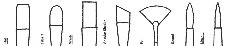
If you’ve tried painting, you know how hard it is to find a good set of brushes. Many of them are flimsy or too soft to spread the paint around. Or they shed hairs like a cat.? Others don’t keep the fine point necessary to paint the details. I went through so many brushes trying to find something that really works for oil painting. You have no idea!
1. Use stiffer, synthetic brushes for your underpainting because the first layer doesn’t go smoothly and can be spread out with a bit of a solvent (Gamsol), not the medium. Both the solvent and textured canvas surface wear out fine brushes super quickly!
2. When you layer oil paint over the underpainting, it layers smoother but still needs just a bit of medium to have the flow. This is the stage when having good brushes is critical to painting subtle transitions and details. Here are a few cheap buys that work. I find that Simply Simmons brushes are cheap but durable and have a good spring to them for painting. For detailed work I really like Ebony Splendor by Creative Mark. This brand has a variety of small brushes. Rosemary brushes are fabulous. Also I find that painting on large canvas is much easier with W&N Galeria brushes.
3. I find that the length of the brush handle makes no difference in painting. In fact, if you do detailed work, you want to minimize your hand’s movement to remain precise. I don’t see how long handles help artists with that.
4. I keep a wide, super soft brush (3/4 or 1″) for blending large areas to soften everything before I quit painting for a day. It doesn’t matter what brand it is as long as it’s soft like watercolor brushes are.
5. It’s important to take care of your brushes to make them last. I’ve noticed that solvents tear them down quite quickly. That’s why I take the paint off with a paper towel and then use a soap bar to clean them after every painting session.
#5 Be kind to yourself
If you’re like me, I’m very hard on myself doing, well, anything. I try to do my best and if it doesn’t come out any good, I often feel devastated. By being aware of this problem, I try to refocus and see what I actually did right. I also enjoy the very act of painting. Every painting makes me one step closer to my goal. I’m lucky I can paint and it makes me feel grateful that I have this opportunity. What about you?
Basic Art supplies:
- Transfer paper:
Loew-Cornell C101-1 4-Piece Grey Transfer Paper https://amzn.to/2Zx3Wyv
White transfer paper: https://amzn.to/3gAaPFo or https://amzn.to/2XMdBPg
- Panels: Ampersand gessobord: https://amzn.to/2WWioP1
Da Vinci pro Panels: https://amzn.to/36qrgQf
Jack Richeson panels: https://amzn.to/3gfk6CI
- Mono eraser: https://amzn.to/3e6SHRw
- Kneaded eraser: https://amzn.to/3gaZWtH
- Don’t buy the cheapest canvases! Their gesso is (white ground) is very low quality that affects everything from paint application to oil paint adherences to archival properties. Affordable, good canvas: https://www.anrdoezrs.net/click-9265447-13717235?url=https%3A%2F%2Fwww.dickblick.com%2Fproducts%2Ffredrix-gallerywrap-cotton-canvas%2F%3FclickTracking%3Dtrue%26wmcp%3Dpla%26wmcid%3Ditems%26wmckw%3D07106-1002&cjsku=07106-1002
- Oil paint: Gamblin intro set: https://amzn.to/2zt5gbd
Linseed oil: https://amzn.to/3ebrixQ or https://amzn.to/2LWkdoP
Varnish for oil and acrylic paintings only: https://amzn.to/3bUJ2fh
If you find this article helpful, forward it to a friend. thank you! 🙂