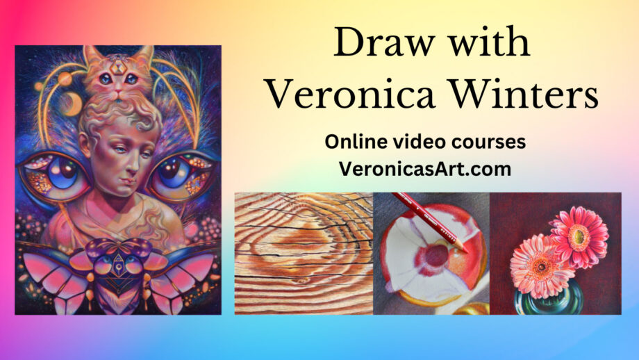
In this comprehensive colored pencil drawing guide you’ll learn about photography, shading, tools, art supplies, colored pencil techniques, realistic colored pencil portrait drawing, mixed media drawing and more. While I closed the comments section under each article because of spam and bots, you can email me your suggestions at nika@veronicasart.com or message on Instagram for videos and topics you want me to cover in the future.
Explore related articles in colored pencil drawing tips:
4 best colored pencil shading techniques
How to draw on wood in colored pencil
How to check the accuracy of your drawing
How to draw glass in colored pencil
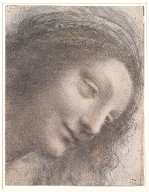
Drawing daily is essential to advancing an artist's skills. I used to struggle with the depiction of human form, drawing stick figures. It was difficult to get classical art education over 25 years ago, but it is available today in a number of atelier schools popping up throughout the country. They didn't exist back in 2001. It took me many years to "learn" how to draw, studying here and there without the backbone of a complete system that is now offered by the Grand Central Academy of Art in New York. Over the years I learned some important drawing principles that I'd like to share with you here.
HOW TO USE COLORED PENCILS FOR BEGINNERS: art supplies & techniques
If you’re new to colored pencil drawing, please learn about the basic colored pencil techniques and art supplies I mention in this video. Colored pencil portrait drawing is the second step. Master the first step by drawing simple objects from life.
Master color in 20 minutes: https://youtu.be/LX8dAE36nNE
Art Supplies:
Colored Pencils:
- Prismacolor 36: https://amzn.to/3PdrdvY
- Pablo 30: https://amzn.to/3c018Cg
- Polychromos: https://amzn.to/3yoTxF1
- Luminance: https://amzn.to/3P7lkBf
- Caran D’Ache full blender: https://amzn.to/3RkCBrO
Drawing paper:
- Bristol Vellum white paper: https://amzn.to/3nJxeVN
- Canson colorline toned paper: https://amzn.to/3yLd9EO You can buy a wide selection of paper at Dick Blick Art Supplies
- Colourfix primer: https://amzn.to/3WLDdbx
The best colored pencil drawing paper: In this video I show and explain what drawing papers I use for my colored pencil art.
Spray fixative for drawings:
- Sennelier: final fixative https://amzn.to/3yqLOq8
- Grumbacher: working fixative https://amzn.to/3bL7k0X
- DON’T buy the krylon spray!
Other art supplies:
- Transfer paper: white https://amzn.to/3Ittcu7
- black https://amzn.to/3OSTnN5
- Gamsol: https://amzn.to/3yP8nGr
Tombow mono eraser: https://amzn.to/3yOVmMT
Art books:
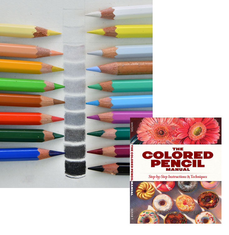
- My art instruction book “The Colored Pencil Manual” covers the basics of colored pencil drawing. You can buy it on Amazon at a great price here: https://amzn.to/3fRpoEb
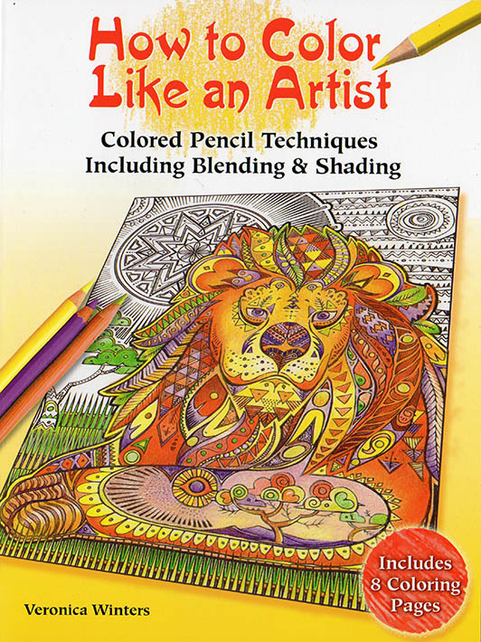
- How to Color like an Artist, art coloring book gives artist’s tips and techniques to become great at shading, color choices, texture drawing and much more! https://amzn.to/2LtH0Iq
- Art Lessons in realist painting, drawing & beyond, art book: https://amzn.to/3fRcSEU
- If you heart desires to see lots of art, visit my site: https://VeronicasArt.com
Quick Tips:
Realistic colored pencil portrait guide
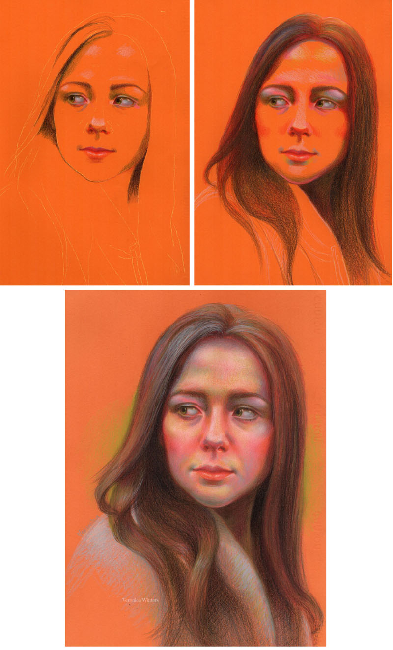
Colored pencil portrait drawing is infinite fun. There are numerous ways to be creative, capturing unique personality of people. To create beautiful portrait drawings artists study more than the human anatomy. Artists aim at painting the human soul. In this article I’d like to share my basic colored pencil techniques as well as some colored pencil portrait drawing ideas and inspiration you can use in your art.
Limit your color palette
- To see the values (or tones) on your model convert your pictures to grey scale using any software you have. I use Photoshop Elements. By removing color, you focus on values only.
- Take a light grey drawing paper for your portrait drawing.
- Use two colored pencils -black and white. Everything that’s dark is shaded with black colored pencil and the highlights are marked with white. By controlling your pencil pressure, you adjust the brightness or darkness of your values.
I learned this colored pencil technique up by looking at the old master figure drawings.
Follow your favorite artists on Instagram and study their drawing for composition, design, color. etc.
If you just start out pick in portrait drawing, pick the reference photo with a face looking straight at you. Eliminate the head's rotation for now that complicates things.
Reserve your highlights in a colored pencil portrait drawing
When you draw on white paper, you must think of your highlights in advance. Reserve wider space for the highlights that you might need. Later you’ll shade around those highlights with very light colored pencils to have soft transitions in the light. The highest lights MUST stay free of any shading on white paper to have impact.
Control the light, color & values in a colored pencil portrait drawing
Light
All three parameters – light, color, and values are important to understand to create realistic colored pencil drawings. Study the light direction. When the light is directional, one side of the face is much brighter than another. The shadows are strong.
When the light is soft, diffused, and not directional, it gets more challenging to see the changes in skin tones and shapes of the shadows. Although such light gives gorgeous skin tones, it’s much easier to start drawing portraits in colored pencil when you can see definite lights and shadows! In my colored pencil drawing video course, you get ideas and tips on how to pick the pictures, pose models, and photograph them in various lighting conditions. I also complete demonstrations, picking pictures that have good color, clarity, subject, and composition.
Color
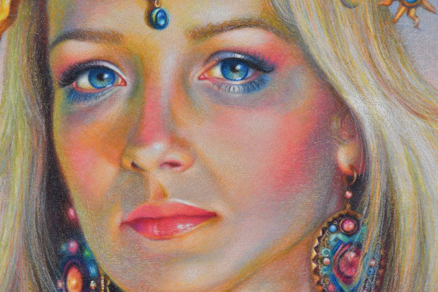
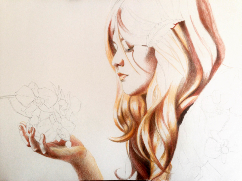
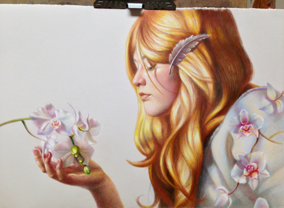
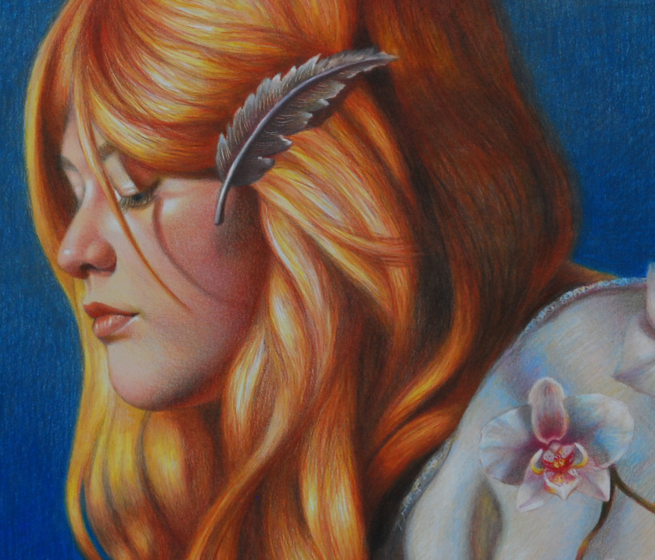
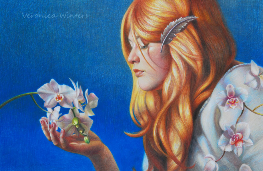
To understand how the color works, limit your colored pencil choices to 15-20 at the most. Study how one color (red) can have lots of variations in color tone (very light to very dark) and color temperature (warm/cool). Because we shade in layers with various pencil pressure we can use 2-3 reds to describe a variety of tones in different parts of the drawing. For instance, in this portrait I used 2 reds – light cadmium red and pink carmine, and 2 pinks – dark flash, light flash (Polychromos). I placed red in the ear, mouth, cheeks, neck, and even the hair. I adjusted my pencil pressure to get a variety of tones.
Values

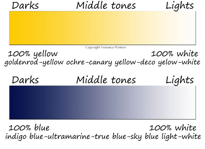
To get a better understanding of values, do this fun exercise every time you start a new project. Step back from your reference photo to see it from the distance. You don’t look at the details anymore. It’s like looking at objects without glasses when it gets a bit blurry. Find the strongest lights, darks and middle tones. These are abstracted shapes on the face, not the features like eyes or lips. Most students shade portraits with many colors, arriving at the image with no contrast. Begin by defining at least 3 values: highlights, deepest darks, and midtones. Leave the highlights uncolored if you draw on white paper.
If colored pencil portrait drawing is your passion, consider following these tips to improve your colored pencil portrait drawing:
- Light quality on your subject
- Anatomical accuracy
- Paper’s smoothness
- Colored Pencils’ softness
- Colored Pencil Shading
Let’s look at every principle in greater detail.
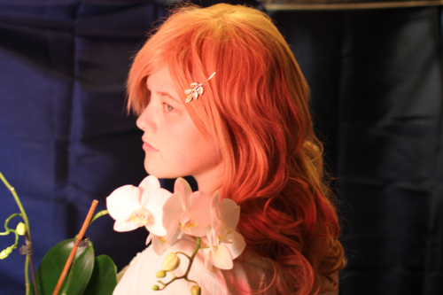
1. Tips to capture the light on a model in colored pencil portrait drawing
The light quality on your subject, people in this case- is crucial to your success in colored pencil portrait drawing. Since most colored pencil drawing is done from photographs, you must become a good photographer to catch the light on a person with your camera. If you don’t take pictures and use other references instead, you still need to understand the light to create realistic colored pencil drawings.
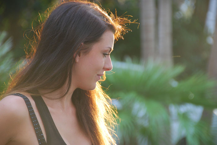
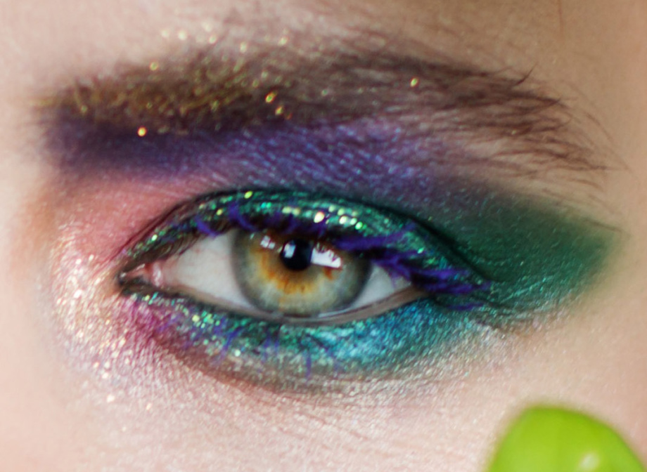
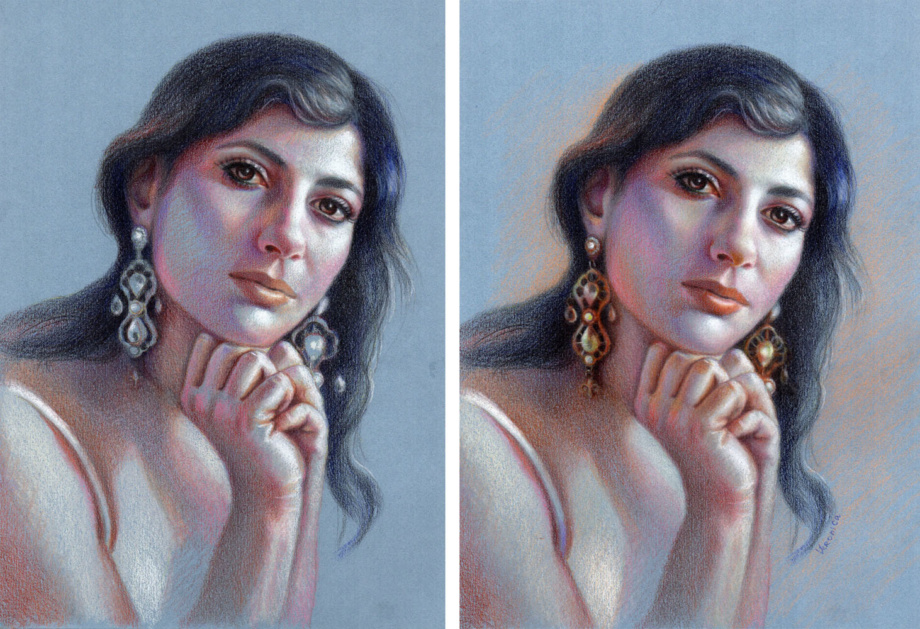
In this picture I catch the evening light with a beautiful contour on her face and hair. I love this glowing evening light. It’s pinks, golden yellows and purples make the skin look fresh. The shadows are much softer and don’t cut into the face as much as in the afternoon light.
- Study other artists and photographs to see how the light turns the form.
- Don’t use flash to observe natural shadows.
Let’s look at some art examples.
Shadows:
Take pictures of people and faces at different times of the day to understand how the light changes shadows on the face. Remember, that the portrait must look exciting to you. Spend some time arranging and posing people to capture light and shadows. When you use strong contrast between light and shadow, your portrait drawing will look more realistic and three-dimensional.
High contrast:
To create high contrast in your colored pencil portrait drawing you need to use the Rembrandt lighting. It’s easy to set up in a small studio. All you need is a single light source, like a table lamp or a floor lamp, to create an abstract pattern of strong light and shade on a person. Set the person up against a plain background, put the light on one side of the face and shoot.
Vary your point of view, taking pictures:
Besides having good lighting conditions, consider your model’s personality. There is a reason why you want to draw people. Find a special angle that sharpens the character, makes him or her look attractive. Zoom in to the face and crop it on purpose with your camera. Stand up or look down, don’t just take pictures at an eye level.
2. Tips in human anatomy for colored pencil portrait drawing
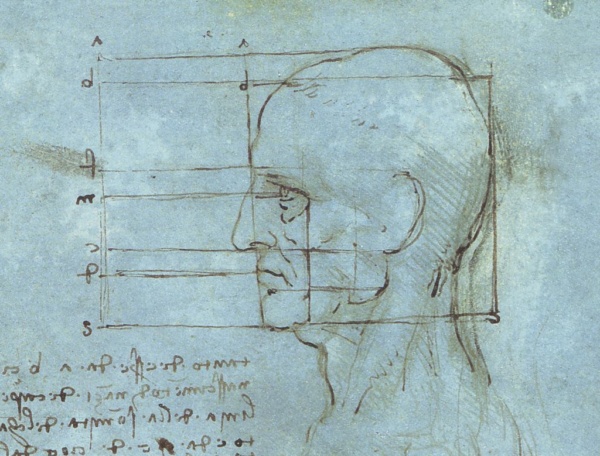
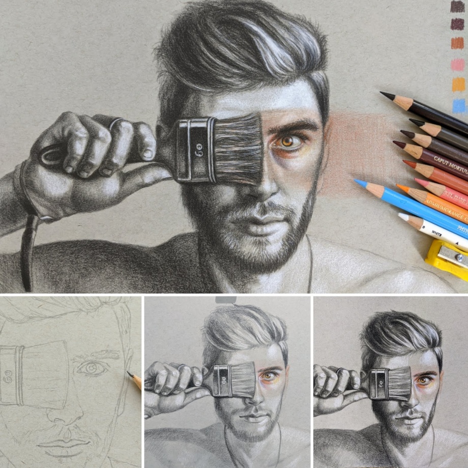
If your aim is to draw realistic faces, you need to catch the unique features of a person. Begin with a basic anatomy drawing of the face. These lines show you basic face proportions. Always check the face proportions and the tilt of the head that determines the line up of all features. I make light lines to place the eyes, nose, and mouth on those lines.
Colored pencil portrait drawing of eyes
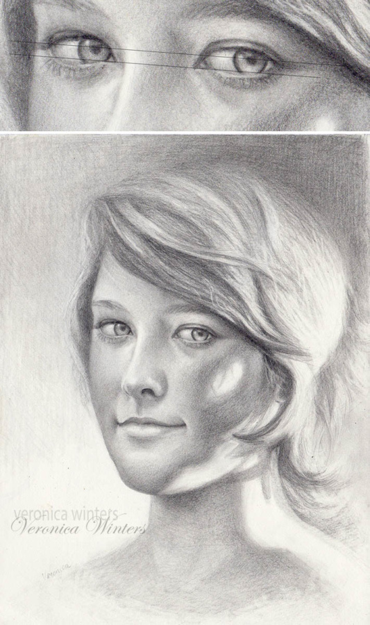
I always draw the eyes first. I make a straight line to line up the eyes on it, and then strive to make the eyes of the same size and shape, so they appear identical. For that I draw equal circles first and then partially cover the circles by the eyelids. The upper eyelid has a different shape from the lower eyelid. Both eyelids don’t make a corner, like you see in the Egyptian eyes. It’s a very common mistake to draw the eyelids of the same size and shape converging in a corner. Always keep a one-eye distance between the eyes.
I draw the face on a sketch paper and then transfer the outlines either using the window light, or transfer paper. When you shade in colored pencil, the surface must be clean of any residue or excessive graphite lines. Shading over the graphite makes the color look dirty and flattens out the space. So either use a kneaded eraser to clean up the lines or the transfer paper. I tap the lines with a kneaded eraser to get rid of the extra graphite that shows through light colored pencils during shading.
Here you see the steps drawing the eyes. Using the darkest brown, I draw the eyelids and leave space for the highlight in the eye. The color of the iris is lighter at the bottom and much darker at the top because the upper eyelid always casts a shadow on it.
Stand in front of a mirror and look at the colors around your eyes. Do you see light purples, pinks or greens? Look at the area around your nose. Is it warm or cool? Most of the time the nostrils are warm. What’s the color of a shadow on the neck?
Colored pencil portrait drawing of mouth: colored pencil portrait drawing tutorial
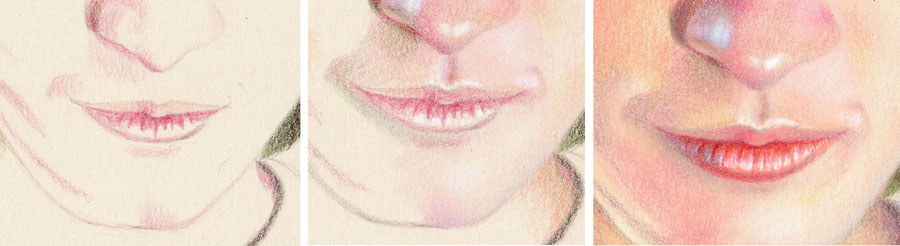
Step 1: I begin by using Light Peach to shade the upper lip. Then I map out the shadows on the lips with a light touch of Pablo Carmine.
Step 2: I mark the highlights on both lips with White. If I drew on white paper, I would leave these spaces free of any shading. I add very light shading to the upper lip with Pablo Carmine. Next, I shade skin tones around the mouth with Carmine, Light Peach, and Olive Green (or Prussian Green).
Step 3: I add more color to give the mouth dimension using the same hues. The upper and lower lips never look the same. They differ in tone, shape, and color. Usually the upper lip is darker than the lower one, but here it’s in reverse! The texture of the lower lip is unique to this model. I add Burnt Ochre to the lower lip. With the Periwinkle, I add a touch of grey-blue on the bottom left side to create a shadow. I also shade the skin tones carefully around the mouth with soft strokes and overlapping.
Although I’m liberal with my colors, you can see that my drawing palette is limited to a few colored pencils. The trick is to use the same colors in different combinations throughout the colored pencil drawing for unity. Here I don’t blend the colors with a blender because I draw on smooth paper.
One mistake that most beginner make is shading the lips roughly. They make definite corners and sharp contours in an attempt to define the mouth. Keeping everything soft and remembering that the lower lip doesn't end in a sharp corner makes all the difference. I also pay attention to the size of the mouth in relation to the nose and the eyes. For that you can use a grid method as a beginner. I keep the grid in my mind, constantly measuring and comparing distances to make features of the right size and place.
I spray the colored pencil portrait drawing with a final fixative outside in low humidity. I usually do 3 layers of spray, allowing each layer to dry completely for half an hour.
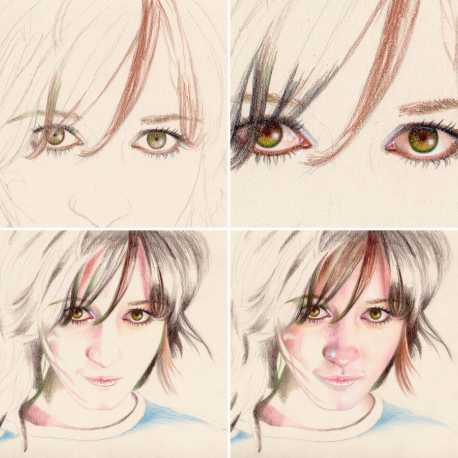
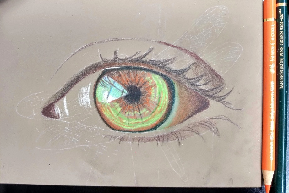
Colored pencil portrait drawing tutorial: how to draw an eye in colored pencils on colored paper
It’s difficult to draw the entire portrait at once. So to practice, you can start drawing facial features separately to understand how light turns the form. Draw the eye, nose, lips, ear separately many times. Below you’ll find an example of me drawing the eye in colored pencil. I often use colored paper because it speeds up the process and lets me create super vibrant colored pencil drawings. A lot of greys look like blues on bright drawing paper.
Here I used Canson Colorline Fuschia drawing paper, Prismacolor white+ Cezanne colored pencils. I don’t think you should buy a specific brand of colored pencils, rather use the color chart to see and match your colored pencils to mine. White colored pencil must be very soft to give strong highlights ( I often use Prismacolor & Luminance whites). Beware that cheap colored pencils have very weak whites… These are basic colors and a few more hues may have been used in this colored pencil portrait drawing tutorial.
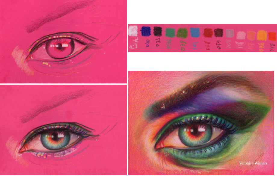
Step 1: Transfer the image using your favorite method. I never sketch my outlines on colored or drawing paper because it needs to be very clean to retain color. I use a semi-transparent sketch paper to do my sketching and then I transfer the perfected outline onto my drawing paper. I decided to rotate my reference photo to draw it with a different direction. I map out the shape with black and place the highlights.
Step 2: I draw the pupil & iris. The pupil must be in the center of the eye and not super black. So I add some brown to it. I use radial strokes to shade the area inside the iris. The top part of the eye always has a shadow cast from the upper eye lid. If you don’t place this shadow, the eye is going to stare at you.
Step 3: I look at my reference and push contrast. I take a mix of dark green and brown to place the darkest values in the eye creases first. The eyebrow consists of flat shading in brown first. I add greens and grays over this flat shading with short, directional strokes, following the eyebrow’s rotation.
I hope that this short portrait drawing tutorial of an eye encourages you to draw on colored paper!
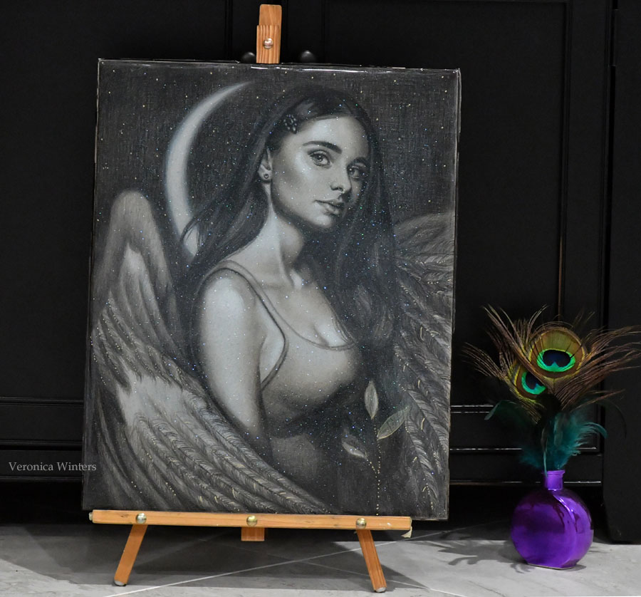
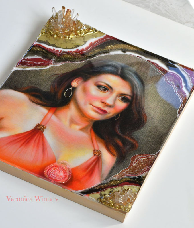
Colored pencil portrait drawing tutorial for advanced artists: how to draw an eye in colored pencils on pastelbord with resin
This colored pencil drawing tutorial is for advanced artists who would like to experiment with colored pencils or need to try some new colored pencil drawing ideas.
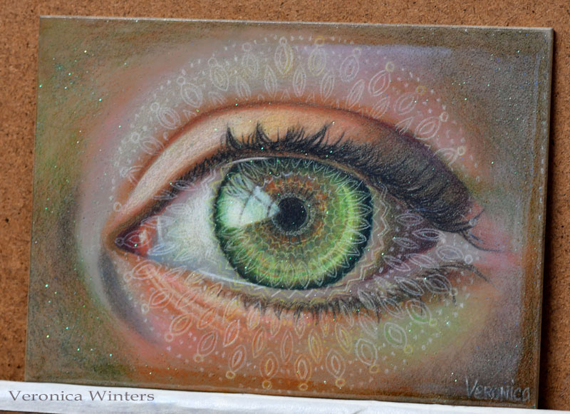
Art supplies used in this colored pencil drawing tutorial:
Ampersand pastelbord, Polychromos, Prismacolors, Golden Mediums GAC-100 acrylic polymer, Brilliant Resin by Little Windows, some super fine glitter bought at Wal-Mart.
Step 1
The greatest challenge working on Ampersand pastelbord is the limited layering in colored pencil. Hard pencils work much better on this surface because the board feels like a fine sanded paper. It “eats up” soft colored pencils. The greatest advantage of working on pastelbord is its archival surface. It’s thick, durable and doesn’t require mounting before framing like any drawing paper does. I also love working on colored surfaces because colors “pop” when drawing on them. Ampersand pastelbord also comes in several neutral colors.
Step 2
Once I have the outline in place, I begin colored pencil shading of the darkest darks and highlights. My colored pencils are super sharp to keep the finest point possible. I fill in the eye watching my values (how light/dark each area is).
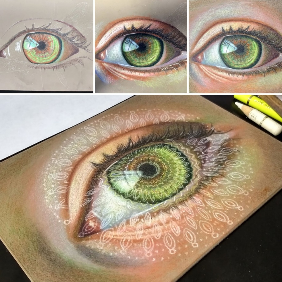
Step 3
I wanted to create a magical feeling in my colored pencil drawing of the eye. To achieve this, I made an overlay of a simple white mandala over the green eye. I used white transfer paper to place the design where I wanted it to be. (It would be very hard to draw such complex geometric design freehand). I reinforced faint outlines with Polychromos Cream colored pencil. The color is off-white and doesn’t “compete” with the highlight in the eye. Also, I decided to add some extra sparkle with fine glitter (next step).
Step 4
Before proceeding to the next step I use acrylic fixative to seal the surface of my drawing, even though Polychromos are water-resistant colored pencils. Resin can move the pigments and change the color of the surface. Sealing it is necessary to create a barrier. I use the Golden Mediums GAC-100 acrylic polymer. I’m sure there are plenty of other sealants out there. It’s just the one I have in my studio. It dries out very fast, so I brush it with a wide soft brush quickly, not to make streaks. It dries glossy and clear, but may look uneven if you’re not quick doing it.
Step 5: Adding resin over colored pencil drawing
Adding resin
It takes time and practice to learn how resin works. It’s tricky to work with it, and you should watch a bunch of videos on YouTube before getting into this. Also, the quality of resin plays a big role in the end result. Inexpensive resin products produce lots of bubbles, a smell and give headaches. They may be toxic and sticky. No matter what resin you get, I strongly suggest not to use your “first-time experiment” on your finished drawing. Seal the drawing with multiple layers of final fixative or acrylic sealant. Also prepare a cover to protect the art from dust and hair while it cures for 24 hours. I wait for the resin to cure for 24 hrs before proceeding to resin pouring. I mixed fine glitter into the resin mix and poured it over my sealed drawing. I let it rest for 24 hrs. The result is a glass-like finish with a touch of magical sparkle!
You can find more information on mixed media drawing and resin art here: https://veronicasart.com/resin-art-ideas-for-beginners-10-things-i-learned-pouring-resin-art/
Colored pencil portrait drawing of hair with markers on white paper
If you work in colored pencil, you know how long it takes to complete one drawing. To speed up the process, many artists use watercolor pencils, neocolor crayons, or markers. If you feel open to some experimentation drawing hair or large backgrounds, using permanent markers may be your thing.
Step 1
I sketch out the face using HB pencil on Strathmore drawing medium paper. This paper has a very slight texture that becomes somewhat problematic later. If you want to try out this technique, draw on Stonehenge paper or Bristol papers that are smoother and thicker.
Step 2
My pigment markers include just a few colors. Therefore I didn’t use black or brown on the hair. Instead I used a combination of sap green and red to get the darkest hue possible in the beginning. Usually, wax-based black colored pencil gives a lot of wax bloom and therefore underpainting the darks in markers is a good idea.
I also use yellow to fill in the background.
Step 3
Once pigment markers are dry, I do some colored pencil shading over them. The underpainting gives me new, surprising color combinations. This is the step where I understand that smoother paper would work better with this drawing, simply because layering over the markers in colored pencil still reveals the paper’s texture, which I thought would be eliminated by now.
When I’m done filling in the hair, I blend the colored pencil with the colorless pencil blender, and create the highlights with some flyaways, using the Sakura Pen-touch marker that has a thin, sharp point.
I fill in the face in colored pencil only.
Step 4
In my final step I spray the fixative lightly, let it dry, and adjust minor things, like edges and details. A light coat of spray fixes the paper and allows me to work on areas that become too waxy and don’t accept pigment anymore.
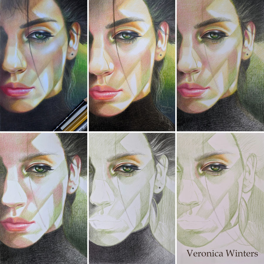
Step-by-step colored pencil portrait drawing tutorial
This is one of my older colored pencil portrait drawings that illustrates colored pencil shading in steps. It shows how to layer colors in a slow progression to build up color and contrast. I positioned the model under a single light source to give me definite shadows on her face and figure.
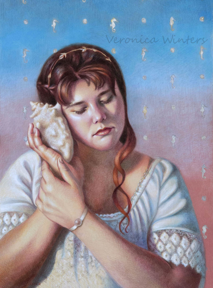
In this colored pencil drawing tutorial I use a very light grey, smooth, printmaking paper, the surface of which is similar to Stonehenge paper pad. I used the Prismacolor Premier colored pencils, Luminance, Gamsol and Caran d’Ache full blender for blending.
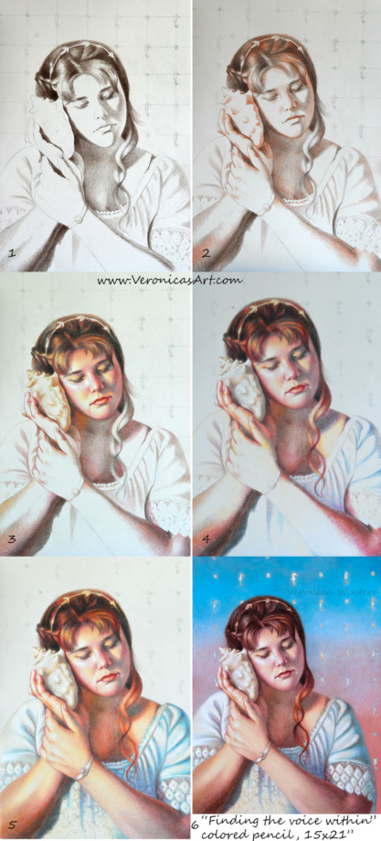
Step1: I work on the outline of my drawing on a sketch paper, and then transfer it to my high-quality drawing paper. It’s crucial to get the anatomy right at this step. I check for mistakes by looking at my drawing in the mirror. I keep fixing the outlines until the portrait looks good to me.
Next I create the underpainting in one dominant color – dark brown. I focus on shadows only to block them in with the consistency needed to develop a sense of light and shade.
Step2: I introduce the second color and slightly overlap it over the first one to create softer transition into the light.
Step3: I focus on shading on the face. I add warmer colors -yellows and pinks to create the middle tones.
I use the same colors to shade the neck, arms and even hair. This is important to do for color unity, so that everything ties in. This is the main reason why I work from general to specific, and don’t draw one area from start to finish, ignoring the rest of the picture.
Step 4: I introduce the blues and lilacs into her shirt. I shade the darkest folds first, then add the middle tones and finish up with the lights. Please see below how I approach drawing highlights on colored paper.
Step5: I work on the background that complements my subject. Here I’ve experimented quite a bit. I added silver acrylic paint to paint the seahorses, so they change their color slightly, depending on the viewer’s position to the drawing. I didn’t use any Gamsol on the face because it would make the darks appear too harsh. I fixed the drawing with a final fixative for dry media, spraying it twice outside.
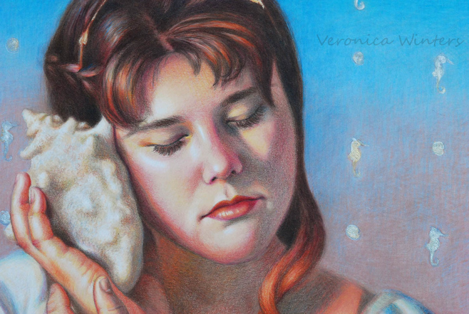
Background
Background is important. Never draw your subject without considering the color and value of the background because it determines contrast and edges. You must have enough color on the page to do the blending with Gamsol. Otherwise, there is not enough pigment to dissolve the colors. Be conservative in your solvent application, and never allow your solvent to run like water. Use a small brush to have a controlled application. Let the first layer dry completely.
In my drawing, I painted the seahorses with the acrylic paint after the blending. You need to have a fine-point brush. I didn’t use any water to spread the paint around, but used it for cleaning up the brush periodically, because acrylic paints dry super fast. Then I shaded the background again using the same colors with heavy pencil pressure. In my third layer I added light grays and blues to make softer transitions and to achieve an effect of “soft fuzziness”. I also shaded with grays to neutralize the brightness of the colors so that the background doesn’t “compete” with the figure.
Shading white fabric and highlights
I shaded the highlights with Prismacolor white over previously applied light colors using heavy pencil pressure.
Colored pencil blending techniques
There are two basic colored pencil blending techniques. One requires blending with a solvent (Gamsol) and another with a colorless blender that looks like a pencil. Sometimes one technique is better than the other. While the solvent dissolves the pigment and moves it around fast, making the color much smoother and darker, some colors may look too harsh after the application. The Caran d’Ache full blender blends all the colors equally, but the process is very time-consuming, especially if you work large, and requires a very heavy pencil application to achieve even blending.
Step-by-step colored pencil portrait drawing tutorial II
This is a variant of the previous demonstration drawing on the same light grey printmaking paper using a high-contrast photo reference.
3. Picking the right paper for colored pencil portrait drawing
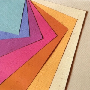
Never draw on a textured paper with colored pencils! Textured surface “eats up” the colored pencils, and the colored pencil blending becomes a real nightmare. Pick the drawing paper that’s smooth to the touch, and avoid using sketch paper as your primary drawing paper. Sketch papers are too thin to layer the pigments, and are not archival to work on. There is very little burnishing needed to achieve the desired colored pencil blending effect, if you draw on a smooth surface.
The best colored pencil drawing paper
I often draw on:
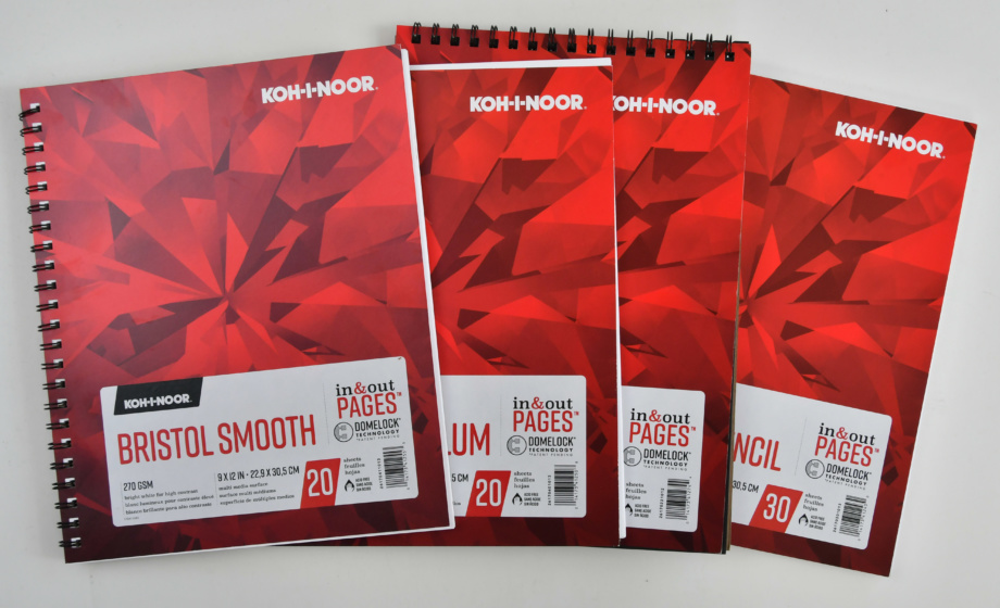
- Stonehenge colored paper pad
- Bristol Vellum drawing paper by Koh-I-Noor
- Canson Art Board Bristol Vellum
- Canson Colorline sheets
- Some printmaking papers that have similar properties to Stonehenge.
- Many artists use mat boards because they are archival, very thick and smooth.
In general, the drawing paper has three properties that affect the quality of colored pencil drawing:
- the paper’s tooth or texture
- the paper’s weight or page thickness
- the color
Let’s look at each property in detail.
Texture
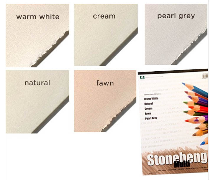
It’s very hard to draw on the textured surface in colored pencil. Blending can be a nightmare even if you blend with a solvent. Therefore, I highly recommend drawing on smooth paper. These include the Koh-I-Noor Colored Pencil Drawing paper, Strathmore Drawing paper, Bristol smooth paper, or Stonehenge papers. If you are a beginner, go to a craft store like Michael’s and simply touch the pages of various papers to understand the difference in texture among them.
Weight
The weight of the paper affects how thick your paper is. If you use a solvent for colored pencil blending, don’t work on paper that weighs below 80 lb. It’s just too thin to withstand washes of any solvent as it crumbles. Sketch paper is too thin and shouldn’t be used for fine drawing at all.
Regular drawing paper is 80 lb., but some printmaking papers and pastel papers are over 98lb. The Bristol smooth drawing paper has the greatest smoothness and 100 lb. thickness. However, some artists find it hard to shade on it, because it doesn’t accept as many layers of color as less smooth papers do. Some artists use mat boards to draw because of their extreme thickness and velvety smoothness.
Colored Pencil Portrait Drawing on Canson Colorline drawing paper
In this section, I’d like to share what drawing paper I use most often to create my colorful colored pencil drawings. I rarely draw on white paper because I love how colored pencils “react” to the bright surfaces and I’m able to create colorful drawings with very few colored pencils.
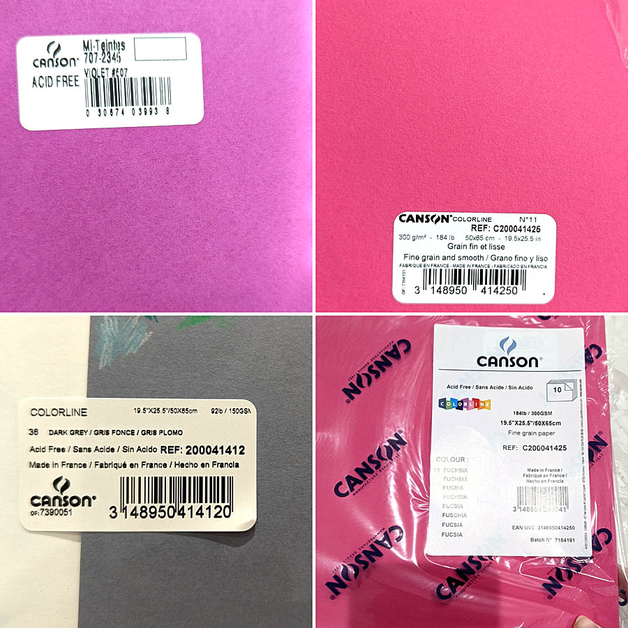
I used to draw on Canson Mi-Teintes pastel paper, using various paper colors they have (violet paper at the top left corner of the image). Their paper comes in both multi pads and large sheets. I used to draw on Violet hue a lot. I loved the paper’s color and the color boost it gave to my colored pencil drawings. What I don’t like about this paper is how much texture it has. Even the “smooth” side has too much texture for my liking. It becomes very frustrating to fill it in. A time sucker of all sorts… SO I was thrilled to stumble upon a different kind of paper also made by Canson.
Canson Colorline comes in many bright hues and at least two thicknesses I’ve been using so far. Maybe, they have more variety in paper thickness. I don’t know. What I do know is that 184lb. is a very thick paper which I love because it’s not flimsy and can withstand a lot of layering and spraying with a fixative. It has a lot less texture than the pastel paper but can still present work for some artists to fill in the grooves.
Canson Colorline dark grey, 92lb. is a much thinner paper. So I’m more careful with my choice of a fixative for it or how I layer colors. However, I think it’s a perfect surface for colored pencil drawing!! It’s smooth but not too smooth. Also this grey is a middle-toned grey. It means that it’s perfect to mark the highlights with white, mark the shadows with a dark colored pencil and then create a range of values in between the two poles.
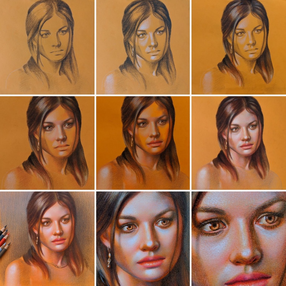
Colored pencil portrait drawing tutorial
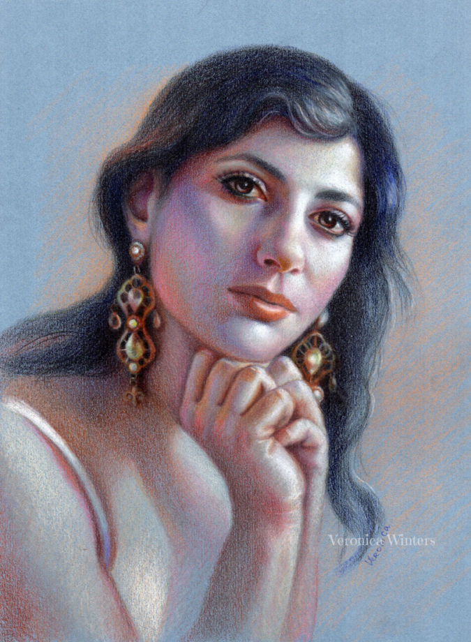
I often draw on colored paper instead of using the white one. Main reason is that it takes much less time to shade everything because colored pencil drawing is a very time-consuming. My second reason is that I love to push colors to the extreme using few colored pencils. The result is always surprising even to me.
Art supplies for this demonstration:
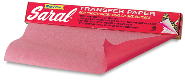
While I used Cezanne colored pencils, I don’t endorse this brand. Rather use my basic color chart to match your colors with mine. I used Sarah Transfer paper to transfer the image.
I used Canson Mi-Teintes Pastel drawing pad, 9×12, assorted colors pad. I used blue sheet of paper, smooth side. I strongly recommend to buy a range of colored papers from Canson Colorline brand instead. These are 19×25 sheets of paper that can be subdivided to many pieces to create drawings. They’re much smoother and more vibrant than the pastel paper.
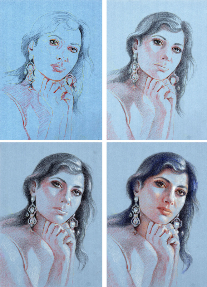
Step1: Transfer the image onto your drawing paper. Don’t sketch with graphite pencil on your drawing paper because the surface must be very clean to accept colored pencils. If you have lots of pencil work on drawing paper and layer colored pencils over it, the colors look dirty and lose luminosity, especially when you work with light colored pencils. So I like sketching on my sketch paper and then transfer the outlines onto my colored paper using white transfer paper. In this image you can still see the transfer lines. After that I place the darks or shadows.
Step2: I work on the division of space between light and dark using just two colored pencils. I create volume by placing shadows first.
Step3: I mark the highlights with white colored pencil (Prismacolor premier).
Step4: I begin to introduce color, shading the hair and eyes with deep blue hue. I also find the light color to shade light areas around white highlights.
Step6: I didn’t use a solvent or blender. Rather, I used a very heavy pencil pressure to get rid of the paper’s texture. I used the same colors, shading the earrings as I used on her skin. What’s different is the pencil pressure that makes colors look much darker. Also, I outlined some of the edges in the earrings, which I didn’t do shading the skin (trying to keep it soft and smooth). I worked on the face the most making it a focal point, so everything else has a sketchy look.
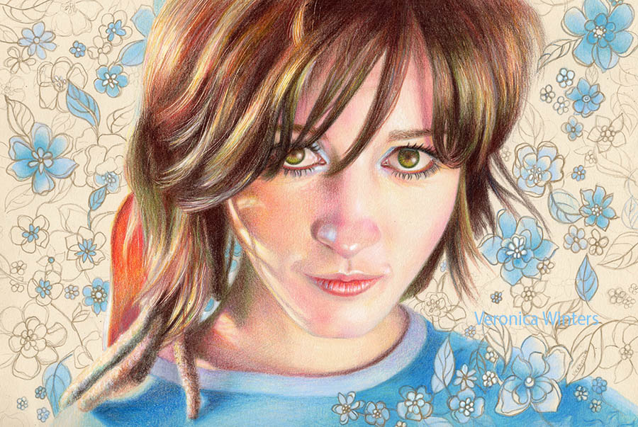
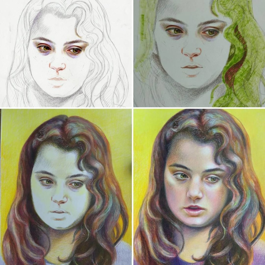
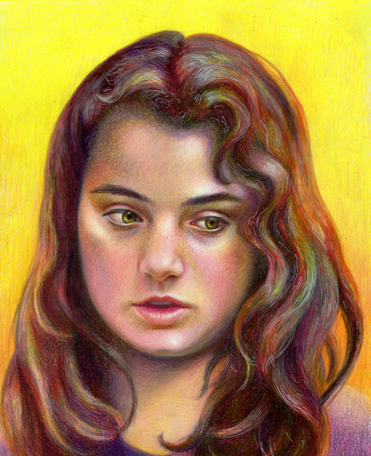
How to create emotional portraits
To create emotional portraits in colored pencil drawings requires a bit of magic. Pick the photo reference of a person that will keep you motivated to draw him or her for many days of work. You can be attracted to certain features such as light or color, or texture. Intensify one of your favorite features to get a unique colored pencil portrait drawing. I often play with hues drawing on toned paper. I also make a big emphasis on the expression I see in the model’s eyes.
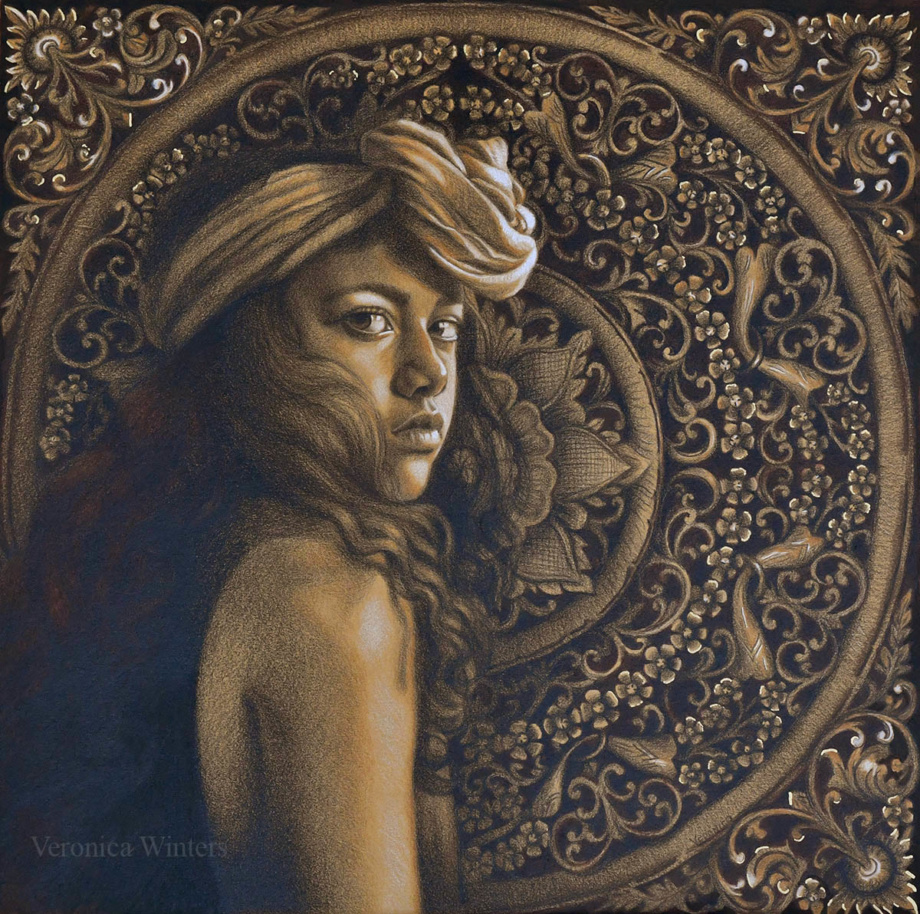
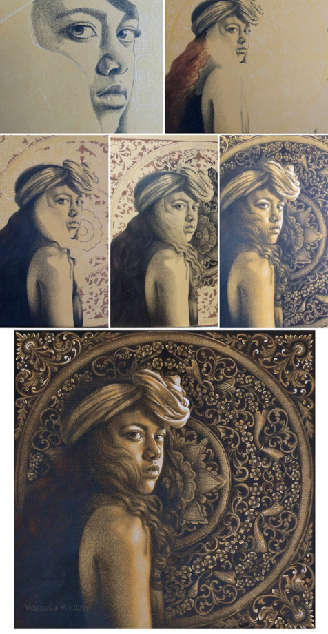
Step-by-step colored pencil portrait drawing tutorial: drawing on matboard
I’d like to share my thoughts behind this portrait drawing inspiration. To create this drawing I got inspired by two very different pictures. When I saw a photo of this girl, I knew I would love to draw her because of her intense gaze and beauty reminiscent of the Vermeer’s girl with the pearl earring. I wanted to create a beautiful, high-contrast portrait drawing with personality. I think Ameli’s confidence attracted me the most to draw her gaze. I was so happy when Angelika let me use her photo! Angelika Kollin is a professional photographer who shoots poetic portraits of diverse women. See her portrait photography here: https://www.instagram.com/angelikakollin/
I also love rich patterns found in woodcarvings in Asia. My trips to Japan and Thailand let me see a very different side of spirituality and creativity. I love combining mandalas as a samsara symbol in my art. I like how the floral circle in the background almost repeats itself in her headscarf. Elaborate design in the mandala complements curving shapes in her headpiece.
Materials:
Colored mat board (warm beige hue), Faber-Castell Polychromos black, burnt umber, brown ochre, white & Prismacolor Premier white. W&N pigment marker, medium brown. Permanent marker, gold. Grumbacher final fixative for dry media.
Most work was done in black colored pencil only. I used the Polychromos one because it’s harder and much less waxy, which gives me higher detail and no wax bloom. The idea is to draw the deepest shadows in black first. Then mark the highlights in shades of white, and touch up the drawing with two other colors where necessary in the end.
While I shaded the entire face in black, I made some underpainting using the marker. I shaded the model’s hair, jacket, and mandala in flat strokes to build up darker hues fairly quickly. While nothing was quick about this drawing, this underpainting saved me some time.
Step 2:
I worked on the figure, shading everything in black. My pencil was very sharp to produce refined crosshatching strokes.
Step 3:
While I left the face unfinished, I began shading the flower in the background because its values determined how light/dark I should have shaded the face. Shading the background also lets me work on edges, making softer transitions.
I made the background with less detail on purpose, so it didn’t overwhelm the viewer, taking the focus away from the model. Also, my photo of this wood carving had lots of highlights I omitted placing because of the same reason.
Step 4:
I analyzed the light direction. Coming from the right, the face received lots of light. I used Polychromos white to mark the highlights and to create shades of white on her shoulder and headscarf. I strengthened the strongest lights with Prismacolor Premier white afterwards. I also used a gold marker to place very few accents in the background. Unfortunately, it’s impossible to photograph gold shimmer as it reflects at different angles not seen in photography. I fix all my drawings with professional fixative spray. I love Grumbacher mat fixative for dry media. (Don’t buy Krylon brand. It gives uneven coverage and white bloom in humid climate!)
4. Using soft, professional colored pencils
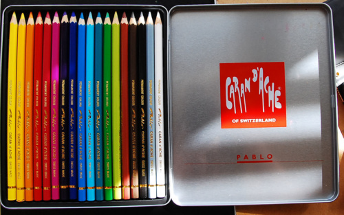
You will achieve a much better result, if you draw with professional colored pencils. What makes them different is their softness, lightfastness, and durability. In general, I use 3-4 brands of colored pencils: Prismacolor Premier, Caran d’Ache Pablo and Caran d’Ache Luminance, Derwent Lightfast, Derwent Colorsoft. I also use Polychromos that are harder.
I pick the colors based on their lightfastness rating, buying them as open stock. I & II are known to be lightfast. Avoid using III & IV because they’re fugitive colors that fade off the page within very few years even when protected by the varnish. Prismacolor’s blue-violets, some reds and greens are fugitive colors. I substitute those hues with Luminance. Luminance is the most expensive brand of colored pencils out there, running at about $4 per pencil. It is the Cadillac of colored pencils in quality and softness. I also have a basic set of 18 Pablo colored pencils that are great for detailed work, but again not all of them are lightfast. Beware that many artists encounter problems with Prismacolor Premier colored pencils since they’ve relocated their manufacturing facility to Mexico. While I have never had any problems with this company, many artists claim that these pencils break easily these days.
5. Colored pencil portrait drawing of skin: shading & layering colors
There is no predetermined formula drawing the skin tones. I don’t use the same palette of colors from one drawing to the next. The skin tone of each person depends on his/her general skin color, the reflected light, and the color temperature. Students often feel timid about color, and try to pick them based on the tutorial’s directions, instead of studying the color by looking at a real person and paying attention to subtle shifts between warm and cool hues.
Instead of shading one area with all the colors you have, try to layer your colors slowly, mainly one at a time throughout the picture. This way you pay more attention to values and shadows as opposed to random shading all over the place without consistency.
Finally, just have fun with it! Not every drawing is a masterpiece, but every drawing brings you closer to your success. 🙂
Mixed media expressive colored pencil portrait drawing ideas
This section of the article introduces you to some experimental colored pencil drawing techniques, with the addition of some other materials. I share how I combine colored pencils with markers, resin, acetate, etc. These mixed media drawing ideas are for advanced colored pencil artists.
Colored pencil drawing and resin
Colored pencil drawing with markers
This W&N pigment marker heavy weight paper is designed specifically for the W&N markers. It doesn’t bleed through and its smooth surface is very good for colored pencil drawing in general. But you have to get used to it too because layering feels different than on other drawing papers. Also test different markers. These dried out too quickly.
In this drawing Invisible I I went back and forth shading in colored pencils and markers, creating the first layer with the markers and then layering colored pencils on top, blending them with the markers and layering again. I didn’t use the markers drawing the skin tones. The hair, however, have layers of markers only. I find that these markers don’t layer evenly and I have to shade with colored pencils over them a lot. The main reason for me to try layering with the markers is the speed of covering the background space.
Pay attention to the markers’ lightfastness rating. If your materials are not lightfast, they tend to fade off the page quite quickly. Various pigments have different lightfastness ratings and you may see some pigments fade much faster than the others.
The W&N heavy weight paper is much better for colored pencil drawing than their lightweight paper. The lightweight paper is just too smooth and too thin to accept the colored pencil. That’s why I don’t buy it unless you plan on drawing with the markers only. It’s great for drawing with the markers exclusively.
Colored pencil drawing with graphite pencil
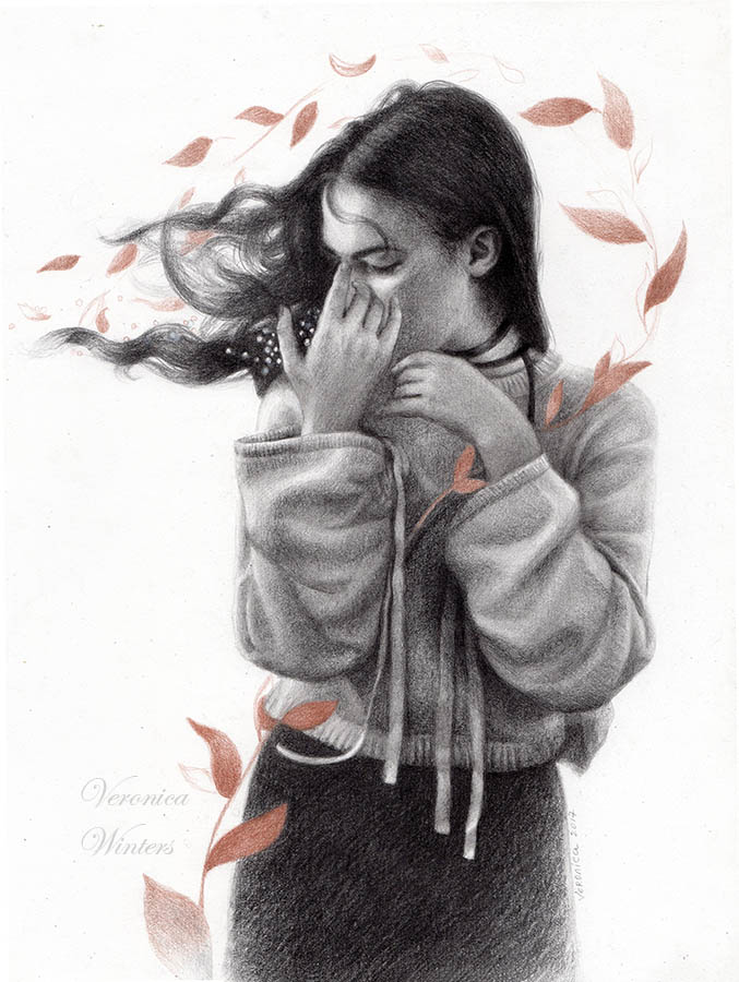
In this drawing I shaded the figure to completion first because graphite smudges and it’s important not to smudge it over the colored pencil areas to keep the color clean. Once the figure was complete, I sprayed the drawing lightly, let it dry, and used metallic colored pencil to draw the leaf design to create the movement.
The fixative prevented smudging. I sprayed it one more time once the drawing was complete. For graphite work, I usually shade the darks with soft pencils (4-6B) but switch to the hard ones to develop the skin tones (2H). The only eraser I use is the kneaded eraser. It leaves no residue and lifts out the highlights beautifully. If I need to get into tiny details and erase there, I love the Tombow Mono eraser that I order on Amazon from a store in Japan.
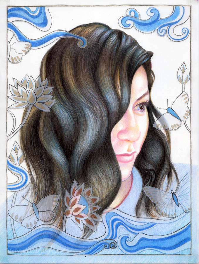
Colored pencil drawing on dura-lar paper
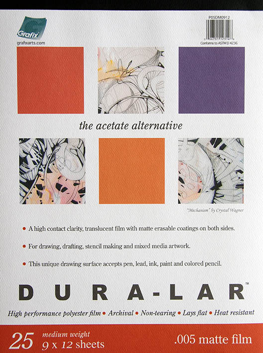
In the first image you can see how translucent it is where both white paper and brown paper show through. I didn’t use white pencil to draw the highlights, rather they show as white because of my white paper placed underneath the drawing.
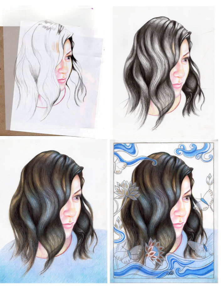
In the third image at the bottom you see me layer as much color as possible. I must say that I was interested in drawing the hair more than the face.
In the last image you see the second layer of this transparent paper placed over the portrait drawing. I tried to cut this paper with a scalpel, but preferred working with small scissors cutting out the shapes. Paper cutting was a very laborious process, just like the drawing on such a smooth surface, resulting in much struggle to finish the work. I connected all three pieces of paper with the archival, double-sided tape in the corner, although other alternatives could have been explored.
As always feel free to share this post with your colored pencil fanatic!
 |  |
Art supplies:
- Drawing pad, bristol vellum
- Kneaded eraser
- koh -i-noor drawing paper, colored pencil
- Tombow mono eraser
- Drawing fixative
- Sennelier fixative for charcoal and pencil has a super fine spray mist, matte, high-quality
- Gamvar varnish for oil paintings, satin
- Brush for varnishing oil paintings
- Color Wheel
- Canson Colorline drawing paper is available in many colors and various thickness. You might find better choices at art supply online retailers
- Molotow metallic marker, gold
- How to color like an artist, coloring book for children and adults
- The colored pencil manual, art instruction book
13 ways to improve your drawing skills:
- Draw daily from life, even if it’s a small sketch that looks insignificant.
- Study great works of art. Yes, studying, not just looking at art. How does the artist solve a problem of the movement, composition, contrast, and color?
- Embrace positive attitude and acceptance of failure as part of the learning process.
- Consider Mentor’s help. (It’s worth your buck to pay a well-known, practicing artist to learn the tricks of the trade. Don’t expect those artists to guide you for free. There is a reason why they’re successful and their time and knowledge are valuable.
- Be passionate and consistent working on your art.
- Have fun drawing!
- Choose the right school to study drawing. Follow your favorite artists and figure out where they studied or study with them. Some great art schools that give classical education are GCA, Studio Incamminati, Ani Art Academy, the Ryder Studio and many more!
- Draw from plaster casts or classical sculptures at the museums. This is one of the cheapest and best ways to study the human anatomy before drawing a real person.
- Study the complex subjects separately. Draw one object at a time before combining them together.
- Sign up for free business newsletters /webinars written by practicing artists and crafters that will guide you how to set up and handle the art sales.
- Some good art books to have in your library: Anthony Ryder, “The artist’s complete guide to figure drawing,” J.D.Hillberry “Drawing realistic textures in pencil,” Jane Jones “Classic still life painting,”
- Some good business books that are worth your time are by Jack White who is an amazing marketer and a practicing artist: http://www.jackwhiteartist.com/pages/books.htm. I also recommend “Making it in the art world” by Brainard Carey. He lists some unconventional strategies he employed in his art career.
- Join groups on Facebook to keep yourself motivated and to receive quality feedback. (The Atelier Movement is one of the groups for oil painters, Colored Pencil Artist League is one of many colored pencil groups).
What doesn’t work:
- A fixed mindset where you believe that you can become great in a couple of lessons. There is no point in starting out on this venture, if you don’t have realistic expectations. It takes at least a year of consistent work to see permanent results.
- Inconsistency or a lack of work ethic.
- Trying to learn the material from someone whose artwork doesn’t represent the art style you are trying to learn.
- The absence of motivation. No one will make you successful, unless you work on it!
Veronica does a lovely job of explaining how she accomplishes such fantastic drawings and paintings. I look forward to reading this blog!
I love your beautiful painting!!!!
I love your paintings. They are all so beautiful. I wish I had this kind of talent but since I don’t I just try to enjoy others talent. Which you have quite a bit of.