Tag: how to draw

Colored pencil drawing on UART Paper: pros and cons to consider in your colored pencil shading

my-mother- -veronica-winters
My mother, 9×12 inches, lightfast colored pencils on uart paper, private collection

As I like to experiment with new art supplies once in a while, I gave a try using the UART premium sanded pastel paper. It comes in various grits and feels like a real sandpaper. It’s finest grit is 800, which is advertised as a perfect surface for colored pencil drawing.

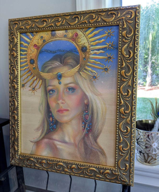
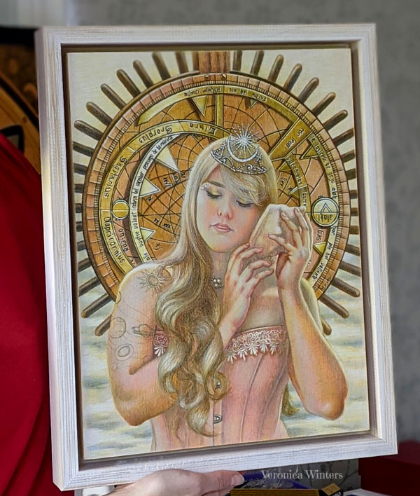
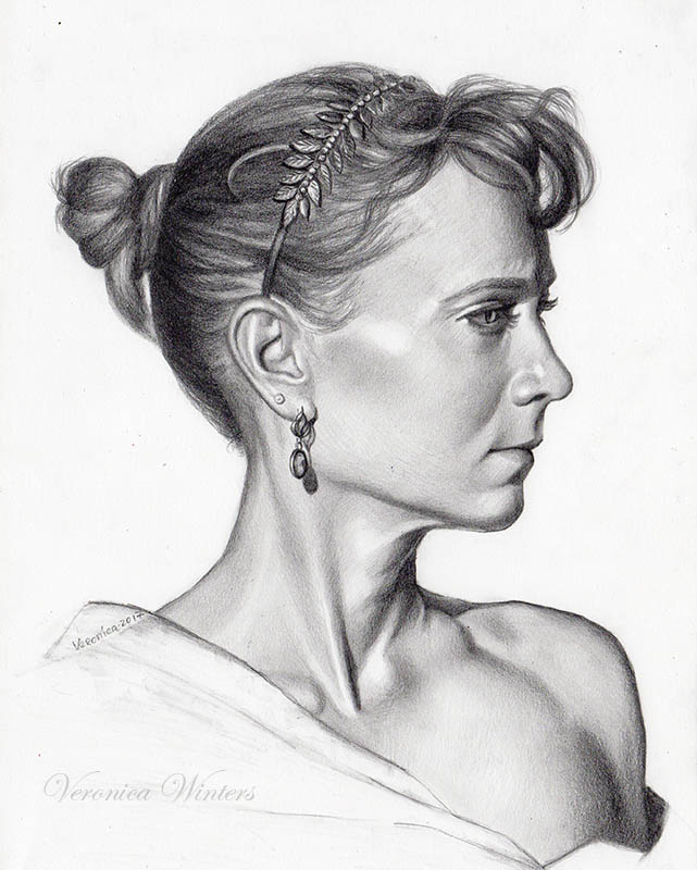
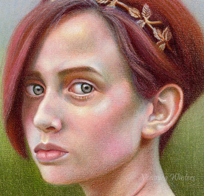
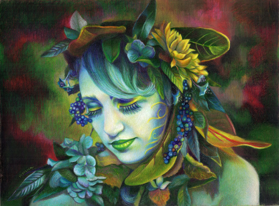
All the drawings you see here were done on 800 grit paper, tan hue. This paper is produced for pastel painting and the 800 grit is made for colored pencil drawing. But is it really that perfect? Many artists say it’s their absolute favorite, but I found several considerable challenges working on it. Let me explain.

UART Paper review

a closeup of a drawing done on uart paper, 800 grit

Challenges & solutions:

1. The surface is not smooth enough for colored pencil drawing. The 800 grit makes the strokes look very textural, even when the colored pencil point is super sharp.
The solution isn’t using a paper stump for blending, rather applying Gamsol. It really “calms down” the surface and makes it a lot easier to shade with colored pencils after that. Gamsol melts the wax in pencils, spreads it around, and gives a painterly effect to my first layer.

Warning: if you are a beginner, you might be seriously frustrated with the result, because Gamsol creates loose edges on this paper, and its hard to keep the outlines intact with such approach.
veronica winters colored pencil
Nymph, colored pencil on uart paper, 9×12 inches

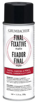
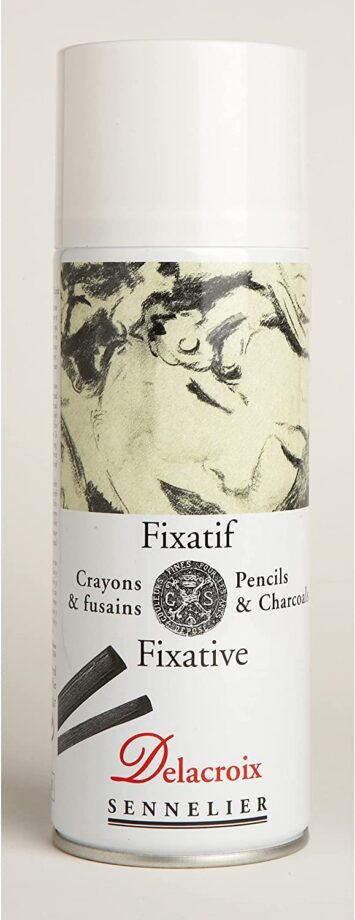
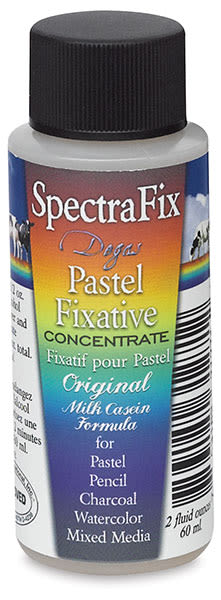
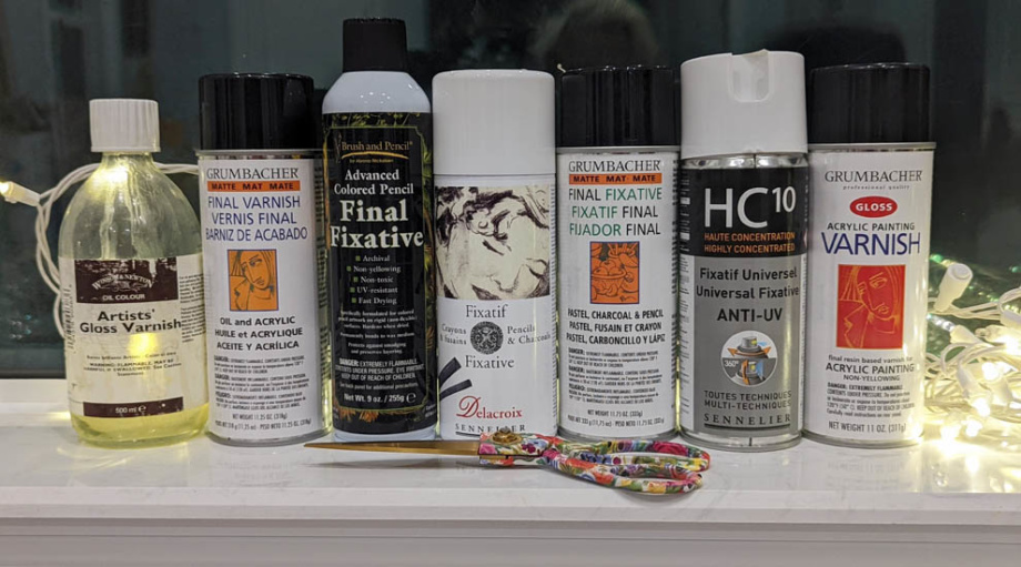
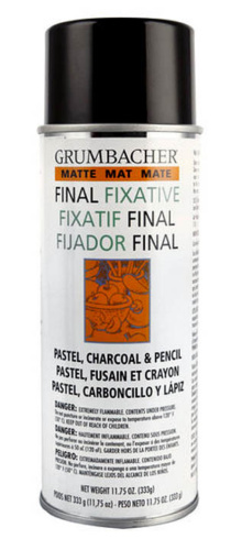
2. So the second solution is to use a soft, clean brush and blend the entire surface with it. Fix this layer with a fixative, wait till it dries and continue working on it shading in colored pencil.

colored pencil drawing
Steps: 1. Here you can see the paper’s texture when I drew with colored pencil on it. 2. Here you see the painterly effect that happens when I use Gamsol over it. 3. Here you see me work on the eyes with the colored pencil again, after the first layer has dried.

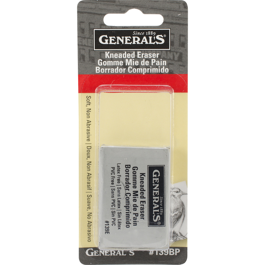
3. It’s easy to make and to spread dirt on paper. This is the case when you begin shading in colored pencil, especially if you use dark colors. The solution: Use the kneaded eraser to pick up the smudges and put a piece of paper underneath the palm of your hand.

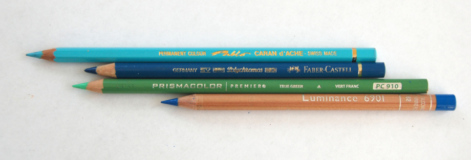
4. UArt paper "eats" up your pencils because the sanded surface has a lot of texture. The solution: test your colored pencils to see which ones respond better to this paper. I find that Prismacolors and Pablos work well. You can blend them with a solvent, and continue shading with soft colored pencils over this layer. Another option is to work with Polychromos because they blend and behave like soft pastels. They're quite hard, so they last longer shading on uart paper.
colorful-dreams-sm-veronica-winters-colored-pencil

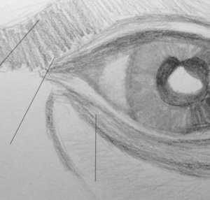
5. Details. After the paper dries (if you use solvents), it’s much easier to continue doing colored pencil shading. However, if you have small details like the eyes or finger nails, etc., it requires precision and patience to fill those details well. I use Polychromos colored pencils for shading the details.
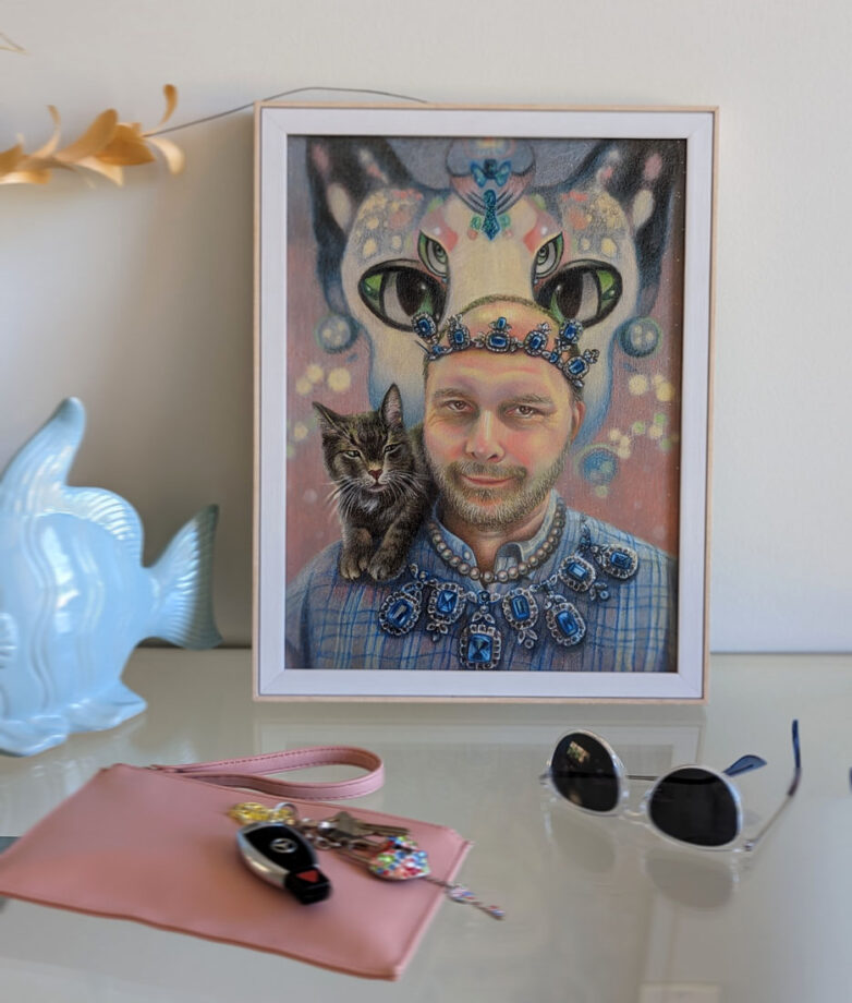
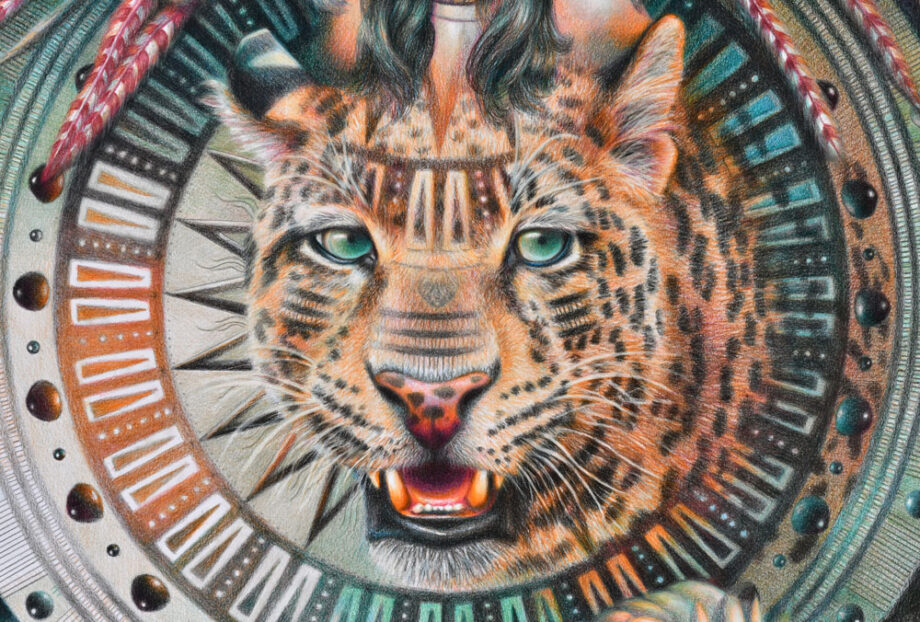
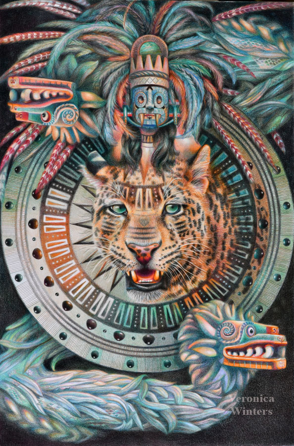
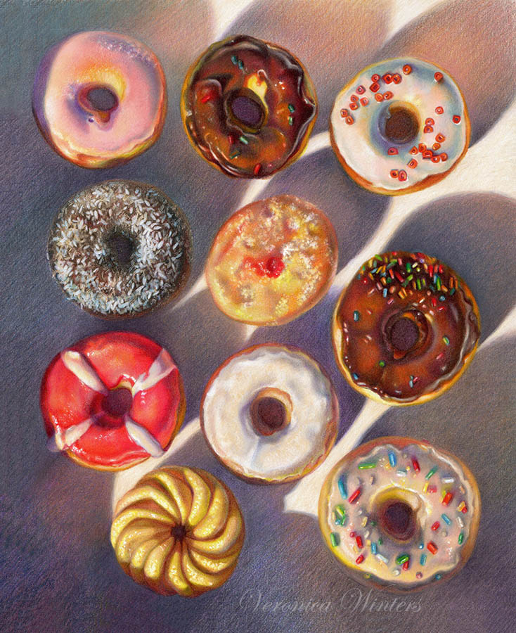
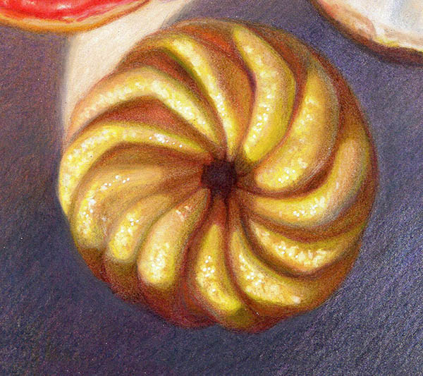
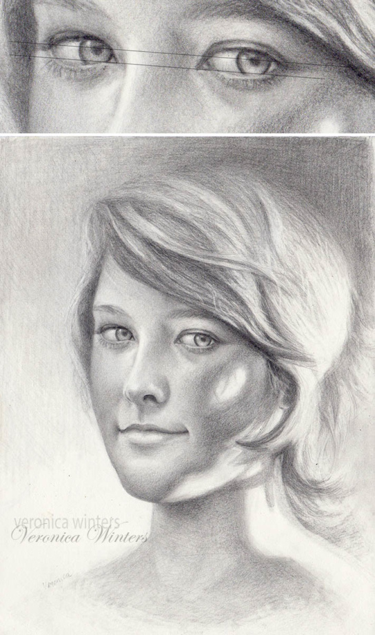
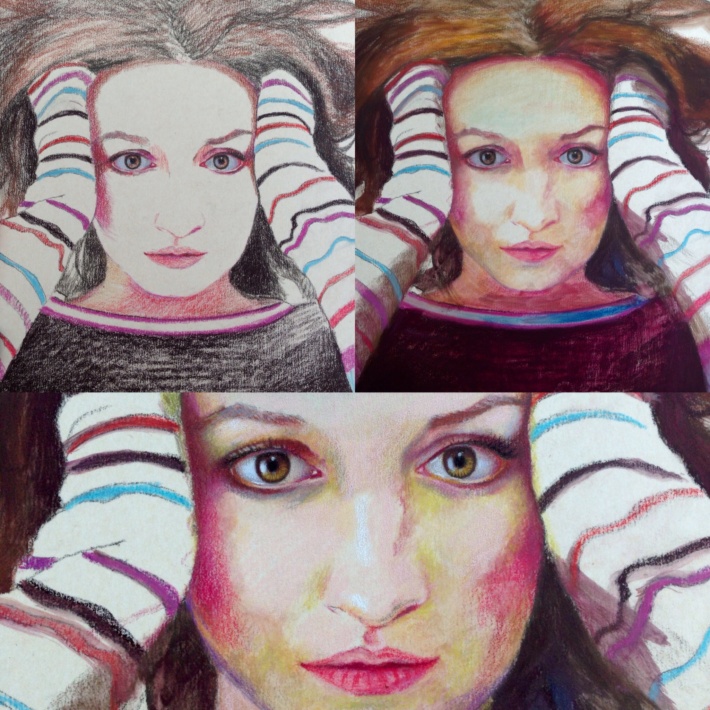
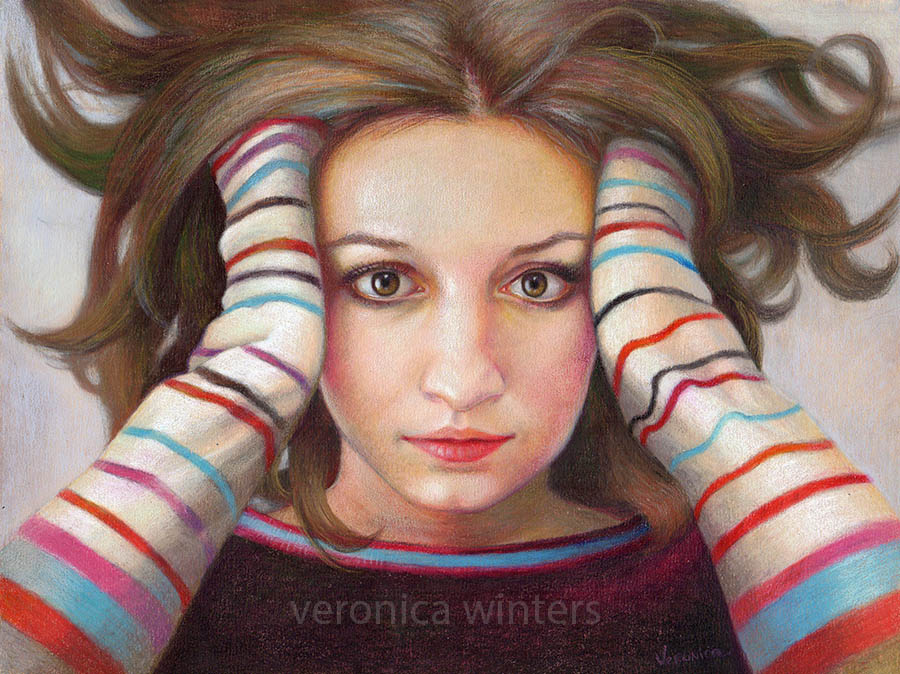
The solution: the solution is to draw larger in colored pencil. In this post you see several drawings completed on 800 grit uart paper. With my third drawing done on this paper titled the “Colorful dreams,” it became much easier to shade because I increased the scale of the portrait. The eyes are not as small in this drawing as in my previous attempts. Still, it was taking a lot more time to fight with the surface’s roughness as opposed to working on smooth Stonehenge.

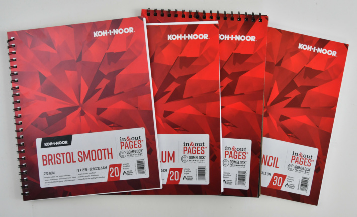
6. Pretty pricey paper. Selling at nearly $40 for 10-9×12 sheets per pack, you really can’t allow yourself to screw up at all. UArt paper on Amazon.

nicaraguan-boy-sm-veronica-winters-colored-pencil
Nicaraguan boy, 9×12 inches, lightfast colored pencils on UART 800 grit drawing paper

Advantages:

The more I work on it, the more I like it.

1. It accepts many layers of pigment, and it’s really great for soft pastel painting! I used to work with soft pastels but switched to colored pencil drawing because I find it more fun and archival.

2. UART durable surface is much stronger than a regular 80 lb. or even 100 lb. paper. It stays flat at all times.

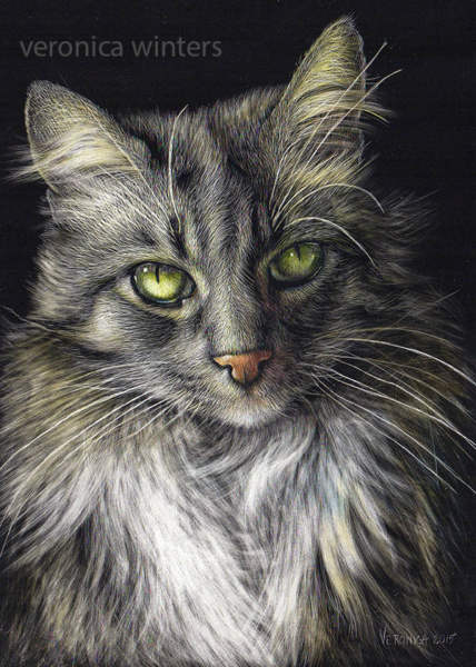
3. Colors look much brighter on this paper in comparison to drawing on white paper. Colors pop and look gorgeous!

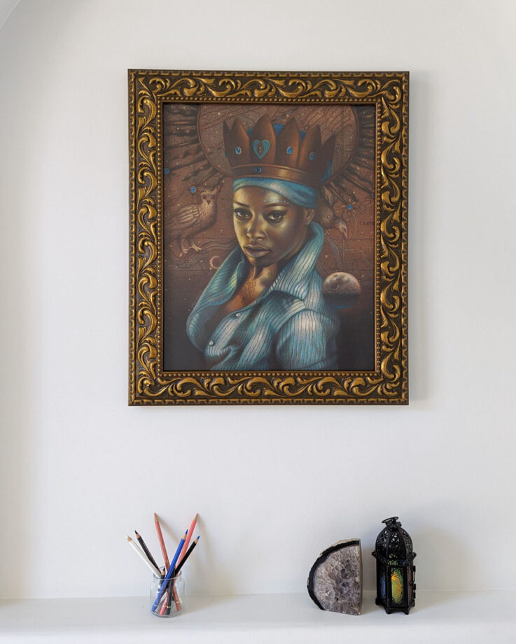
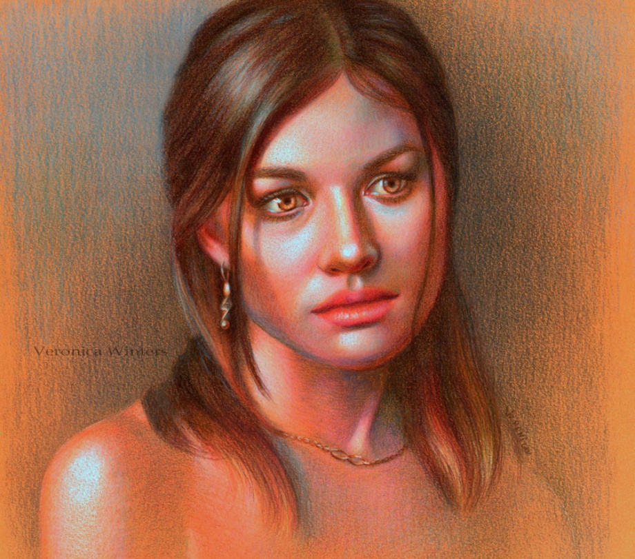
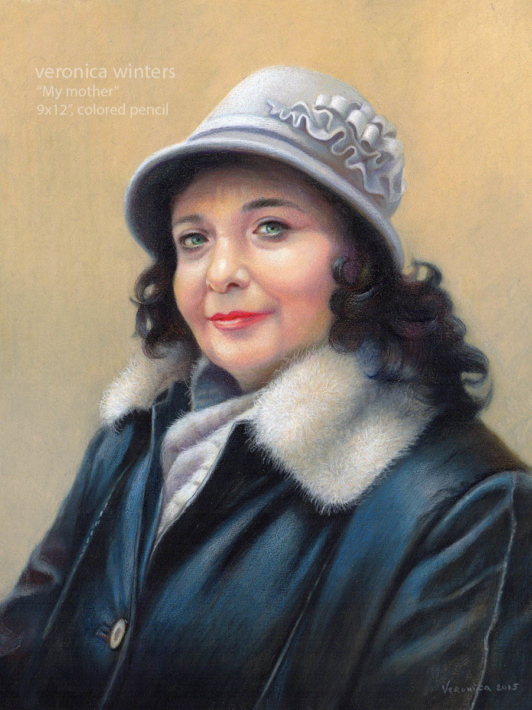
4. Accepts various media. You can make a painterly underpainting with the colored pencils and Gamsol, or use the watercolors or watercolor pencils like Neocolor underneath your work as this surface accepts various media. In my drawing titled “My mother” the painterly effect on her leather coat was a happy accident. Once I used Gamsol on dark colors, it melted with the blues I used for the highlights and created the leather coat effect.

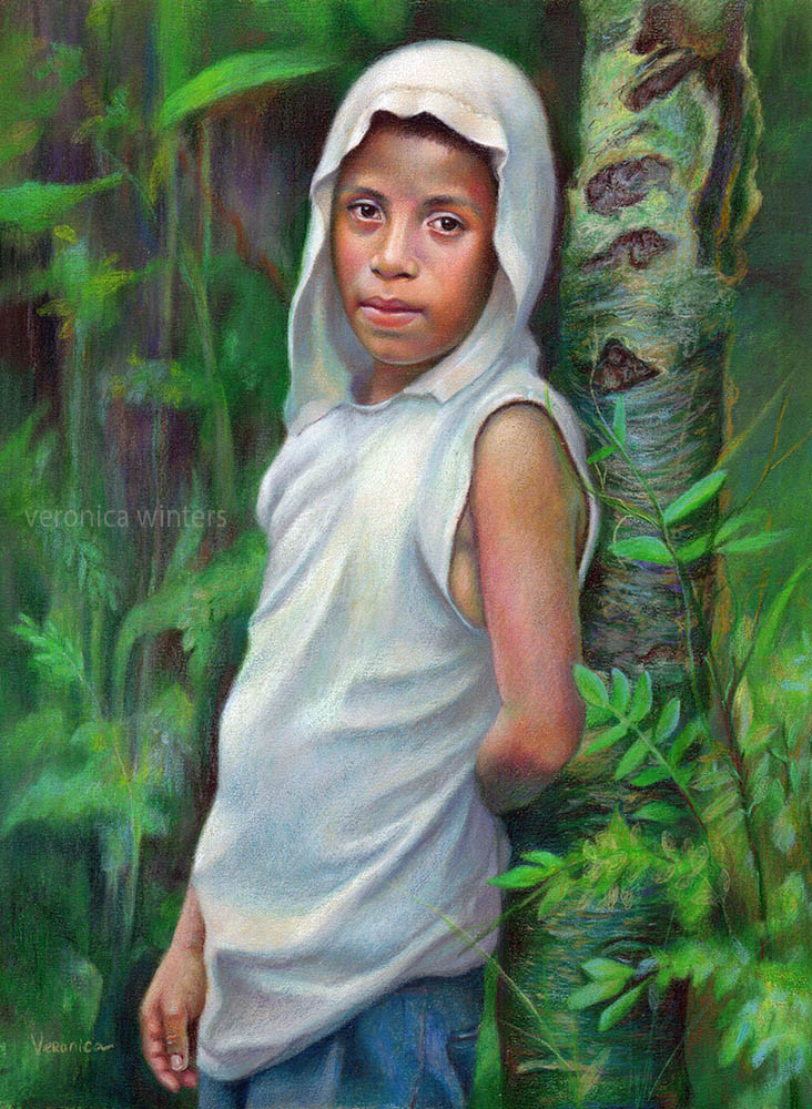
5. The paper is at its best when you work large. I discovered that 9×12″ is just too small to work on subjects with tiny details, like the boy’s face here where I had a hard time keeping up with the anatomic accuracy.

Because this paper is designed for pastels, the colored pencil shading technique should be close to pastel painting technique. What do I mean by that? Draw from dark to light. Shade with dark pencils first. Fix the layer. Continue shading with lighter colors over it. You’ll see the effect it’s producing. Quite awesome and so different from regular colored pencil drawing on white paper!!

Hopefully these pros and cons will let you make an informative decision buying the uart paper and having fun with it. 🙂

Other artists working on this paper:
Linda Lucas Hardy & Lisa Ober

video courses by veronica winters
Check out free previews of my video courses

If you’d like to take your colored pencil drawing to the next level, check out free previews from my video courses. Click on the image above to learn more!


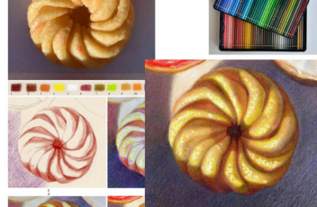
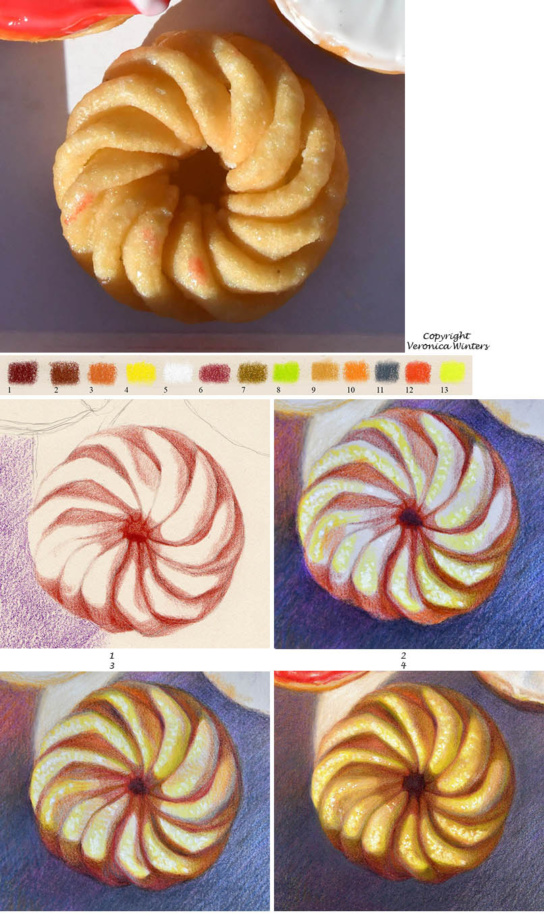
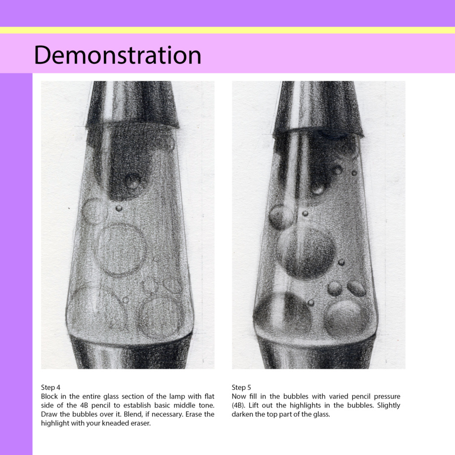
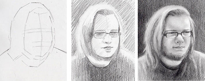
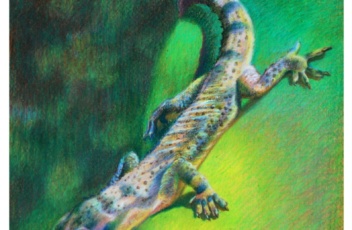
Colored pencil shading on uart paper, step-by-step tutorial

how to draw on uart paper-veronica winters colored pencil
Cosmic joy, step by step drawing by veronica winters, colored pencil drawing on uart paper

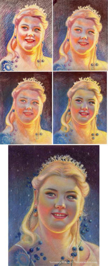
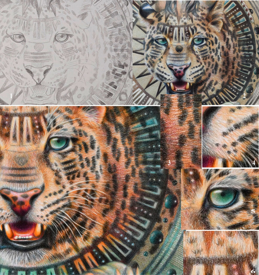
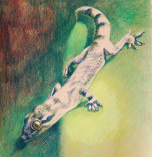
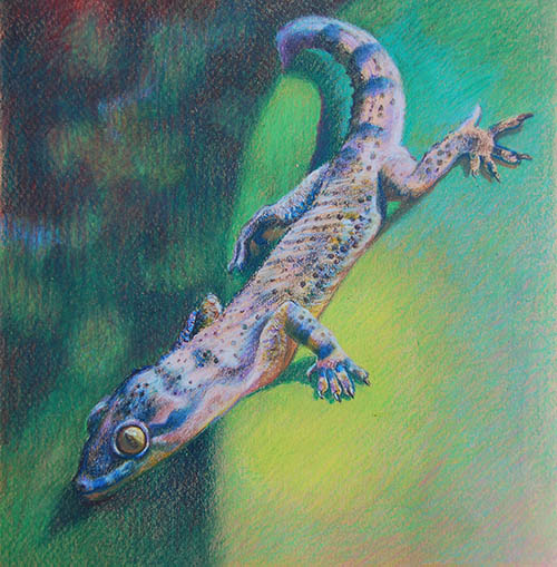
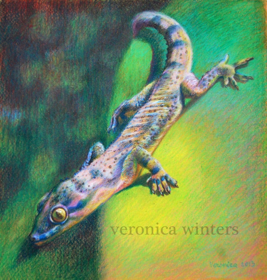
Here you can see the steps drawing in colored pencil on uart, 800 grit paper.

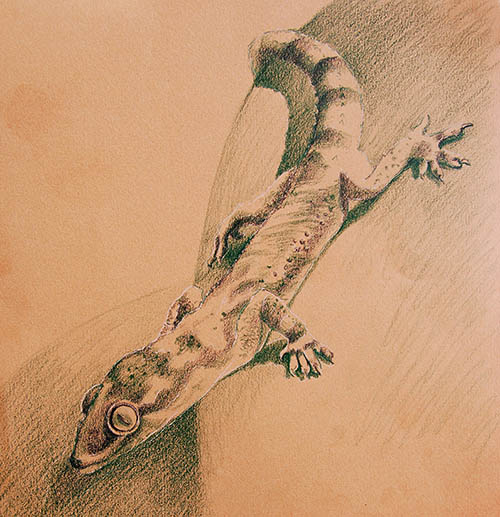
  1. In the first step I applied major lights and darks very loosely.
  2. In the second step I blended everything with a soft brush. You can see a very dark left corner there. This is how I tested the solvent on it.
  3. In the third step I applied Gamsol over the entire drawing, letting it dry. This is an underpainting.
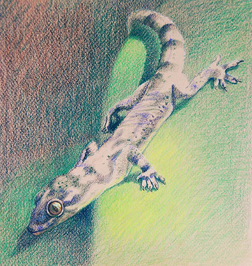
  4. In the forth step I began layering more color aggressively.

What I love about this paper that the colors looks super vibrant and I love working from dark to light on it. (I apply much darker colors on purpose to lighten them up in subsequent layers).

The UArt paper accepts many layers of color. In the final image I use a touch of oil-based paint pen by craftsmart to draw those tiny blue dots. This marker has a pearlescent quality that’s subtle and beautiful. I hope that this short tutorial helps you in your creative pursuits.

Check out all my colored pencil drawings!

How to improve art skills by taking great pictures for colored pencil drawing and painting

How to take great pictures for colored pencil drawing and painting

If artists paint in figurative realism style, most rely on photography these days. Model fees, time constraints, lighting and studio conditions – all add up in a puzzle we have to organize and manage, if we paint from life. While painting from life is a must for realist artists to get the skill going, perfecting photography is also a necessary skill. Because colored pencil drawing is such a slow medium to work in, almost all artists rely on their references to create art as opposed to drawing from life. Sometimes it takes weeks to complete one colored pencil drawing, and we have to rely on our photo reference to capture story, composition, design, color, and details. That’s why great photography becomes key to artistic success. Let’s master it!

How to take great pictures suitable for colored pencil drawing and painting

It took me years to understand how to see the light turning the form and how to pick pictures, capturing that light. I used to play with pictures from fashion magazines that looked incredibly beautiful, yet they were missing something I couldn’t quite figure out what. Some were OK for black-and-white drawing but none of them were good for oil painting. Why?

All magazine pictures are Photoshoped heavily, getting rid of important information necessary for artists to capture the form realistically. First, the Photoshop filters and presets get rid of warm/cool balance in skin tones, objects and even backgrounds that we normally see in nature. Second, copyright is a big deal, and we can’t use such images for our art to create the originals. Thirdly, a lot of times the “connection” between the subject and artist is missing. We have no emotional attachment to the photo that’s not ours that results in unfinished or poorly executed art.

Photo equipment:

My greatest investment into my studio equipment is my camera Nikon D500 with the interchangeable lenses. The quality of lenses is even more important than the the body itself. The higher the quality, the better the outcome. Over the years I bought several lenses for different tasks.

  • Nikon 105 mm- micro lens for extreme close up photography
  • Nikon Nikkor 85 mm – for portrait photography (that gives no distortion)
  • Sigma 12-24 mm – for interior photography (that has a wide angle with no distortion)
  • Nikon Nikkor 18-200 mm zoom lens – for general photography ( while it’s my heavy duty use lens, it gives the most distortion and requires extra work in Photoshop to even out the perspective, etc. Zoom lens have the most distortion especially noticeable in cityscape photography).

I also have an inexpensive Westcott reflector kit with multiple colored surfaces (silver, gold, white) that I use for portrait photography at times. I use the reflector to bounce the natural light back onto my model or object that removes harsh shadows or adds more light into the shadows.

You can also consider buying a backdrop equipment that I don’t need personally because I shoot models in natural environment, and when I do still life photography I make my own light box set up that you’ll see in the article below.

Besides having excellent equipment you also need to have a good eye to take great pictures, which you develop by studying the art of others and practicing your photography skills.

Pixabay image

Advantages of Mastering Photography:

  • It develops your originality and vision.
  • It forces you to extrapolate and focus on what’s important in busy environments.
  • It teaches you to see how light shapes the form
  • The artist is the sole designer and creator of artwork beginning from the very first step of photography.
  • It’s a forgiving medium, giving you many chances to practice at all times. You become attuned to cropping and balancing techniques that artists traditionally use in their paintings.

Disadvantages of Using Photography:

  • It often flattens out the form to such a degree that you have a hard time re-creating the volume. That’s why it is best to start taking pictures with one directional light source that gives you definite lights and shadows.
  • Camera makes its choice. Even the best cameras don’t capture what you see as an artist, which involves emotion. By working from a picture, artists analyze the subject rather than respond to it freely.
  • There is a lot of distortion in the images depending on the lens and camera you use that is obvious in cityscape photography or in pictures of geometric objects. The same distortion is present in pictures of people or fruit, or whatever subject you have, but our eye doesn’t catch those distortions as quickly as we notice those in linear and geometric forms. Those “unseen” distortions will travel to a student’s drawing when the artist transfers the outlines rather than learns to sketch freehand from his reference.
  • You may have problems with exposure. Use the HDR (high dynamic range) function on your phone to level out the exposure. HDR combines two or three pictures into one automatically, giving you a single balanced shot. HDR function is very handy when the sky looks too bright or the background is so light that it makes your subject appear too dark. • You can take good pictures with your phone, although the quality won’t be the same as shooting with a DSLR (digital single lens reflex) camera. If you shoot with your phone, zoom in on your object as closely as you can. That will blur the background, giving your subject a boost in color and texture.
colored pencil manual veronica winters
You’ll find sample photos and more information on mastering the photography in The Colored Pencil Manual as well my Colored Pencil Video Course

Subjects

leopard, how to improve art skills
This image is taken from Pixabay, a free resource for artists to use!

First of all, decide what you favorite subjects are, and isolate them from busy environments. Here are some ideas for your photography. Close-ups of textured subjects—these can be the most fun, unpredictable subjects for your photography and art.

They can be reflective surfaces and reflections, fabric patterns and lace, rusted door locks, wood grain, colorful feathers, candy, sliced fruit, marbles, flowers, kitchen utensils or tools, and even mechanical parts of clocks. Other popular subjects are glass; portraiture; animals, birds, and pets; food; florals; seashells and sea life; trees and landscapes.

Properties of light

Your goal of shooting in the “right lighting conditions” is to beautify your subject and to bring the best out in it. Ask yourself what attracts you to this object. It could be a specific texture, transparency, color, or an abstract pattern of light and shade that you see. You need to figure out what you love about your subject and how you can highlight its most attractive qualities in a specific light. If your subject looks boring in a picture, chances are that the lighting conditions were boring at the time it was shot.

Light temperature:

starfish, how to take good pictures
In this picture the evening light is warm (yellow) and the shadows are cool (blue).

The light can be either warm or cool. In the beginning it may be difficult to spot the difference, but if you ask yourself if it is yellowish or bluish, it makes more sense. Fluorescent lights tend to be cooler, while the tungsten lights are warmer. In nature, you see a beautiful golden light twenty minutes before the sunset. The light temperature affects how you see the colors and how they unify everything in the image. You also use the light temperature to understand the color on your subject: if the light is cool, it gives cool lights and warm shadows. If the light is warm, it gives you warm lights and cooler shadows.

Quality of light:

This picture has a soft, diffused light throughout. While the picture looks like fun to draw, it would be much harder for a beginning artist to create volume and to turn the form using this kind of lighting. (Pixabay image)

Natural light is the most beautiful light we have as artists. While the soft, diffused light may give the artist beautiful, soft skin tones in portrait photography or a dream-like mist in a landscape, this light is difficult to master for a beginner who is shooting pictures of glass, fruit, or flowers. The glass loses its sparkle and reflections, the fruit doesn’t have the volume or shadows, and flowers appear quite bleak. That’s because the diffused light gives you very soft, almost unnoticeable shadows and highlights, which, in turn, are difficult to reproduce in art for a student. Whatever the light temperature is, the goal is to avoid getting monotonous images that often happen in diffused light situations when you have an overcast sky.


Light direction and shadows:

how to improve art skills
This teapot has one directional light set up on the right at night. Such light gives strong highlights and shadows that are easier to re-create in a drawing.

The most effective way to study the light on a form is to have a singular, strong directional light source set up at 45 degrees, which is often called Rembrandt lighting. This light direction creates beautiful highlights and shadows that will add dimension to your objects.

If you go to an atelier school of classical painting, you’ll see students draw from plaster casts and still lifes set under a single directional light that doesn’t change direction for the entire drawing process. Such setups are vital to an artist’s understanding of how to turn the form. So when you take pictures inside, find and focus on one primary light source, like a table lamp, and consider its strength. Look at your subject and find definite highlights and shadows on and under it because it will give you this 3-dimensional quality you want to re-create in your drawing.

Set up a strong directional light drawing people. In this example the David’s Eye sculpture looks very three-dimensional because of the directional light that makes the forms pop.

In my video course I teach how to take your colored pencil drawing to the next level including set up and photography. Watch a video preview here:

Depth of field:

Shallow depth of field allows you to capture your object in a sharp focus, blurring the rest of the image. A soft background supports the focal point rather than competing with it. When you have a high depth of field set at f16 on your camera, everything is in focus, and oftentimes the image will look too busy and indistinguishable from other elements in the background where everything competes with each other. Always think what you’d like to focus on, then make it your priority by zooming in or fixing the depth of field.

Zoom in, keep it simple & use negative space as a design element:

crystal pitcher colored pencil drawing
This is a crystal pitcher colored pencil drawing. The background (negative space) becomes part of the design in the artwork.

Background affects the edges and creates abstract shapes. As a beginner, stick to plain backgrounds to isolate your subject and to show contrast. After a while you can start playing with the color and complexity of your negative space as well.

Use backgrounds and boxes for staged photography:

light box still life set up
Light box still life set up

If you don’t want to buy a light box, you can make a very simple setup next to your window. Use colorful but plain matboards, fabric, or paper as your choices. The result is a single image with a beautiful, natural directional light, a shadow, and a white or color background all around it.

Avoid flash photography:

Flash destroys the natural flow of light and its shadows. It flattens out the object and gives you strange, unnatural colors. Professional photographers know how to rotate their flash unit to get the right position of the flash, but most of us don’t!

Prioritize values over color:

When a student is learning to draw and paint, it is difficult to translate hues to tones. Convert your photos into greyscale to see values. Most students end up with middle-toned drawings because of weak contrast.

Well, I hope this article helps you to shoot beautiful pictures as references for your art!

video courses by veronica winters
Check out free previews of my video courses here: https://veronica-winters-art-school.teachable.com/

Pros and cons drawing on wood in colored pencil

In this article, I’d like to share my experience doing colorful pencil drawing on wood. I list both advantages and disadvantages working on wood.

The advantages of colored pencil drawing on wood

  • The panels are very durable and stable. They resist warping.
  • The panel has a 1-inch depth, which is good for wall display.
  • Wood panels prevent warping.
  • The panels look like paintings that aid professional presentation and make people more excited to purchase art. Drawings on wood don’t need a mat.
  • Because the wood surface is so stable it accepts many materials and techniques in addition to the colored pencils. For example, I tested it adding acrylic inks to its surface. I also added Fine Tec iridescent colors with a tiny bit of water, various markers, acrylics, resin, glass, diamond dust, glitter. The possibilities are endless!
  • The wood panels accept layers of color when primed with the right primer for drawing that I list below.
  • You can play with the negative space of the wood panel by not coloring the entire surface, rather allowing it to show in art because it has it’s own pattern and color.

veronica winters colored pencil-portrait painters
“Celestial Day“, 16x20in, colored pencil on wood panel

Drawbacks in colored pencil drawing on wood

  • It’s much harder to draw on wood panels in comparison to drawing on bristol vellum paper! It can be frustrating to fill in the surface.
  • The surface tends to “eat” the colored pencils.
  • Hard colored pencils may slide off of the surface.

I highly recommend buying a very small panel to test all the materials and techniques on it first.

veronica winters colored pencil
Let it be, 12x16in, mixed media on wood panel. This colored pencil drawing has colored glass, glitter and resin to produce unique look.

colored pencil manual veronica wintershow to color like an artist_coloring book_veronica winters
These art instruction books are on sale on Amazon!

Art supplies list for colored pencil drawing on wood

how to draw on wood art blog by veronica winters

Wood Panels

Obviously, we can find many brands of wood panels suitable for colored pencil drawing. I happen to use Da Vinci Pro panels because they are sturdy and have a 1-inch depth that makes them look like paintings. I usually buy my art supplies at JerrysArtarama although some of them are available on Amazon.

Da Vinci pro panels come in different sizes and surface preparation. If you plan to draw on those, buy the panels that are NOT primed. You’ll prime them with one of the primers listed below. These panels come in primed for oil and acrylic painting and I find that even the smoothest, primed surface isn’t good enough for drawing. They’re made of birch wood and are available on Amazon here: https://amzn.to/3OUEGw4

Art Primers for colored pencil drawing on wood

I did some colored pencil drawing on wood with and without a primer. I prefer using the primer to have that extra tooth in the surface to grab the colored pencils. Primers seal the surface to prepare it for drawing in colored pencil.

There are several primers that you can test to use to cover wood panels, panels and paper. All of them are quite similar but give a slightly different grip or tooth to the surface to apply the colored pencil to.

  • I like Colourfix Primer because it comes in several colors!! You can tint the surface with this primer and draw like you draw on toned paper. https://amzn.to/3WKbwjm Colourfix Primer Clear 250Ml, Brand: Art Spectrum.
  • Golden Acrylic Primer for Pastels has more texture than the Colourfix but is also used for surface prep. You can find it here: https://amzn.to/43DNbzC.
  • Finally, there’s another ground with superfine texture for drawing –Golden Silverpoint/Drawing Ground. You can buy it here: https://amzn.to/3MSqbq1
Golden Silverpoint/Drawing Ground, how to draw on wood
Golden Silverpoint/Drawing Ground is a liquid acrylic used for the preparation of supports for drawing media. The ground is designed for the achievement of fine detailed lines on a permanent, lightfast, flexible ground. Developed for easy application, the ground has a very fluid consistency that will level as it dries. A single coat of Silverpoint provides a smooth, durable surface, ideal for use with a silverpoint stylus or other metals, such as brass, gold, copper, or even a steel paperclip.

You need to test them first to see which one will work for your colored pencil drawing. You might not like all of them.

Primer: https://amzn.to/3WKbwjm Colourfix Primer Clear 250Ml, Brand: Art Spectrum

Art Fixatives for colored pencil drawing

There’re numerous brands of fixatives for drawing. I recommend listening to the video with a technical cosnultant Ed Brickler to understand the differences and to figure out which ones will work for you. I’m including some of the best ones below.

Grumbacher Final Fixative is an excellent spray to protect colored pencil drawing. Don’t buy Krylon fixatives as they can present problems.
https://amzn.to/3MT4WUO

Sennelier Delacroix Fixative https://amzn.to/3MT4WUO is also an excellent spray for pencils that has a super fine mist. Both sprays are hazardous and must be sprayed in a very well ventilated space or outdoors with low humidity levels.

One of safe fixatives is Spectrafix.

SpectraFix is a safe fixative for drawings. https://amzn.to/3OSNZfS Personally, I haven’t tried it yet but it was recommended to me by a technical consultant (watch the video below on that).
To read about fixatives and varnishes, go here: https://veronicasart.com/fixatives-varnishes-what-you-need-to-know-to-preserve-your-art/

How to frame colored pencil drawings on wood

This is a tough one! The panel has a 1-inch depth, which is good to prevent warping and it also aids professional presentation but it makes it quite difficult to find a proper frame for it. So you have to search for “canvas-depth frames” that would compliment your drawings. Regular frames won’t have enough depth to cover the panel’s sides.

You still must use a non-glare plexiglass to protect the drawing from UV-light and moisture.

veronica winters colored pencil, how to frame art
This is a colored pencil drawing done on a 1-inch, Da Vinci Pro wood panel. It’s framed with a canvas depth wood frame (rabbit width is 1 inch to accommodate the wood’s depth), UV, non-glare plexiglass. The result is that it looks like a painting, not a colored pencil drawing. There’s no glare and the colored pencil drawing looks vibrant and clear of reflections.

“Celestial Night” is a 16×20″ colored pencil drawing on wood. It’s framed with a non-glare plexiglass and solid wood, canvas frame. This colored pencil drawing has high-quality plexiglass with a much greater depth than glass, which offers superior protection from light. However, the wider the depth of plexi the less colorful it becomes because it absorbs some of the color in the original colored pencil drawing.

artist drawing for sale, veronica winters colored pencil
“Celestial Day” is a colored pencil drawing is framed with the UV-protective plexiglass with custom-cut real wood frame. The weight is over 10lb.

To read about framing of colored pencil drawings, go here: https://veronicasart.com/how-to-frame-art-on-paper-and-on-canvas/

veronica winters colored pencil drawing
Canvas float frame completes the look of this beautiful, colored pencil drawing titled “Alignment”. It doesn’t have glass or plexiglass.
veronica winters colored pencil
Summer Solstice is framed with real wood, black-gold canvas float frame and is ready for wall display! It has a coat of resin with glitter over the colored pencil drawing!

If you’d like to learn more about colored pencil drawing, take one of my video classes here: https://veronica-winters-art-school.teachable.com/

Art supplies:

Contact:

How to draw fur in colored pencil: the secret tool you need to succeed

When it comes to drawing realistic fur with colored pencils, there are a variety of techniques you can use to create texture, pattern, color, and shading that mimics the look of real animal fur. Whether you’re drawing long fur or fluffy fur, a cat tail, dog tail, or any other type of animal tail, there are a few key things to keep in mind. When it comes to creating realistic animal drawings, the texture of the fur can make or break the artwork. Colored pencils are a great medium to use when drawing fur, as they allow for precise and detailed strokes that can mimic the look of individual strands of hair. In this article, I’ll focus on drawing tips, ideas, techniques and a simple tool for drawing realistic fur with colored pencils on white paper. (I usually draw on colored paper and the colored pencil technique is different for that).

How to draw fur with colored pencil

#1 Start with a good reference photo

Before you begin drawing, it’s important to have a good reference photo of the animal fur. Look for a photo that clearly shows the texture and pattern of the fur, as well as highlights and shadows. The more detailed the reference photo, the easier it will be to create a realistic colored pencil drawing. Take photo that has a clear division between light and shade (or highlights and shadows).

I found this free photo on Pixabay that you can use as a practice reference. There’s a clear light coming from the left and shadow on the right. The cat is very colorful and in focus. The fur patterns are simple to repeat.

#2 Use directional strokes in colored pencil drawing of fur

One of the most important factors to consider is the texture of the fur or the direction of the hair growth. To create a natural-looking texture, it’s important to use a combination of short, directional strokes in varying lengths and pressure levels. Depending on the type of fur you’re drawing, you may need to use different stroke techniques to create the desired effect. For example, for long fur, you may need to use longer, more fluid strokes to create the appearance of length and movement, while for fluffy fur, shorter, more jagged strokes may be more effective.

how to draw fur-photo with fur direction
Study the fur’s length and direction because different parts of the animal’s face will have slightly different coloring and fur’s length. Use short, directional strokes to mimic the look of individual strands of hair. Vary the length and direction of the strokes to create a natural-looking texture.
#1- These are rather wide stripes and fur’s patterns that WRAP AROUND the body. Most students draw them too flat. Observe how the animal’s fur wraps around the neck, stomach, etc.
#2 Copy the unique patterns of the fur as precise as possible.
#3 Some fur is rather long. Use multidirectional strokes to re-create it.
#4 This fur is very short but super soft with the blurry edge. Edges are important.
#5 These are rather long and sharp-edged hairs that wrap around the eye.
#6 Extremely short and multi-colored fur.
#7 Very long, directional strokes.

#3 Layering

Build up layers of color. Another important aspect in colored pencil drawing of fur is layering. Building up layers of color gradually can help you create depth and dimension. Gradual layering also helps you blend different colors together for realistic appearance. Use a light touch of colored pencil while layering colors, and build up the darker shades gradually.

Start with a light layer of the base color, and then gradually add darker shades to create depth and dimension. Use a light hand and short, light strokes to mimic the texture of fur. Use a variety of colors to create a realistic fur texture.

#4 Light direction: highlights and shadows

To create depth and dimension in your colored pencil drawing of fur, pay attention to the light direction. You must have both strong highlights and shadows to create some depth and dimension. Use darker shades in areas where the fur is more dense, and lighter shades in areas where the fur is more sparse or where highlights are present. Adding highlights can help create a three-dimensional effect and make the fur appear more lifelike.

how to draw fur in colored pencil step-by-step-veronica winters
Here is a short step-by-step colored pencil tutorial for beginners: 1. Layer the general pattern of the fur using light to medium pencil pressure. 2. Start with a light layer of the base color, and then gradually add darker shades to create depth and dimension. 3-4. Use Tombow mono eraser to lift out the lighter strands. Pay attention to fur’s direction to do the lift outs. 5-6. Build up layers of texture by layering the variety of colored pencils to create a realistic fur texture. Erase. Layer again. And finally take a very sharp colored pencil to draw fine strands that are darker than white.

Shadows

Use darker colored pencils to create shadows in the areas where the fur is more dense. Pay attention to the direction of the light source in your reference photo to ensure that the highlights and shadows are accurate. For that I make a separate image by converting the original photo to a black-and-white one. This way I can clearly see the light direction that I must copy.

Highlights

There’re several ways to draw the highlights in colored pencil. It depends on the drawing paper’s tone as well as your own preference. In this tutorial I focus on drawing the lights of the animal’s fur on white paper. In general, using a white colored pencil to add highlights to the fur can be ineffective. It works well when you do the following trick, however.

After layering the base of color, take the Tombow mono eraser and erase parts of the fur paying attention to its length, strength and direction. This becomes the foundation for texture. Then you start drawing around those “puled out whites”. Then take your drawing outside and spray it lightly with a final fixative. I recommend Sennelier or Grumbacher brands. Wait for it to dry completely!

To continue building up the texture drawing the animal fur, you can add refined lines in a very soft, white colored pencil. You can continue shading with darker colored pencils around the lights. And you can use the mono eraser once again to texturize the fur even more, shading in a slightly different direction. These are steps 3-6 in the drawing of the jaguar.

This drawing is a blend of fantasy and reality and therefore the patterns on the animal’s nose and cheeks are not real. They resemble the patterns of the overall design in my colored pencil drawing. Also it’s totally possible to use white markers to define the whiskers a lot more. I simply chose not to do it on this drawing.

#5 Adding refined texture in colored pencil drawing

To blend or not to blend, right? I think that the colored pencil blending is the opposite of drawing fur and texture in colored pencil. You want to imitate the texture in the cat’s fur or other animal fur. Therefore, you can blend the colors some at the first step when you’re layering the base but refrain from blending the animal’s fur at the end of the drawing process in colored pencil. Never use a blending stump or a piece of tissue paper in colored pencil blending. It’s ineffective and damages the surface. Use a sharp pencil to create fine lines instead. You need to do this towards the end of your colored pencil drawing process when you have the base shading done.

feathered serpent-20x30-veronica winters colored pencil drawing
Feathered Serpent, 20x30in, colored pencil on art board, Veronica Winters

Remember, drawing realistic fur with colored pencils is a skill that takes patience and practice to develop. Don’t be discouraged if your first attempts don’t turn out exactly how you’d like. By starting with a good reference photo, building up layers of color, using directional strokes, adding highlights and shadows, and practicing regularly, you can create stunning animal drawings with lifelike fur texture. Also be open to experimenting with different techniques, and trying new things until you find the approach that works best for you. With some effort and positive attitude, you’ll be able to create stunning drawings of animal tails with lifelike fur texture, pattern, and color.

colored pencil manual veronica wintershow to color like an artist_coloring book_veronica winters
These art instruction books are on sale on Amazon!

Check out the article where I show how to create fur texture and fur shading using scratchboard art. https://veronicasart.com/how-to-start-scratchboard-art-tools-techniques-tips-to-make-fur-texture/

Art supplies on Amazon:

How to draw textures in colored pencil realistically

How to draw realistic textures in colored pencil

Step-by-step realistic colored pencil drawing of a donut

To learn realistic colored pencil drawing techniques, you must consider:

  • drawing your subject and shapes correctly
  • understanding the difference between color and value in colored pencil drawing
  • making even shading
  • making creative compositions
  • understanding how the light turns the form

A full step by step demonstration of 10 donuts is part of my most recent art book The Colored Pencil Manual as well as my video course Complete Colored Pencil Techniques in 90 days.

veronica winters colored pencil drawing
Realistic colored pencil drawing tutorial: I spent about 5 hours drawing each donut and more than eight hours shading the background in this 12” x 14” drawing!

In this colored pencil drawing demonstration I don’t focus on basic drawing techniques but explain how to do shading, texture and color harmony. While I lay out the drawing sequence of every donut, the artwork is completed by filling in the background first and then layering one color at a time while working on all donuts simultaneously.

By shading the background first, I create instant contrast to work against drawing the donuts.
It took a considerable creative effort to make this arrangement of donuts for the photoshoot. I wanted to balance every texture, color, and shape in one composition.

Art supplies:

  • Prismacolor Premier colored pencils unless noted;
  • kneaded eraser
  • tracing paper (optional)
  • Grumbacher final fixative, for dry media, matte
  • a large sheet of printmaking paper, light gray (it can be replaced with Stonehenge Multi pad color either pearl grey or fawn). This project was completed on a very light gray printmaking paper that often doesn’t read as such in photography. It has minimal texture and the colors tend to blend on their own without employing additional blending techniques.
  • Color wheel – optional
  • The Color Chart is separate for each donut. In this example some of the textures are created with varied stroke applications, and Sakura Pentouch marker.
Sakura Pen-touch to place the brightest highlights. This pen can be replaced with another white marker of your choice.
how to draw in colored pencil on stonehenge
Stonehenge multi pad

Basic colors:

Prismacolor Premier colored pencils unless noted;

1. Terra Cotta 2. Sienna Brown 3. Mineral Orange 4. (Pablo) Yellow 5. White 6. Henna 7. Artichoke 8. Chartreuse 9. Yellow Ochre 10. Yellow Orange 11. 70% Cool Grey 12. Pumpkin Orange 13. Yellow Chartreuse

step by step colored pencil drawing of donut_veronica winters
Reference (top) with a color chart and step-by-step colored pencil drawing of a donut

Step 1

Tap all graphite lines with the kneaded eraser. It’s a light donut and graphite will show up once you begin shading. Begin drawing out the rotation of each fold with either terra cotta or sienna brown. While the color looks reddish here, it’s actually a warm brown that the author suggests you use for shading.

Step 2

Once you place the background colors (see the last two steps for instruction), you set the contrast to begin working on the donut. With a sharp point, place random white spots and shade around them with Pablo yellow. Add mineral orange into the brown to warm up the color.

Step 3

With every new step, you keep defining the edges to preserve the correct rotation and clarity in each section. You also work in short, directional strokes on every section to create volume. For that you need to keep rotating your drawing paper as you shade, so the strokes wrap around the forms and don’t become too linear.
Define the brown edges with henna and fill them in with this color in light pressure. Add warm, light greens—chartreuse and artichoke—shading around the yellow to create value transitions between the dark (browns) and the light (white). You shade from white to yellow to chartreuse to artichoke. After that the shapes turn to orange-brown shadows (that you’ve already done).

Step 4

Once the basic pattern of light and shade is in place, you can add variations to the colors seen in the light. The artist shades with yellow ochre, yellow orange, pumpkin orange, chartreuse, and Pablo yellow. Most of the time it is simply layering the same colors over and over again until the right contrast and volume are achieved. Add 70% cool gray into the form shadow in every section.
Texture: Reinforce the texture with white for small dots in the light and add just a few tiny highlights on the left side with the Sakura PenTouch

step by step drawing_donut veronica winters
Finished realistic colored pencil drawing of a donut

Don’t forget to use a final fixative on your colored pencil drawing. Spray it outdoors in a low-humidity environment. Wear a mask to protect yourself from harmful vapor.

Sign up to my mail list for art tips and news or visit the video courses page if you’d like to take your colored pencil drawing to the next level!

colored pencil manual veronica wintershow to color like an artist_coloring book_veronica winters
These art instruction books are on sale on Amazon!

3 graphite pencil techniques for portrait drawing that work: tools and techniques

head study from Indian Girl by Palmer_veronica winters artist
Head study, graphite pencil drawing from a sculpture of “Indian Girl” by Palmer Available

Graphite pencil drawing is a fundamental skill necessary to master for every realist artist. In this article, I’d like to share several most useful tools and techniques for portrait drawing I use the most often. Keep in mind that that these graphite pencil techniques for beginners are applicable to any kind of pencil/charcoal drawing including graphite pencil drawing realistic landscapes, still lifes, faces, fur, etc.

#1 Graphite pencil blending techniques: use paper stumps correctly

Graphite pencil blending techniques: paper stumps help artists blend both graphite pencils and charcoal. Never use the paper stumps for colored pencil blending! They will ruin the surface.
This mood board shows a graphite pencil sketch and a very quick pen sketch to develop the concept drawing for my oil painting titled Faith.
This is a page from my Creative Techniques book that shows you basic graphite pencil blending and shading techniques. In the first step I block in the darks and leave out spaces for the lights. Both lights and darks become the two extremes between which I create a range of tones at a later stage.
graphite pencil erasing techniques
This step-by-step charcoal drawing demonstration shows the same graphite pencil shading and erasing techniques. Blending with paper stumps unifies the surface, blending everything to a medium gray tone (step 2-3). Therefore, I strengthen the darkest areas immediately after that. Various sizes of paper stumps give me the precision I need doing graphite pencil blending.
graphite pencil drawing realistic faces
Graphite pencil drawing realistic faces: in this quick sketch I show how to look at the light and map out the anatomy of the face preparing you to draw realistic faces in pencil, charcoal, pastels.
This is a very quick graphite pencil sketch showing the initial block in and quick graphite pencil blending.

Graphite pencil blending and shading techniques in portrait drawing are the same as in still life drawing shown above. I begin shading the drawing by placing the darkest darks first. I often draw on the Strathmore Bristol vellum paper that’s smooth and thick but still has some tooth to adhere the pencil to. Once I’m done massing out the shapes in a soft, 4B graphite pencil, I use the blending stumps to blend the large areas. In the left picture I blended everything with a paper stump. If you draw in vine charcoal, a soft brush works really well to do charcoal blending. It’s important to do graphite pencil blending in the “right” direction not to overwork the surface.

Drawing Paper

koh-i-noor drawing paper review

I’m amazed by the quality of this paper.  It’s quickly becoming my favorite because Koh-I-Noor in & out pages are thick, smooth, and versatile. I love how easy it is to layer both graphite and colored pencil on it that hardly needs any blending! Also, I can place my drawings back into the pad for a beautiful presentation. I’ve drawn on Koh-I-Noor Bristol vellum, Bristol smooth, Colored Pencil and Black Drawing drawing papers so far. All of them are fantastic! While Koh-I-Noor Black Drawing has thin pages, the rest of them are thick, and all are smooth with a different degree of light texture present to grab the pencil. Give them a try!

#2 Graphite pencil erasing techniques: kneaded eraser & Tombow Mono Zero eraser

Kat with a shell, detail, graphite on paper

In the second step, I usually lift out the highlights with the kneaded eraser to create small spots of light seen on skin. This is the most useful graphite pencil erasing technique. Any brand of a kneaded eraser works about the same.  The kneaded eraser lifts out the pigment without any residue to make soft edges around the highlights. These lights look natural and realistic. I often lift out more graphite pencil than I need to to come back to it with refined pencil shading around the highlights.

General’s kneaded eraser

Graphite pencil drawing realistic textures:

Tombow Mono zero eraser is a great eraser that erases tiny graphite marks. You can create incredible textures and details. This eraser helps in graphite pencil drawing of realistic textures, such as thin strands of hair or tiny highlights in the pearls or lights on the face and eyelashes. This eraser works great in colored pencil drawing as well when I try to erase hard to reach, tiny areas in my drawings. I buy these on Amazon. So if you decide to give zero eraser a try, order two or three of them at once, you won’t regret it!

Tombow eraser

Drawing realistic textures in graphite pencil: Once I’ve developed a range of tones, I work on specific textures seen in the reference photo. In this drawing of Khaleesi you see the texture of clothing that I’ve done with rubbings. I placed a pumice stone under my paper and shaded over it with a soft pencil where the clothing should be. This rubbing gave me the initial texture I worked around in pencil to develop it further. I also did some lifting out with both kneaded eraser and the zero eraser on her necklace and hair.

To make texture in the jewelry on her neck, I used some magic tape. I placed it over the shaded area, made short strokes on the tape with a ballpoint pen and lifted it out to reveal this unique texture.

figurative art, portrait drawing, Khaleesi
Emilia Clarke as Khaleesi, 9×12″ | graphite on Koh-I-Noor Bristol vellum drawing paper available | There is something about the character that attracts you when you watch a movie. I think it happens because you find a part of yourself present in that person. Khaleesi has fragile beauty of course, but she also grows to become fierce and powerful woman. Drawing is an essential building block to any representational art form. Pencil drawing is something I practice as much as I can because it improves and informs me of shapes, colors and composition.
Drawing detail: hands with a shell | I often use the kneaded eraser to make soft lift outs, create subtle edges, and to clean up without leaving grease and residue on paper.

#3 Graphite pencil shading techniques: values & layering

Value scale

Every color has its own value scale going from the darkest dark to white. Some dark colors have a much wider value range as opposed to the light colors. (Think of ultramarine as a dark color and yellow as a light one).
You control your values while you keep graphite pencil shading. You need to create a range of tones from very light to very dark to make your portrait three-dimensional. Usually, students complete their drawing with a very limited range of tones. That’s why everything looks “average grey” or “too flat.”
Convert your color image into a black-and-white picture on your computer, and you’ll understand how dark the shadows should be. Then step back from your finished pencil drawing to compare it to your black-and-white reference.

portrait drawing
Self-portrait facing 41, graphite study for warrior, 9×12, available | Graphite pencil shading techniques includes simple repetition of shading to achieve dark values in portrait drawing.

I layer the graphite pencil by erasing, enhancing the dark values, and refining the details. I work on subtle transitions of tone with harder pencils, especially if it’s a skin tone. I usually shade with 2-4H graphite pencils gently transitioning from medium to light tone.

Final fixative:

When graphite pencil shading is complete, I use a final fixative, spraying my drawing outdoors. I strongly recommend using professional-grade fixatives, like the Grumbacher matte final fixative for dry media or Sennelier HC10. It gives a very nice and even finish to my artwork that’s impossible to achieve with cheaper brands like Krylon. Spray art in low-humidity, at room temperature.

Final fixative for dry media

How often do you draw in graphite pencil? Drawing in pencil is a fantastic way to train your eye and hand to see values and gain precision necessary to build technical skills in realistic pencil drawing. When you become confident drawing in graphite pencil, begin drawing in color.

Check out all video courses here: https://veronica-winters-art-school.teachable.com/

6 drawing mistakes & how to fix them fast!

As I’ve been teaching drawing since 2004, I see the same mistakes every beginner makes in his art. I’d like to list the most common drawing mistakes and how to fix them fast.

6 drawing mistakes & solutions:

1. You have crooked lines that make your drawing look uneven.

Fix: Work on the perfection of your drawing by checking the accuracy of your shapes in a mirror. When you look at your image in the mirror, your mind reads the information differently, allowing you to see the mistakes. The same happens when you look at your art upside down.

Look at your artwork upside down or in a mirror to catch the mistakes.

2. Your drawing lacks clarity.

Fix: Always shade right to the edge of your outline without leaving the uneven, white spaces. When we shade we have the tendency to lose the edge. As a result our drawing falls apart by becoming uniformly soft, lacking focus and definition. While not everything should be defined or outlined, most students have a problem of not “connecting” numerous lines that leads to uneven shading.

The solution is to outline the edge with the line of the correct value (tone) and shade right to that edge to restore the original outline.

drawing-mistakes-and-how-to-fix-them
The black lines show you where the unevenness of shading happens, creating the ‘broken’ lines that destroy the sense of the form. Shadows must look uniform without any white spots present in between your lines!

3. Your drawing looks messy.

When we sketch the lines graphite tends to smear all over the place. It’s important to keep the drawing clean to give a nice impression of a finished work even if it’s not finished. While it sounds obvious, you won’t believe how many students make messy drawings!

Fix: If you draw in colored pencil, it’s vital to keep all the graphite pencil marks super light and avoid smudging as much as possible. Kneaded eraser is your best friend. It doesn’t leave any residue on paper and erases softly.

To buy on Amazon: https://amzn.to/464j8lt

4. The objects in your drawing escape or fall off the page.

Start your sketch with the envelope where you mark the top, bottom and sides of your objects. Then draw inside those markings without “leaving” the envelope.

This sketch shows how to start drawing correctly by sketching out the "boundaries" of the object first, and then breaking them down to smaller shapes.
This sketch shows how to start drawing correctly by sketching out the “boundaries” of the object first, and then breaking them down into smaller shapes.

5. You focus on drawing the contour so hard, but it never looks right when you’re done.

Fix: always make directional lines first, and position your shape over that line. This technique gives you the right rotation & position of your subjects in space.

creative-techniques-book-sample-pages49
This is a page taken from the ‘Creative Techniques’ art book that illustrates the concept of subjects’ rotation in space. The line in the center gives the direction to the object, or places it in space correctly. Then you simply draw the object over it.

6. You don’t know where to start shading.

Fix: start shading from your darkest shadows! Then continue to your mid tones and finish up with the lightest shading around the highlights.

This is another page from the book that shows you this concept. You block in the darkest areas first, and then erase the highlights and make tonal transitions.
This is another page from the book that shows you this concept. You block in the darkest areas first, erase the highlights, and make additional tonal transitions.

Hope it helps! And now you can go and create your masterpiece following these tips. 😁

Step by step drawing tutorials can be found here.

Basic art supplies I use that are sold on Amazon:

  1. Transfer paper: white transfer paper: https://amzn.to/3gAaPFo or https://amzn.to/2XMdBPg 
  2. Mono eraser: https://amzn.to/3e6SHRw
  3. Kneaded eraser: https://amzn.to/3MCnQ2Z
  4. Drawing paper: https://amzn.to/3QNYl1e
koh-i-noor drawing paper review
Available on Amazon

I’m an Amazon affiliate.

Watch several video lessons for FREE!

Video courses

Enter ”LOVETODRAW​” at checkout to get 12% off of any VIDEO COURSE.
Hurry. Limited to the first 50 students only.

Go to all video courses

Mentorship

Art student mentorship is available on a very limited basis. We meet in zoom to discuss your art, progress and any question you might have in drawing or painting. Email communication is available as well. One hour session is $65, which could be split into two half an hour sessions. To discuss your options and to set up a schedule, please email to nika@veronicasart.com . For a limited time I provide email feedback for my Colored Pencil Techniques course.

#1 Comprehensive Colored Pencils Techniques Drawing video course

veronica winters colored pencil drawing

Designed for beginners in colored pencil drawing, this video course consists of 18 video lessons. In this video course you study how to draw various objects in colored pencils. Each video lesson builds up in progression, focusing on a single object to draw.

  • Complementary, downloadable pdf file includes line art, color swatches and materials list. For a limited time the artist provides every student with feedback via email. To check out the previews and enroll, click on the image above to follow the link.
donuts by kathy-testimonialocolored pencil techniques video course-veronica winters
This free video explains what’s inside the course.


#2 COLOR CRUSH Course for Colored Pencil Artist, video course

Design your perfect color harmony in colored pencil drawing by taking this course : https://veronica-winters-art-school.teachable.com/p/color-crush-course-for-colored-pencil-artist-by-veronica-winters

#3 Portrait drawing: creating emotion in colored pencil, video course

colored pencil portrait drawing by veronica winters
Click on the image to go to this PORTRAIT DRAWING VIDEO COURSE!

Uncover the secrets to portrait drawing in colored pencil! This unique video course builds up in progression to prepare students to see and capture light on a model, and draw portraits in colored pencil from pictures. Even if you don’t draw from the references, you still get plenty of ideas and information how to create vibrant portraits working in colored pencil.

  • The projects consist of lessons- narrated video recordings where the artist draws on various surfaces and explains valuable colored pencil techniques. Some portrait drawing demonstrations include a downloadable reference.
  • This course has downloadable color charts/ color list for every demonstration. Click on the image to see a complete curriculum for this class! Enroll today.

Watch free preview of this course…

#4 Realist oil painting techniques secrets for serious beginners & beyond

oil painting course
https://veronica-winters-art-school.teachable.com/p/realist-oil-painting-techniques-secrets-for-serious-beginners-beyond

This class is available as online video course now! In this class you’ll see me paint a single still life using traditional oil painting techniques, such as:

  • glazing
  • grisaille (indirect painting) and
  • painting in full color.

I’ll walk you through every step of the painting process that includes:

  • prep drawing
  • underpainting
  • using grays to neutralize chroma (tube colors)
  • painting in full color
  • painting textures (in a shell)
  • painting glass (in a blue vase)

I also include a step-by-step guide (pdf file) that complements the videos. Download it! This class is for serious beginners and more advanced students who already have good understanding of drawing in color, and wish to proceed to the next step – oil painting. This class will give you classical approach to realist painting that you can apply to your daily painting process. It took me many years of schooling and practice to learn this classical approach to painting that’s summarized in this video. Take advantage of this opportunity. Start learning today!

If you’re subscribed to Skillshare, you can watch it there as well. Just click here or search my name on the site.


# 5 Step-by-step colored pencil drawing tutorials

Direct link to step-by-step demonstrations: https://veronicasart.com/product-category/step-by-step-drawing-tutorials/

Or you can purchase a buddle of all digital art books and demonstrations for one price here: https://veronica-winters-art-school.teachable.com/p/downloads-tutorials-art-books

You will benefit from these colored pencil demonstrations the most, if you’ve already had some experience in pencil drawing. These demonstrations are not made for the absolute beginners in drawing. Every step-by-step demonstration includes the art supplies list, color chart, and images in steps to complete the exercise.

  • The demonstration comes as a digital pdf file that you can save to your computer and work from at your pace. A few demonstrations have drawing videos that are available for download in addition to a pdf file (sold separately).
  • When you complete your payment, an automatic email is sent to your inbox. Please check your spam folder as many of my files go there! If you don’t find the e-mail with the demonstration, please e-mail me. nika@veronicasart.com Don’t worry. I’m happy to send it manually. 

#6 Art Instruction books

Direct link to books https://veronicasart.com/product-category/art-instruction-books/

These art instruction books feature step-by-step drawings completed in various media, including colored pencil, graphite and even soft pastels. The advantage of buying a digital file rather than a Kindle book is that you can open and see large images on your computer screen. Also, if you have black-and-white kindle, it makes no sense buying the art book that explains how to draw in color.
Every book sells as a digital download that you can save to your computer, and open the file whenever you’re ready to work on your art in colored pencil or paint!
If you live in Europe or any other country, please order art books on Amazon in your country. I can’t ship books overseas.

Watch art instruction videos & previews:

I flip through the book to show you all the pages!

Watch it now. Every art student makes this single drawing mistake!

One of previews free to watch on YouTube. This colored pencil drawing tutorial is included into the comprehensive drawing course.

Testimonials:

“A committed artist, author, and teacher, Veronica Winters’s illuminated artwork and attention to detail pushes her to create realistic images that breath life into everyday objects. We are honored to present lessons by Veronica in the quarterly publication of COLORED PENCIL Student”

–Sally Ford, Founder & Editor, COLORED PENCIL Magazine

I attended Veronica’s soft pastel’s class, and she was very inspiring.  She gave good individual instruction, building confidence in her students by creating a non-competitive environment.  Veronica’s instruction is straight-forward and she has a true desire to help you.  I attended her class after decades of doing no art, she inspired me to continue my journey and I have since had my art accepted by and displayed in the Von Liebig Art Center in Naples. 

–Clare Roberts

Veronica has been an instructor in our Adult Education program for several years offering a variety of drawing techniques in both classes and workshops. Her classes include teenagers and adults, beginners and more experienced artists, and she provides professional and individual instruction to each student. We feel fortunate to have Veronica teaching in our program.

–Marie L. Doll, Executive Director, Art Alliance of Central PA

The experience of learning to draw with graphite and colored pencils with Veronica as a teacher for me was like learning to grow down and up in the world of art. Expressively up, because with each drawing advice I applied more the nuances of finding the skilled way to make a drawing shine through with life, and fruitfully down because for each finished drawing while looking for her to give the ‘teacher’s final remark’ she would always add: How do you like it?

–Kristina Egumenovska, Fulbright Visiting Research Student, Department of Human Development and Family Studies, The Pennsylvania State University

In a very short time, Veronica has helped me to develop confidence in my artistic ability. Even though I am a beginner, I am progressing rapidly under her direction. She is patient and knows how to nurture a student’s natural talent, while helping the learner to stretch and grow in new areas of understanding (such as how to see and draw proper shapes and tones; working with perspective; how to see, work, and play with color). She is a fabulous artist herself, and learning from her is fun, educational, and inspirational.

–Stelli Munnis

As a teaching artist, Veronica inspires students with her own beautiful paintings and drawings, as well as with her personal attention and gentle, thought-provoking, well-planned, and thorough method of instruction.

–Stephanie Hosier, Assistant Director, Galaxy: The Arts in Education Program of Central Intermediate Unit # 10

I just wanted to say thank you for all your help so far – I’ve really been enjoying the class. This has opened up a whole new world for me. Drawing was something I always wanted to learn how to do, but I used to think you needed to be born with some sort of natural talent. I love finding things I want to draw, and I draw as often as I can at home. It’s something I definitely want to keep doing in the future.

–Brianne Hennel

I was admiring your art and your ability to bring out the full potential of colored pencils! I have to say, I am very impressed. I myself love using colored pencils- they are my favorite medium. By the way, your art work is very inspirational.

–Lauren Foley

Would you like to see your testimonial here? Shoot me an e-mail: nika@veronicasart.com đŸ™‚

PayPal Acceptance Mark

Copyright

I reserve all rights to my intellectual property. It is illegal to forward, print, electronically copy, or distribute any digital content from this website or from downloads without prior written permission. If you copy, or forward any content, in any form, or grant access to the digital products to someone else, then you’re guilty of copyright infringement and this is a violation of U.S. and international copyright laws. Violators will be prosecuted to the fullest extent of the law.

Step by step drawing in colored pencil how to draw a gecko

Step by step colored pencil drawing tutorial for children: gecko

In this step by step drawing demonstration you’ll learn how to layer color in colored pencil shading on toned or colored paper. You will also see how to use solvents to blend the colored pencil drawing. This is a fun drawing project to complete for both kids and adults alike.

Materials:

  • Canson Colorline paper. This paper can be replaced with a similar, professional toned paper.
  • Prismacolor Premier colored pencils (colors are listed in steps); they can be replaced with other soft, colored pencils
  • Gamsol or Caran d-Ache full blender-optional
  • white transfer paper
General’s kneaded eraser

Step-by-step colored pencil drawing tutorial demonstration

Step 1 Define the shape and shadows

how to draw gecko

Sketch out basic outline of gecko on a sketch paper. Then transfer the outline onto your colored paper using white transfer paper. Keep the fine drawing paper clean of any residue at all times. I usually transfer the outlines using white transfer paper manufactured by Loew-Cornell. This paper lasts for years, and the lines are very easy to erase with the kneaded eraser. MAKE SURE YOU USE THE SMOOTH SIDE OF YOUR DRAWING PAPER!

When you have transferred the outline, strengthen some lines in colored pencil to separate between the shapes. The color of my colored pencil depends on the subject’s basic tone. If the subject is light, I use cream colored pencil to strengthen the outlines, if the subject is dark, I use dark brown to outline some shapes.

Use dark brown like raw umber and dark green to map out the dark spots and shadows on the lizard’s skin.

Step 2 Block-in the background

how to draw step by step
Block in the background with indigo blue and the same dark brown you’ve used before. (A combination of any dark colors would work well here). Add grass green and apple green in the background’s middle tone. Then add spring green in the light.

To strengthen the pattern on the skin, shade with a combination of violet, indigo blue, and dark green.
For the eye, use a sharp point of indigo blue and dark brown to outline the circle and to draw the iris. Shade the darker values (tones) on the left side of the eye, while deliberately using lighter tones on the right.

Notice that all colors look a lot more vibrant on colored paper as opposed to colored pencil shading on white paper.

Step 3: Blend the background

how to draw gecko

When you’ve completed shading in the background, use a solvent (like turpenoid or Gamsol) to blend the background and a few spots found on the gecko’s skin. Let it dry completely!

Make sure you use a small brush to blend the image with solvents that is not used for anything else. Solvents melt wax in the wax-based colored pencils making the surface smoother and darker.

Be careful using the solvent. Although Gamsol is a mild one and doesn't have the smell, don't inhale it anyways. Use a modest amount spreading the pigment around. To replace the solvent you can buy the caran d'ache full blender and shade the background with it.

Step 4: Colored pencil shading

When it’s dry, shade with the same colors in the background and add a few more over the entire background space. The colors are poppy red, aquamarine, light aqua, and limepeel. OVERLAP the COLORS to get rich tones!

Now let’s draw the body. You can shade the light areas of the skin with parma violet and cloud blue, using a very heavy pencil pressure.

It’s important to see how the skin pattern curves around its body.

Don't make straight lines and repetitive shapes. Create volume and dimension by curving the uneven lines around its arms and feet.

Step 5: Work on details

how to draw gecko step by step

Use a touch of canary yellow and light pink to shade the reflected light on the gecko’s bottom.

Step back to look at it from the distance and check your drawing for contrast, color and shapes. If needed, re-apply the background colors once again with heavy pencil pressure. Step back. Check tones and edges. Is it dark enough? Outline a few edges in its head with sharp pencils for additional crispness and focus.

colored pencil manual veronica wintershow to color like an artist_coloring book_veronica winters
These art instruction books are on sale on Amazon!

Check out all video courses here: https://veronica-winters-art-school.teachable.com/

Download free tutorials https://veronicasart.com/free-downloads/