This is the excerpt for your very first post.
Tag: colored pencil drawings
How to use color harmony in colored pencil drawing
When you begin realistic drawing in colored pencil, artistic aim is to copy what you see in front of you or in your reference. Beginners in colored pencil drawing pay attention to small things like details and textures, and they’re important. However they become truly important only when the basic drawing is in place. If you begin shading one spot and forget about the rest of your composition, you might end up having the colored pencil drawing that has no consistency or unity in color harmony and composition. In this article I’d like to share a few strategies I often employ using color harmony to create mood and atmosphere in colored pencil drawing. Let me give you some ideas how to use color harmony in colored pencil drawing so you can discover your own unique approach to drawing.
Another extensive article on colored pencil portrait drawing and the use of values and color: https://veronicasart.com/realistic-colored-pencil-portrait-drawing-guide/
On YouTube: https://youtu.be/kFdssDSWL3c
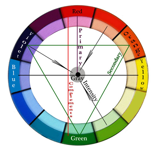
Color wheel for colored pencil drawing
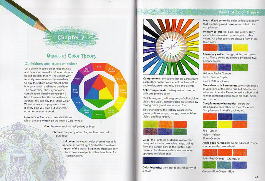
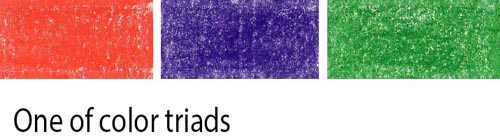
While color wheel isn’t everything for colorful pencil drawing, you do need to know these basic definitions and color triads.
Definitions:
- Hue – means color. Red, green, yellow, etc.
- Value – means how light or dark the shading is.
- Chroma – is the color’s strength or color intensity. Colors can be super intense or muted.
- Value – the lightness or darkness of a color.
- Color Intensity – the saturation or purity of a color.
- Neutralized color – the color with less intensity that’s either grayed down or mixed with its complement.
- Local color – the natural color of an object as it appears in daylight (green of the cucumber or blue of the blueberries). Art students see only local colors in objects rather than the colors of light and reflections.
I know it’s difficult to remember all the definitions and I strongly recommend buying a color wheel because it’s visual. You can rotate the dial to see complementary colors, triads, etc. I still use it every time I design my colored pencil drawings. You can buy it at any art supply store or on Amazon.
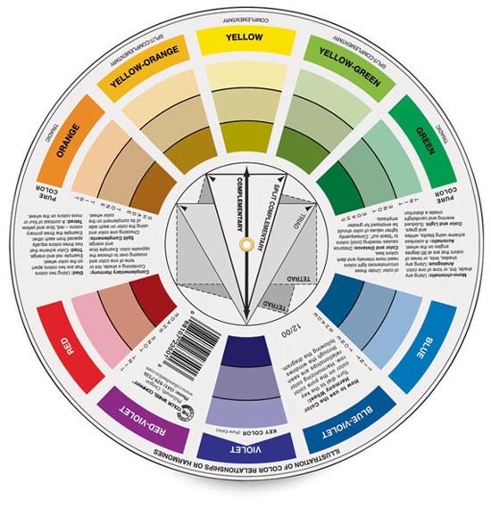
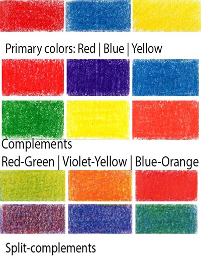
- primary colors are red, blue, yellow. If you put all three primary colors (making them equal in intensity) your colored pencil drawing will be screaming with too much color.
- secondary colors are orange, violet and green. They’re mixed with two primary hues.
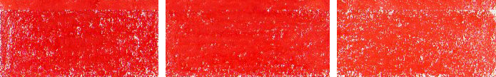
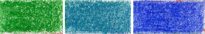
- complementary colors in colored pencil drawing – are opposite each other on the color wheel. Complements intensify each other. You don’t want to have all the complements in one drawing for that reason. Red-Green, Violet-Yellow, Blue-Orange.
- analogous colors in colored pencil drawing – are hues adjacent to one another on the color wheel.
- triadic colors in colored pencil drawing –
- split complementary colors in colored pencil drawing – are the colors on either side of a color’s complement. For instance, if your primary color is blue, your split-complementary colors would be yellow-orange and red-orange. Violet’s complimentary color is yellow, and its split-complementary colors are yellow-green and yellow-orange. Blue-purple and red-purple are split complementary colors. Red and green are opposite each other on the color wheel, so red-orange and blue-green are split complementary colors. Split-complementary colors seem to be less color-intense.
- tetradic colors in colored pencil drawing – are a color scheme that uses four colors that are equally spaced around the color wheel. The four colors are made up of two sets of complementary colors, which are also known as double complementary colors. To be honest, I don’t think this color scheme is very useful although you can try it of course. I think it’s too many bright colors competing for attention unless you use as single dominant color in this color scheme.
- monochromatic color harmonies- colors composed of variations of the same hue but different in color intensity and value. Red is a hue. Its monochromatic variant is pink and maroon.
Color Intensity – the saturation or purity of a color. Neutral colors are mostly browns but
Neutralized color – is any color with less intensity that’s either grayed down or mixed with its complement.
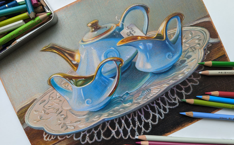
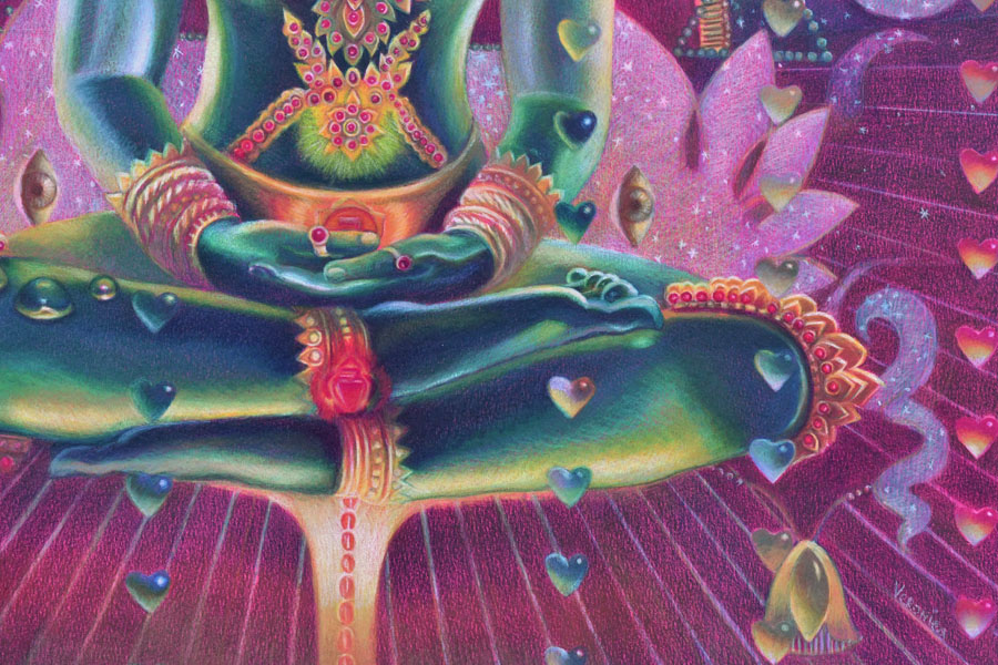
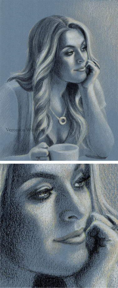
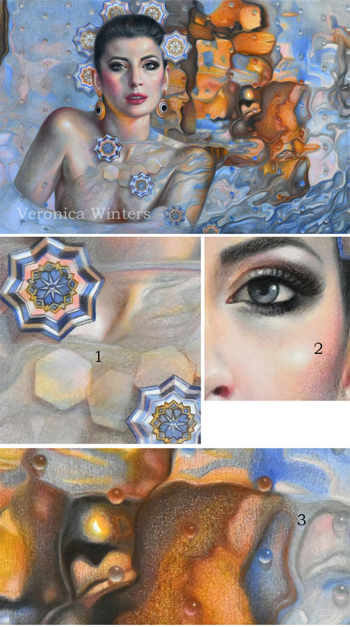
Colored pencils don’t mix to grey unlike oil, acrylic and watercolor paint. Therefore you need to use grey colored pencils to neutralize the color so that there are 1-3 dominant colors in the picture, and the rest are neutralized. By using the grey colors you create selective focus as well as beautiful, subtle color variations and texture. In the closeup drawing below you can see grayed down fabric. I shaded with some bright hues first and then added light greys over them.
How to use color harmony to create mood and atmosphere in colored pencil drawing
I’d like to share 5 drawing tips on using color harmony to make your colored pencil drawings more realistic.
1. Consider overall color harmony design in your colored pencil drawing
Decide on the overall color theme of your colored pencil drawing. Is it light or dark? Is it monochromatic or in full color? How do you decide? Look at your main reference to see the dominant color. Make that particular color your main focus in colored pencil shading. Everything else should be less color intense to support the dominant color. The color harmony you decide on may not be unique to you but you make it unique by choosing the unusual point of view, stroke or subject. Your choice of a dominant color(s) and contrast determines the mood in the drawing. For example, light blues and pinks look serene, while deep reds and blacks make us feel very differently.
2. Test your colors to decide on the best color harmony
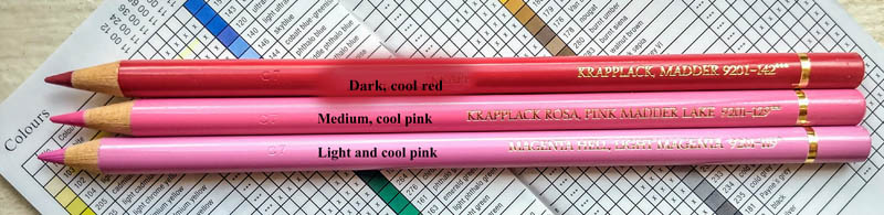
Once you decide on your leading or main colors for your drawing, look at your colored pencils to pick the colors from that color family.
Test your colored pencils on your drawing paper to have consistent color harmony and shading. If you see lots of blue in your reference, test all your blues to see which ones look similar to your picture. Start testing these colors right next to your reference and you’ll notice that some colors are totally off and don’t look right as your main hue. If you have a big box of colored pencils, you have many similar colors. You don’t need to use them all in one drawing because you can adjust your pencil pressure drawing in one blue to get a range of blue tones that’s similar to a number of various colored pencils.
3. Keep it simple to create consistent color harmony
Shade all shadows in one color first. Students love to jump around the picture, using all possible colored pencils to draw the portrait. Instead, pick one color to shade all your shadows first. Colored pencil shading in one color is key to create volume in portrait drawing.
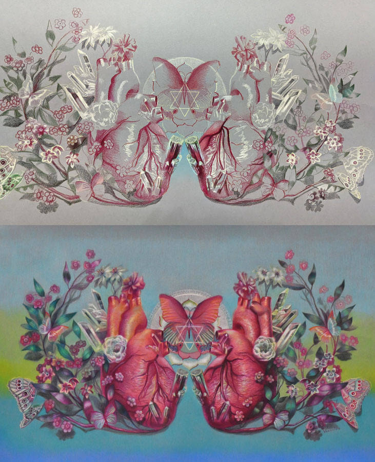
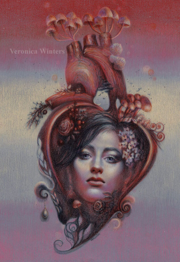
You can make personal colored pencil drawings by focusing on a familiar subject that has unique story line or idea. For example, we all know how the human heart looks like but by designing my own composition and color scheme, I make my colored pencil drawing look different from everyone else’s.
4. Add more tested colors to develop contrast in your color harmony
Most colors are warm and cool. This includes reds, greens, blues and even greys. Some are neutral like browns. You must consider how light or dark they’re. You can’t create a very dark shadow using light pink. You can’t shade around the highlight with a dark blue ( because dark blue is too dark for shading in the light).
Build contrast by having a range of tones in your colored pencil drawing going from very light colors to very dark ones. Of course, not all references call for it but keep it as a guideline for your art and colored pencil shading.
5. Look at your colored pencil drawing from a distance!
You lose all the details by looking at your art from the distance. You do see the inconsistencies in color, awkward shapes, weak shadows and highlights, or undefined edges.
If you consider all 5 rules you will be able to draw a photorealistic colored pencil drawing that has unity in color.
On using color harmony to create unique and personal colored pencil drawings
I’d like to share my approach to using color harmony to create unique and personal colored pencil drawings. I think it may be useful for advanced artists interested in colored pencil art.
#1 Start with a good idea
Have a good idea in mind what colored pencil drawing you want to create. The idea is a visual story in color, subject or light. It doesn’t have to be the figure. It could be one object displayed in a unique light, rotation or point of view in artist drawing. This is the artistic vision and interpretation of a “boring” object that becomes fun to look at because of your unique interpretation of it. You can train yourself to see the world more creatively by improving your photography, reading, looking at art masterpieces and contemporary art.
I have a folder where I save art to learn from done by other artists. I study unique color choices, composition and subject. Sometimes, the subject isn’t new but the approach to drawing it is totally unique.
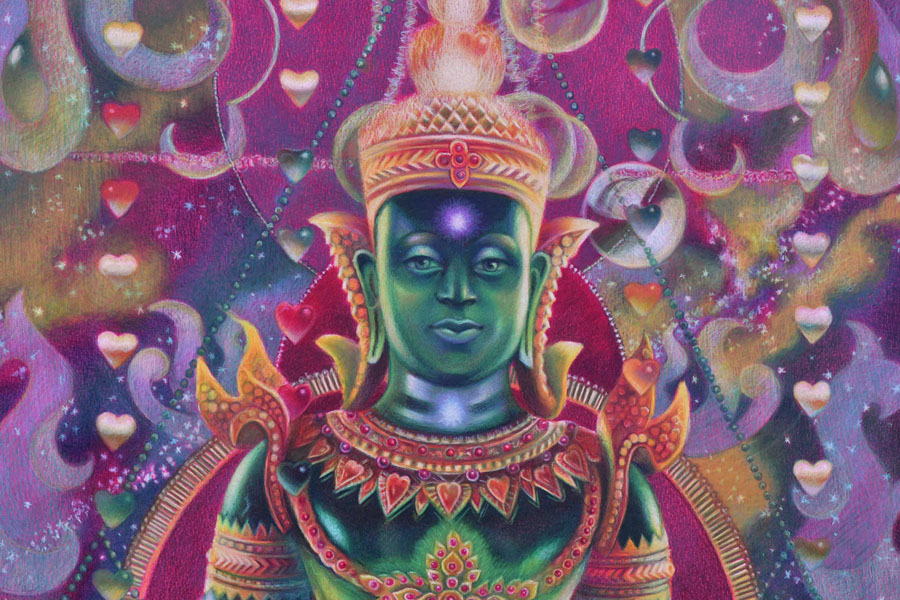
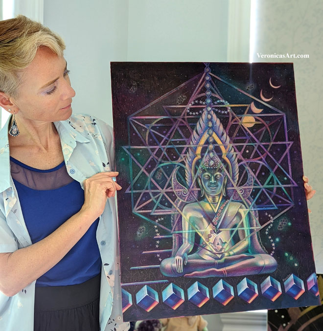
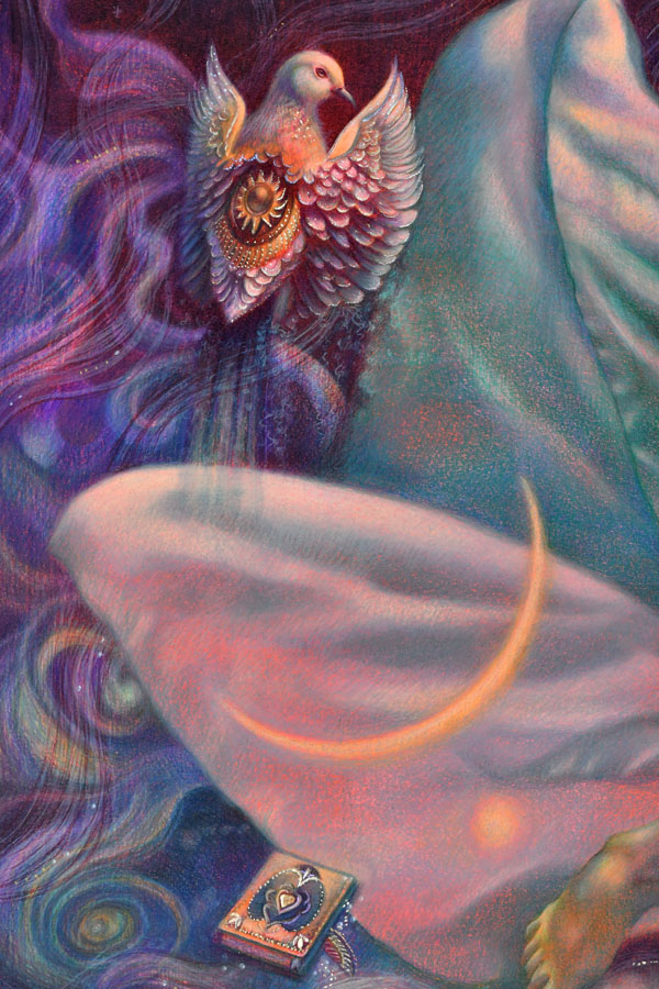
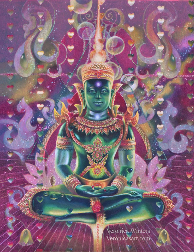
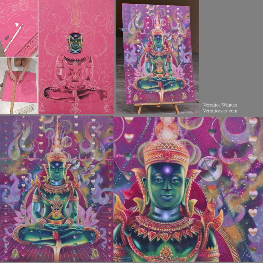
My idea starts from my imagination, reading, travel, emotions and thoughts. One day I imagined a seated figure with light passing through his body. I also imagined a rain of hearts above the figure. I made notes of this idea on my phone…I wanted to depict energy, chakras and the colors of the Universe in this colored pencil drawing of Buddha. I came home and started thinking of my references to illustrate this concept.
#2 Pick high-quality references for realistic colored pencil drawing
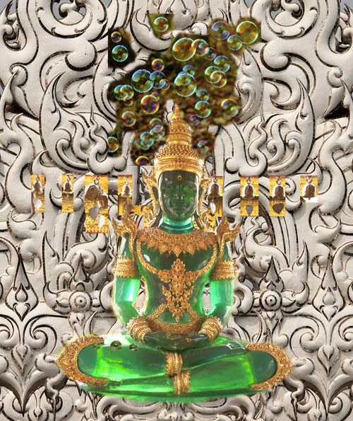
At first I wanted to paint a real person but I had no references of the pose. So I browsed pictures from my Thailand trip folder. I saw so many beautiful Buddhas and palaces there…And this green Buddha was made of semitransparent stone that looked like glass.
You need to pay attention where your references come from. Sometimes you can’t enter competitions drawing from someone else’s photo. Other times, you don’t have an emotional connection to the picture which is not yours. Or you need to get a photo release that takes time and effort. Personally I try to use my references but when it’s impossible to do, I go to Pixabay to find inspiration and you can too! Pictures are of high-quality and free for commercial use. The only problem with them is that they’re Photoshoped heavily. You must see if you have enough information to draw from as most filters remove warm/cool contrast from pictures.
Picking the right references is not enough. They need to “connect” with each other in light and color temperature.
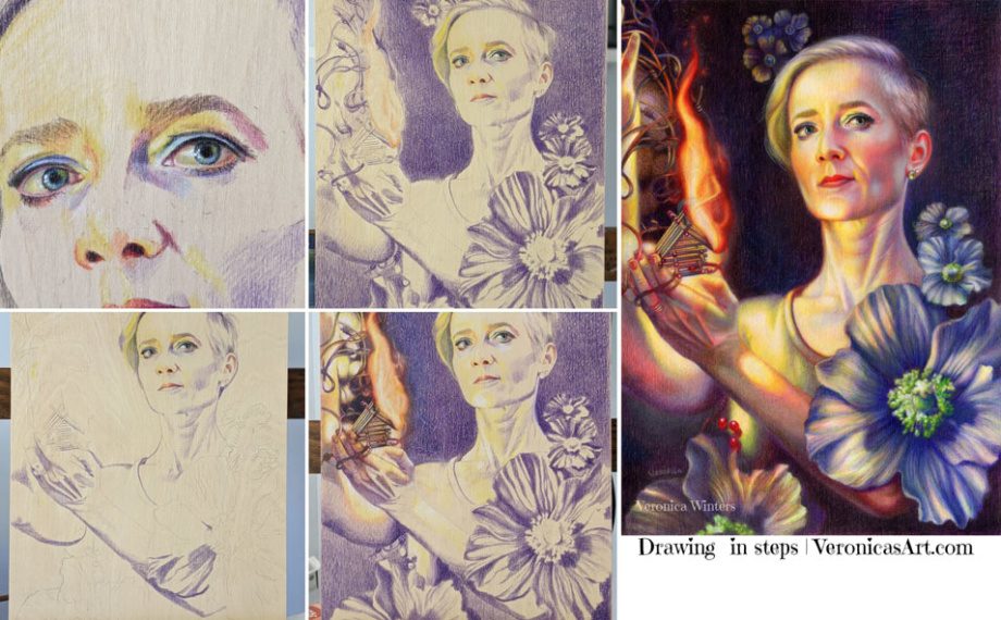
I always design my images around the main subject. I place it first and put smaller shapes around it. In this example, the largest shape is Buddha’s image and my design revolves around the figure. I used the ruler to make straight lines and place the hearts. I cut a heart-shaped template to have a consistent shape in my colored pencil drawing. I use Photoshop to plan the design as much as possible by layering and moving elements around the main figure to arrive at a perfect composition.
#3 Decide on your color harmony in colored pencil drawing
This drawing has quite sophisticated color scheme. My color harmony is a combination of cool red, green and cool, bluish white.
My tip is to focus on picking 1-2 main colors in your color harmony. It doesn’t mean that you use just two colored pencils for that. It means that you pick the basic scheme, say, ‘yellow-purple’ and design your colored pencil drawing in these colors. The rest of them should be grayed down or become less prominent to support the main hues.
#4 Pick the right toned paper for your specific color harmony
I love drawing on Canson Colorline paper because it comes in a variety of bright colors. The texture is not overwhelming and colored pencils become very vibrant drawing on this paper. (I’m linking to this paper on Amazon but I find that DickBlick has better choices).
Once you picked you main color scheme, say ‘yellow-purple’, look at the color of your drawing paper. In general, don’t draw on yellow paper if your main color is ‘yellow’. Don’t draw on a purple drawing paper if your main color is ‘purple’. Pick the opposite color of paper (like green or orange) and test the colored pencils on it. Test a few colored pencils on it to see how either vibrant or dull they’re. Some colors may disappear on colored paper and others would be super bright.
#5 Have consistent shading in your colored pencil drawing
Begin shading the shadows first using one color. Don’t jump around the picture with many colors. Pick one color and shade all the darks with it. Mark the highlights with white colored pencil (or reserve the space for your highlights if you draw on white paper). Lastly, shade the middle tones connecting the darks with the lights.
Shade with the softest colored pencils, filling in large areas. If you start working with harder colored pencils like Polychromos, it might be frustrating to fill in large space. I save a lot of time and hustle for myself by drawing with the softest pencils like Prismacolor Premier and Luminance or Pablos, and then switching to harder pencils like Polychromos to work on the details in my colored pencil drawing.
Have fun creating your super vibrant colored pencil drawings with beautiful and unique color harmonies!
You can learn a lot more about color and color harmonies by taking my video course where I explain the properties of color and how you can design your images around color. I share my secret picking a perfect color scheme for my colored pencil drawings every time.
https://veronica-winters-art-school.teachable.com/p/color-crush-course-for-colored-pencil-artist-by-veronica-winters
Colored pencil drawing on Ampersand pastelbord
This board could be an alternative to drawing on colored paper but you must consider the disadvantages working on it in colored pencil.
I like to experiment with different surfaces drawing in colored pencil, searching for the most archival support for my art. Since most people find the colored pencil work inferior to oil painting and even pastel painting, finding the right, archival surface takes the fear away from your clients who wish to buy your artwork otherwise.
This slightly sanded, colored pastelbord by Amersand is similar to the 800 grit Uart paper, which is great for soft pastel painting. Just like the Uart paper, the pastelbord has similar advantages and disadvantages to using it in colored pencil drawing.
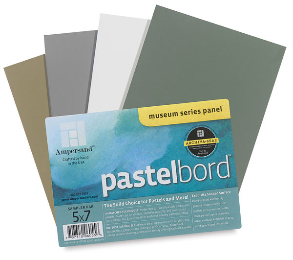
Advantages:
- Ampersand offers a nice variety of colors: sand, dark green, white, gray, and other neutral colors. It takes much less time to shade on colored surface rather than on white.
- Artworks look vivid drawn on this board.
- This archival surface is durable. It doesn’t bend or crumble, stays flat at all times.
- It offers easy display without glass. Just make sure you fix your art beforehand with 3 layers of final fixative. Now you have neither glass reflections nor scare to transport the art!
- The Ampersand pastelbords come in standard sizes that makes it super easy to frame them!
Disadvantages:
- Colored pencil shading on pastelbord is limited. It accepts few layers of pigment.
- It “eats” my colored pencils. If you buy expensive, lightfast pencils, they don’t last long drawing on this surface, and you’d have to replenish them quite often.
- It’s best to use harder pencils on these boards. I use Pablos to fill in all the detail.
- The boards cost more than the average drawing paper, of course.
 |  |
Art Supplies:
Colored Pencils:
- Prismacolor 36: https://amzn.to/3PdrdvY
- Pablo 30: https://amzn.to/3c018Cg
- Polychromos: https://amzn.to/3yoTxF1
- Luminance: https://amzn.to/3P7lkBf
- Caran D’Ache full blender: https://amzn.to/3RkCBrO
Drawing paper:
- Bristol Vellum white paper: https://amzn.to/3nJxeVN
- Canson colorline toned paper: https://amzn.to/3yLd9EO You can buy a wide selection of paper at Dick Blick Art Supplies
- Colourfix primer: https://amzn.to/3WLDdbx
Spray fixative for drawings:
- Sennelier: final fixative https://amzn.to/3yqLOq8
- Grumbacher: working fixative https://amzn.to/3bL7k0X
- DON’T buy the krylon spray!
Other art supplies:
- Transfer paper: white https://amzn.to/3Ittcu7
- black https://amzn.to/3OSTnN5
- Gamsol: https://amzn.to/3yP8nGr
Tombow mono eraser: https://amzn.to/3yOVmMT
I’m an Amazon affiliate. You can find these brands at other art supply sites as well.
The One Colored Pencil Technique you must master to create Photorealistic Colored Pencil Drawings
Colored pencil shading techniques
If your aim is to create photorealistic colored pencil drawings, you need to master the very basic drawing concepts, which includes colored pencil shading. Whatever subject you draw in colored pencil, it’s important to control your pencil pressure to achieve realistic result.
Pencil pressure
For instance, when you press on your pencil very lightly, you won’t be able to achieve rich darks or create enough contrast in colored pencil drawing. At the same time if you’re heavy-handed, your drawing may become too muddy or overworked quickly. So it’s all about finding that perfect balance in colored pencil shading.
You do need to increase your pencil pressure in colored pencil drawing when:
- you try to blend some areas with light pencils shading over the dark layers
- you blend the areas around the highlights
- you want to build up contrast in progression
- or when you work on textured paper and have to do lots of filling of a paper’s tooth.
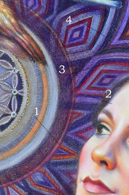
#1 I shaded with white colored pencil over the dark area using a unique stroke to create the texture I wanted. While some dark is showing through, I applied the white colored pencil with medium pencil pressure.
#2 I did a lot of shading with colored pencils on the light side of her face using a very heavy pencil pressure to raise the lights as much as possible. White colored pencil sits on top of all other light colors I shaded with there.
#3 I shaded with a light pencil pressure to create that purple circle so that some previous layers still show through it.
#4 I used a very light grey colored pencil to shade over the purple with heavy pencil pressure. It lightened up and blended the area.
Check out available video courses here: https://veronica-winters-art-school.teachable.com/
Colored pencil techniques: colored pencil shading in white and off-white colors
When you work on your colored pencil shading using heavy pencil pressure, the area becomes very waxy and so filled with the pigment that you can’t layer more color over it. That’s the desired outcome. However, if you feel like you want to add even more color to that area, spray it lightly with a fixative. Wait for it to dry and shade over it again.
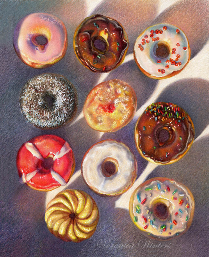
#1 I used white colored pencil and medium pencil pressure to lighten up the geometric shape. It also blended it.
#2 I used a very soft white colored pencil (Luminance or Prismacolor Premier or Pablo) to shade around the highlight leaving the highlight itself uncolored. If your colored pencil is hard this kind of blending is difficult and incomplete.
#3 I used soft, light grey colored pencil and a very heavy pencil pressure to blend the area shading with colored pencils.
I hope that this article helps you in your creative colored pencil drawing and you also find some new colored pencil drawing ideas. Controlling your pencil pressure shading with colored pencils is a must. So next time you draw, pay attention how you press on your colored pencils and observe what results you’re getting. If you’d like to learn more about colored pencil drawing, check out these art books or watch my free videos on YouTube. You may find your answers there. 🙂
| |
Art supplies on Amazon
- Drawing pad, bristol vellum
- Kneaded eraser
- koh -i-noor drawing paper, colored pencil
- Tombow mono eraser
- Drawing fixative
- Sennelier fixative for charcoal and pencil has a super fine spray mist, matte, high-quality
- Gamvar varnish for oil paintings, satin
- Brush for varnishing oil paintings
- Color Wheel
- Canson Colorline drawing paper is available in many colors and various thickness. You might find better choices at art supply online retailers
- Molotow metallic marker, gold
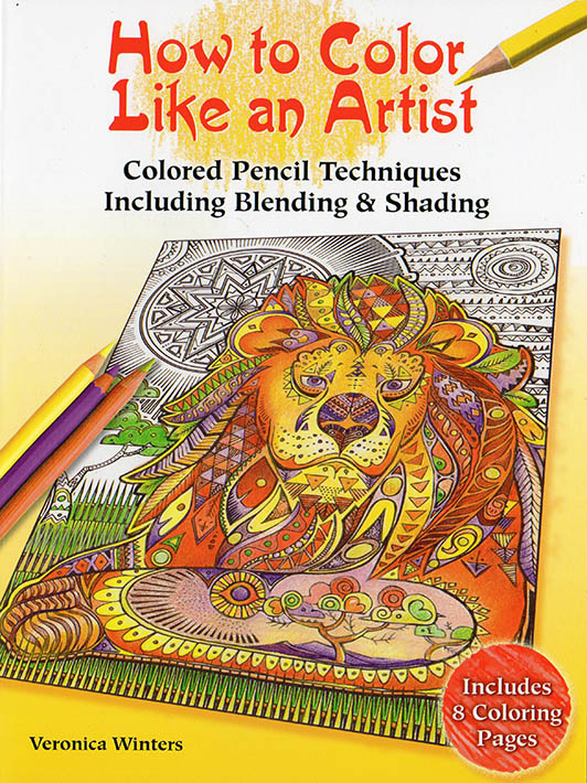
- How to color like an artist, coloring book for children and adults
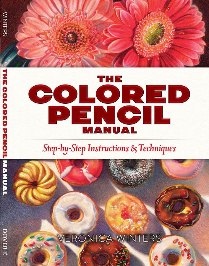
- The colored pencil manual, art instruction book
If you’d like to connect with me:
Video courses
Enter ”LOVETODRAW” at checkout to get 12% off of any VIDEO COURSE.
Hurry. Limited to the first 50 students only.
Go to all video courses
Mentorship
Art student mentorship is available on a very limited basis. We meet in zoom to discuss your art, progress and any question you might have in drawing or painting. Email communication is available as well. One hour session is $65, which could be split into two half an hour sessions. To discuss your options and to set up a schedule, please email to nika@veronicasart.com . For a limited time I provide email feedback for my Colored Pencil Techniques course.
#1 Comprehensive Colored Pencils Techniques Drawing video course
Designed for beginners in colored pencil drawing, this video course consists of 18 video lessons. In this video course you study how to draw various objects in colored pencils. Each video lesson builds up in progression, focusing on a single object to draw.
- Complementary, downloadable pdf file includes line art, color swatches and materials list. For a limited time the artist provides every student with feedback via email. To check out the previews and enroll, click on the image above to follow the link.
#2 COLOR CRUSH Course for Colored Pencil Artist, video course
#3 Portrait drawing: creating emotion in colored pencil, video course
Uncover the secrets to portrait drawing in colored pencil! This unique video course builds up in progression to prepare students to see and capture light on a model, and draw portraits in colored pencil from pictures. Even if you don’t draw from the references, you still get plenty of ideas and information how to create vibrant portraits working in colored pencil.
- The projects consist of lessons- narrated video recordings where the artist draws on various surfaces and explains valuable colored pencil techniques. Some portrait drawing demonstrations include a downloadable reference.
- This course has downloadable color charts/ color list for every demonstration. Click on the image to see a complete curriculum for this class! Enroll today.
#4 Realist oil painting techniques secrets for serious beginners & beyond
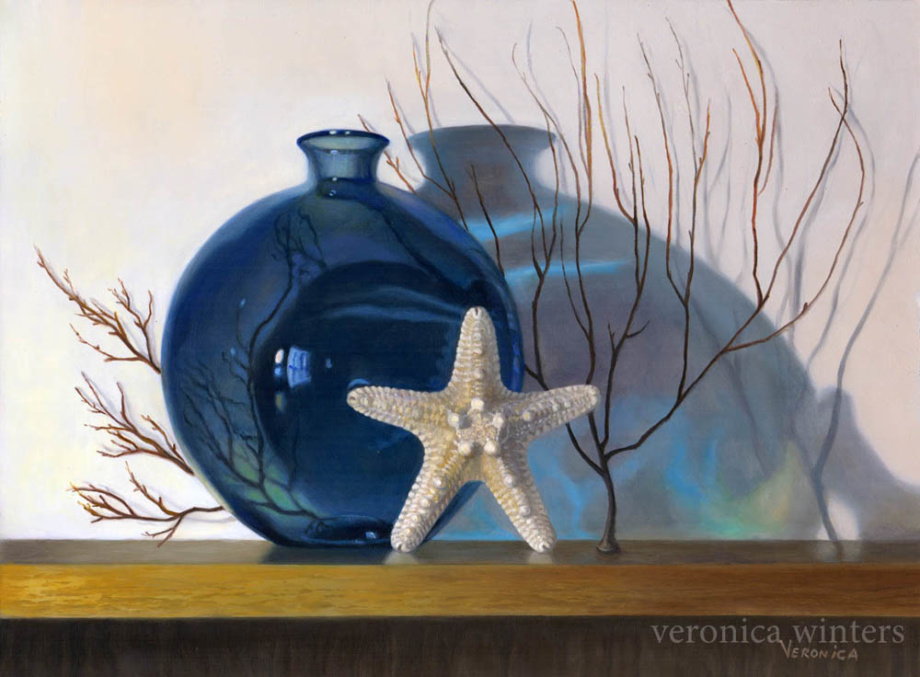
This class is available as online video course now! In this class you’ll see me paint a single still life using traditional oil painting techniques, such as:
- glazing
- grisaille (indirect painting) and
- painting in full color.
I’ll walk you through every step of the painting process that includes:
- prep drawing
- underpainting
- using grays to neutralize chroma (tube colors)
- painting in full color
- painting textures (in a shell)
- painting glass (in a blue vase)
I also include a step-by-step guide (pdf file) that complements the videos. Download it! This class is for serious beginners and more advanced students who already have good understanding of drawing in color, and wish to proceed to the next step – oil painting. This class will give you classical approach to realist painting that you can apply to your daily painting process. It took me many years of schooling and practice to learn this classical approach to painting that’s summarized in this video. Take advantage of this opportunity. Start learning today!
# 5 Step-by-step colored pencil drawing tutorials
Direct link to step-by-step demonstrations: https://veronicasart.com/product-category/step-by-step-drawing-tutorials/
Or you can purchase a buddle of all digital art books and demonstrations for one price here: https://veronica-winters-art-school.teachable.com/p/downloads-tutorials-art-books
You will benefit from these colored pencil demonstrations the most, if you’ve already had some experience in pencil drawing. These demonstrations are not made for the absolute beginners in drawing. Every step-by-step demonstration includes the art supplies list, color chart, and images in steps to complete the exercise.
- The demonstration comes as a digital pdf file that you can save to your computer and work from at your pace. A few demonstrations have drawing videos that are available for download in addition to a pdf file (sold separately).
- When you complete your payment, an automatic email is sent to your inbox. Please check your spam folder as many of my files go there! If you don’t find the e-mail with the demonstration, please e-mail me. nika@veronicasart.com Don’t worry. I’m happy to send it manually.
#6 Art Instruction books
Direct link to books https://veronicasart.com/product-category/art-instruction-books/
These art instruction books feature step-by-step drawings completed in various media, including colored pencil, graphite and even soft pastels. The advantage of buying a digital file rather than a Kindle book is that you can open and see large images on your computer screen. Also, if you have black-and-white kindle, it makes no sense buying the art book that explains how to draw in color.
Every book sells as a digital download that you can save to your computer, and open the file whenever you’re ready to work on your art in colored pencil or paint!
If you live in Europe or any other country, please order art books on Amazon in your country. I can’t ship books overseas.
Watch art instruction videos & previews:
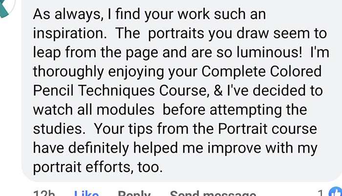
Testimonials:
“A committed artist, author, and teacher, Veronica Winters’s illuminated artwork and attention to detail pushes her to create realistic images that breath life into everyday objects. We are honored to present lessons by Veronica in the quarterly publication of COLORED PENCIL Student”
–Sally Ford, Founder & Editor, COLORED PENCIL Magazine

I attended Veronica’s soft pastel’s class, and she was very inspiring. She gave good individual instruction, building confidence in her students by creating a non-competitive environment. Veronica’s instruction is straight-forward and she has a true desire to help you. I attended her class after decades of doing no art, she inspired me to continue my journey and I have since had my art accepted by and displayed in the Von Liebig Art Center in Naples.
–Clare Roberts
Veronica has been an instructor in our Adult Education program for several years offering a variety of drawing techniques in both classes and workshops. Her classes include teenagers and adults, beginners and more experienced artists, and she provides professional and individual instruction to each student. We feel fortunate to have Veronica teaching in our program.
–Marie L. Doll, Executive Director, Art Alliance of Central PA
The experience of learning to draw with graphite and colored pencils with Veronica as a teacher for me was like learning to grow down and up in the world of art. Expressively up, because with each drawing advice I applied more the nuances of finding the skilled way to make a drawing shine through with life, and fruitfully down because for each finished drawing while looking for her to give the ‘teacher’s final remark’ she would always add: How do you like it?
–Kristina Egumenovska, Fulbright Visiting Research Student, Department of Human Development and Family Studies, The Pennsylvania State University
In a very short time, Veronica has helped me to develop confidence in my artistic ability. Even though I am a beginner, I am progressing rapidly under her direction. She is patient and knows how to nurture a student’s natural talent, while helping the learner to stretch and grow in new areas of understanding (such as how to see and draw proper shapes and tones; working with perspective; how to see, work, and play with color). She is a fabulous artist herself, and learning from her is fun, educational, and inspirational.
–Stelli Munnis
As a teaching artist, Veronica inspires students with her own beautiful paintings and drawings, as well as with her personal attention and gentle, thought-provoking, well-planned, and thorough method of instruction.
–Stephanie Hosier, Assistant Director, Galaxy: The Arts in Education Program of Central Intermediate Unit # 10
I just wanted to say thank you for all your help so far – I’ve really been enjoying the class. This has opened up a whole new world for me. Drawing was something I always wanted to learn how to do, but I used to think you needed to be born with some sort of natural talent. I love finding things I want to draw, and I draw as often as I can at home. It’s something I definitely want to keep doing in the future.
–Brianne Hennel
I was admiring your art and your ability to bring out the full potential of colored pencils! I have to say, I am very impressed. I myself love using colored pencils- they are my favorite medium. By the way, your art work is very inspirational.
–Lauren Foley
Would you like to see your testimonial here? Shoot me an e-mail: nika@veronicasart.com 🙂
Copyright
I reserve all rights to my intellectual property. It is illegal to forward, print, electronically copy, or distribute any digital content from this website or from downloads without prior written permission. If you copy, or forward any content, in any form, or grant access to the digital products to someone else, then you’re guilty of copyright infringement and this is a violation of U.S. and international copyright laws. Violators will be prosecuted to the fullest extent of the law.