Tag: art instruction

Best brushes for oil & acrylic painting

If you’ve tried painting, you know how hard it is to find a good set of brushes. Many of them are flimsy or too soft to spread the oil paint around. Cheap brushes can shed the hairs like a cat. They don’t keep the fine point necessary to paint the details in oil painting. I went through many artist brushes trying to find something that works in my oil painting process. Here you’ll find information on how to pick a good brush for oil and acrylic painting, how to clean the brushes and what brands you can try to purchase the brushes from for your art studio practice.

what are the best brushes for painting?

Painting brushes differ in size, shape, and type of bristles

Size

The higher the number written on a brush, the larger the brush you get. For example #0000-0 brushes are for super fine detail, # 2-4 brushes are for small work, # 6-10+ are designed for a general application of paint.

Shape

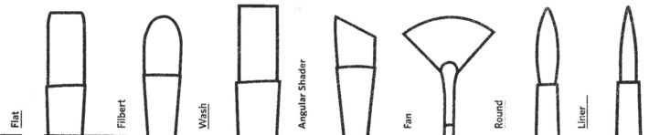
There are rounds, flats, liners, chisel tips, filberts, and fans. The shape of a brush determines the stroke you can make with it. The rounds  have a fine point and are good for small, detailed application of paint, flats are for a large coverage of paint or to make a wide stroke; fans are good for gentle blending of the edges and for creation of some textures like tree foliage. My favorites are the filberts because they give me a variety of strokes. Depending on the rotation of my brush, it can give me either a flat stroke or a thin, fine line that’s great for defining and maintaining straight edges.

How to pick a perfect brush for oil & acrylic painting

Types of brushes

In general, watercolor brushes are very soft and are not suitable for oil painting. They are too soft to maintain a point filled with oil paint. However, small round Kolinsky brushes are very good for painting details, and watercolor 1″ flats are great for blending large areas of paint right after a painting session to soften the entire picture.

There are three kinds of oil/acrylic brushes: the bristle ones, the synthetic ones, and a blend of synthetic and sable hairs. Both the bristle and the synthetic ones are necessary for oil or acrylic painting.

First layer of painting: the bristle brushes

Use stiffer, synthetic brushes for your underpainting because the first layer doesn’t brush over smoothly. Many artists help the oil paint flow by using some solvent ( Gamsol) mixed into the paint. Both the solvent and canvas surface wear out fine brushes using them at this step!

The bristle brushes are used in a first, rough layer of painting to put the paint on canvas and to mass out shapes. It’s difficult to paint the first layer with the synthetic ones on canvas, because they are too soft for this step and don’t spread the paint around easily. I find that major manufacturers produce similar bristle brushes that don’t differ much in quality. I would avoid the cheapest ones because they shed hairs a lot that get embedded into the wet paint, if you don’t take them out of your artwork during painting. However, If you paint on panels and not canvas, the bristle brushes may be too hard to paint with.

Second layer of painting: the synthetic brushes

When you paint with oils over the underpainting, it glides over the first layer much better but often needs just a little bit of medium to have the flow. This is the stage when you switch from stiffer brushes to the synthetic ones. I find that “Simply Simmons” brushes are cheap, over the counter brushes sold at Michael’s that are quite durable and have a nice point when painting. Craft, unbranded brushes is a waste of money because they don’t hold the paint and have no stiffness necessary to move the paint around or to make clean edges and details.

With each layer your painting becomes more refined in color and detail and so do the brushes. I use Robert Simmons oil brushes that are cheap, durable and hold the point well. I paint with #2 round and #2-4 filbert for most work. I also have #6-8 to paint larger areas. The Robert Simmons brushes’ quality is OK for its price. They don’t last for a year, but perform quite well in comparison to other more expensive brushes I’ve tried so far. I also buy them separately, if I need a particular size or a tip. Another brand I recommend is the Rosemary and Co for the majority of oil painting.

To complete big chunks of painting I like using a variety of filberts. The W&N Galeria set of brushes are great. They are quite soft but work well with oil paint.

Third layer of painting: synthetic and sable brushes

Having good brushes is critical to painting subtle transitions, texture effects and details. For detailed work, I like the Ebony Splendor by Creative Mark that are budget friendly. This brand has a variety of small brushes. However, the really good ones are by the Rosemary brushes & Co. This English company manufactures a great variety of brushes.

For a super detailed work I love to use:
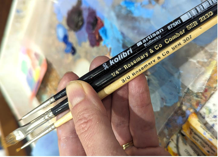
1. the Kolibri, artisan Kolinsky 3/0 sold at Natural Pigments
2. a variety of 3/0 or 5/0 Rosemary & Co oil painting brushes sold on their site, which I prefer using the most.
3. I also use a #0 liner “scepter gold II”, a sable/synthetic blend by Windsor & Newton to paint fine details.
4. Recently I found the Princeton, round, 18/0 to paint the tiny details as well but it didn’t last as long as the Kolibri one.

What about the brush handle?

I find that the brush handle length makes no difference in painting. In fact, if you do realistic painting with lots of detailed work, you want to minimize your hand movements to remain precise. I don’t see how long handles help artists do that.

I keep a wide, super soft watercolor brush (3/4 or 1″) for blending large areas to soften everything before I quit painting for a day. It doesn’t matter what brand it is as long as it’s a super soft brush like the watercolor brushes are.

If you want your brushes to keep their shape, it’s not only the quality of the hairs to pay attention to, but also how you wash them.

Thomas Gainsborough The Honourable Mrs Graham
Thomas Gainsborough The Honourable Mrs Graham (1757 – 1792) 1775 , painting detail

How to clean the oil painting brushes

If you want your brushes to last, take good care of them. Squeeze all the unused paint out of your brush, using a paper towel. I Usually, I deep them in linseed oil first and then take the paint out with a paper towel.

Then you can use a solvent like Gamsol to swish them around in a glass jar, and then wash them out with a bar soap and warm water. I skip the solvent step most of the time because of the two reasons. One reason is a plain health precaution and another one is care for my brush hairs. The solvent dilutes the paint and damages the hairs. I find that cleaning with linseed oil and a bar soap works great and makes the brushes last longer.

To sum up, I take the paint off the brush with a paper towel and use the oil to take most of the paint off. I use a soap bar to clean them after every painting session. I wipe the water off of every brush, and rest them flat on a paper towel, so the excess water doesn’t run underneath the ferrules, damaging them.

One more thing. Brushes wear out a lot faster working on textured canvases. Use lightly textured panels or linen canvases to keep your brushes like new.

Presto!

Check out video classes here: https://veronica-winters-art-school.teachable.com/ or visit my shop. Thank you for stopping by!

How to use varnishes and fixatives-hooked on art podcast with veronica winters and ed brickler

How to use varnishes and fixatives with technical consultant Ed S Brickler

Do you know the difference between fixatives and varnishes?

I invited Ed S Brickler, Technical Consultant from Chartpak, Inc. to explain the common mistakes artists make varnishing their paintings. Visual artists who do acrylic, watercolor, pastel, oil painting and drawing will learn how to varnish and protect art from UV light and deterioration using proper techniques and materials.

This episode is available in a video format on my YouTube channel: https://youtu.be/1hRe8VYLres

If you’re confused about using your materials or don’t know which ones to buy, a good rule of thumb is to contact the manufacturer. There are many brands that produce both fixatives and varnishes – Golden, Winsor & Newton, Grumbacher, Gamblin, etc. Also, many companies keep their own art blogs and educational videos about the use of their art supplies.


To contact Veronica for podcast sponsorship or content ideas: VeronicasArt.com | YouTube | youtube.com/veronicasart Instagram | https://www.instagram.com/veronicawintersart/ Veronica Winters Art School: https://veronica-winters-art-school.teachable.com/ Support artist’s projects: https://www.paypal.com/biz/fund?id=XEALQ6AHQ22EN

Karen Hull artist interview podcast

Karen Hull: art interview with colored pencil artist & reiki master

My guest today is a colored pencil artist & reiki master Karen Hull. You might have seen her amazing art on Facebook before. I set down with the artist to have a conversation about her career discussing colored pencil art, inspiration, art marketing and much more. Karen shares not only her art tips but also talks about meaning behind her creative journey and how her desire to help people made her pivot to studying and working as a reiki master!

First appeared as a video podcast on Youtube: https://youtu.be/irK-fysrWMo

Karen Hull artist interview podcast
Karen Hull, colored pencil & scratchboard demonstration

Follow the artist:

https://www.karenhullart.com/

Portrait drawing class on Craftsy: https://www.craftsy.com/class/step-by-step-photorealistic-colored-pencil-portraits/#

Support the channel/donate: https://www.paypal.com/biz/fund?id=XEALQ6AHQ22EN

Veronica Winters, M.F.A. | https://VeronicasArt.com | https://www.instagram.com/veronicawintersart/

How to paint realistic shadows in colored pencil, graphite and paint

If you’re interested in realistic drawing and painting techniques, you must study the shadows. The right placement and depiction of shadows helps artists create the three-dimensional illusion on a flat surface. The concept or the formula of seeing the light and how it turns the form is the same across various media. Let’s dive in.

How to draw realistic shadows in colored pencil, graphite and paint

The distribution of light

To understand how to draw realistic objects on paper, you need to study how the light turns the form. This image illustrates the idea. Artists observe the light direction and try to find the highlights, form shadows, cast shadows and the reflected light on an object.


How to draw shadows | This image shows the distribution of light on a solid object with the light coming from the left, forming shadows on the right.

What are the shadows?

There are two types of shadows: the form (or core) shadow and the cast shadow.

how to draw shadows
The distribution of light on a sea-biscuit

The form shadow is present on the object itself, and is of the darkest value (tone). It appears where the light turns into darkness. You can see the form shadows on various objects including faces, fabric, flowers, etc. The form shadow makes the objects look three-dimensional, and if you don’t see it, the objects remain flat in your artwork.

The cast shadow(s) is situated right under the object and is always attached to it.

While the form shadows give the objects the roundness or volume, cast shadows give the physical presence to objects. They “make” the object look heavy set in the environment it’s in. Sometimes the cast shadows are a lot more interesting to draw than the object itself.

Adjusting the light

If you see no clear shadows in your still life or a photo, it’s much harder to create the 3-D illusion on paper. While we usually have no problem spotting the cast shadows seen on tables or windowsills, found under the fruit or vases, we do often find it difficult to pinpoint the location of the form shadow present on the fruit/object itself. Strong, directional lighting helps artists find the form shadow. Play with the light to see a variety of shadows on and under your objects.

Seeing shadows in glass:

Not every object confirms to the same formula I’ve described above. For instance, drawing reflective objects and glass requires a different approach or formula to create the 3-D illusion on paper. It involves observation and copying of major abstract shapes and reflections found within the glass object.

how to draw glass
Glass chandelier, Veronica Winters
how to draw glass
Glass bunny, Veronica Winters

How to draw realistic highlights in pencils

When we look at realistic drawings and paintings, we try to figure out how artists achieve such level of realism in their art.

There are three elements that make drawings and paintings look three-dimensional on a flat surface:

  • Accurate shapes or perfect drawing of objects
  • Clear understanding how the light turns the form
  • Correct placement of highlights on objects, fabric and people.

What is a highlight and how do you find it?

Highlights are the lightest lights or the whitest spots you find on your objects. Always analyze the light direction and the light source. Is it coming from the left or right, top or bottom? You’d find the lightest areas on all objects being the closest to that light source.

This image shows a general distribution of light on reflective objects with the light coming from the right. As a result, the shadows are on the left.

The placement of highlights on your object is logical. Analyze the light direction. If it comes from the left, then your highlights would be on the object’s left hand side. If the light comes from above, then the highlights accumulate on the object’s top.
If it’s a vase, a cup or a bottle directional highlights would appear on the object’s surface where the object usually curves or changes direction.
You may see secondary lights in your set up as well. Usually they’re light but not as strong as the highlights. Make sure they remain secondary and don’t “compete” with your major few highlights. This way you create the hierarchy of light and shadow.

Aphrodite plaster cast | Here the light comes from the left, illuminating half of the face. Therefore all highlights remain on the left side of the face.

How to draw highlights in graphite drawing

Placement of highlights in graphite drawing, david's eye drawing
Placement of highlights in graphite drawing. My drawing study of the David’s eye, 9×12″ graphite on white Strathmore drawing paper. The highlights are pulled off of the page with the kneaded eraser to make the brightest areas white.
pencil portrait drawing
A study of Kat II, 9×12 inches, graphite on paper. | Here I used the kneaded eraser to lift out the lights and to create texture in her hair.

If you’re interested to take your art to the next level, take a video class to learn more about the techniques of colored pencil drawing and painting here.

How to draw highlights in colored pencil drawing

Drawing on white paper:

how to draw glass
Still life with a vase, 9×12 inches, lightfast colored pencils on paper | This drawing was done on white, Bristol smooth paper with the lightest areas remaining free of any shading to preserve luminosity.

Drawing on toned paper:

white-fabric-
A study of fabric, 9×12 inches, lightfast colored pencils on Stonehenge paper | Here the light comes from the left. Therefore the lightest part of the fabric with its highlights remains on the left side where I used white and off-white colored pencils to shade the highlights.

This is the drawing completed on bright orange paper. Here you see white highlights. There are light yellow or light blue colors placed underneath the white first to create colorful highlights.
The white highlights look white by shading with some light yellow or light blue colored pencils and then drawing with the white one over them.

Take your art to the next level by watching a video course on demand.

check out visionary art for sale

How to improve realist painting working from pictures

Many artists draw from pictures today or at least use them as a reference material. I use them a lot in the creation of my visionary art, especially when working in colored pencil. Being aware of the advantages and the limitations using photography, makes you a better realist artist because you learn to adjust your process to accommodate it to your practice. So here I list a few advantages and drawbacks using the pictures in painting and drawing.

The advantages of using pictures in art creation:

  • The convenience of working from a picture is tempting. We want to snap a picture of a model instead of paying her for many hours of posing.
  • There are those lucky moments when the moment is just right to capture a moving subject or a facial expression.
  • Fast-changing weather conditions are easy to capture in photography when I travel, and I either have no time to paint or have no capacity to carry my art supplies to the top of a mountain.
  • Working from a picture in colored pencil is almost easier than drawing from life, especially when it’s about capturing the reflective surfaces or real flowers. I usually keep the real object as a reference, but end up drawing it from a picture.
  • By taking pictures yourself in a controlled set up, it’s possible to get nice images. For that I take a cardboard box used for shipping and cut two sides out, to which I glue the white tissue paper that diffuses the light. I place my object inside it and I light it up with one, two or three lights, depending on my idea. My set up is similar to this one:
This photo is taken from this website: http://photography.tutsplus.com/tutorials/10-tips-to-get-started-with-still-life-photography–photo-8278
oil painting techniques shadow box
This is my basic still life painting set up where I don’t aim taking paictures, rather I use it to paint my still life objects direct from life.

This is a striking image of a cloud with the fairly balanced tones between the sky and the ocean. Yet, the color is really off here, too blue and too dark to paint a large painting well without having a sketch made from life that captures the real colors I saw at the beach while taking this picture.

The disadvantages using the pictures for realist painting:

  • The sky is washed out, the land is too dark. This happens a lot in the pictures of the amateur photographers. You need to learn to compensate for the colorless sky by either adjusting your camera settings by 1-2 stops, or taking more pictures of the sky itself separate from the land. Many phones have the HDR function in them these days and combine several shots into one, giving the right light balance between the land and the sky.
  • It’s imperative not to draw from the copyrighted images or use the photos without the written permission of the photographer. It includes the photos made or taken as the movie stills. Years ago I lost a lucrative deal with one of the companies that wanted to feature my artwork on their product. I knew nothing about the copyright rules and drew a movie character they liked, but as you may guess, the image didn’t get cleared by their legal department.
  • If a picture you paint from is not yours, you can’t enter your artwork into the juried shows, unless the artist has the permission from a photographer to do so. And even then, some national contests prohibit the use of someone else’s photography because the artist must be the sole creator of his work.
  • Although painting from pictures is convenient, it has hidden difficulties. Even if the quality of your camera is good enough to capture reality, it misses out on a lot of information artists put back into their drawings or paintings. In other words, the camera filters through some information that the artist responds to when he paints directly from life.
  • Cameras distort reality. Colors, shapes, and shadows never look the same as we see them with the naked eye. Most lenses distort the linear perspective to such a degree that I never use a printed picture as my map to transfer the image. I have a nice Nikon D80 that gives me a wonderful range of hues. I can also change lenses on it that gives me additional advantage in painting with the relative accuracy. Yet, I still use my pictures selectively, and I don’t buy into everything I see in them.
  • The distortion in color and perspective also changes your perception. Camera makes a choice instead of the artist making it. As artists we make decisions what to see and what to leave out in images. For instance, you see a thin horizon line and a single tree in the wind. You feel the air’s blowing coolness; you see a wide range of greens in that tree. You notice a huge cloud looming over it. Snap a picture. What do you see? The sky in the picture registers too bright in comparison to the dark, green land and the shape of that enigmatic cloud is now too light and incomplete. You lose the subtle shifts in color of the sky’s along with its incomplete cloud shape. In the picture, the tree also misses your real perception of it. The range of greens that you see with your eyes doesn’t look the same in the photo. Finally, you lose your feel of nature, the violent and mighty power it exhibits while you are in the moment with its wind and the rain.
  • This is especially important for artists who paint realistically in oils or acrylics. Our perception of reality is instant, and we respond to it swiftly by mixing the right colors without over-analyzing the information. When we paint from pictures, we tend to analyze the same reality a lot more, which is already adjusted by the camera for us. My paintings done from life always have freshness and liveliness that is virtually absent in paintings done solely from pictures. Only the experienced artists can paint from pictures very well, because they have the knowledge to place or replace the elements that the camera doesn’t catch or overemphasizes.

How to take good pictures: examples of bad ones:

  1. There is no sense of the directional light source here. It’s hard to turn the form shading such dull objects.
  2. The lens’ distortion makes this picture great to draw a cartoon, but not a fine portrait.
  3. Everything is uniformly gray in this picture with no clear focal point. Nevertheless, this photo can be used as a reference to understand the atmospheric condition.
  4. Pictures taken with a flash cut on the natural shadows and throw off the colors. Never draw from pictures taken with the flash!
  5.  The sky is really boring here. The absence of an exciting focal point also makes it rather dull to draw.
  6. While the sky looks OK, the foreground is so dark it makes it impossible to use it as a reference to see the shifts in tones drawing the tree.

If you find my post helpful, please share my website with your friends!

Check out all video courses here